Critical art reviews of Detroit galleries and museums weekly

Author: Dennis Nawrocki Page 1 of 3

Writer

Mark Newport and Jane Lackey @ Simone DeSousa Gallery

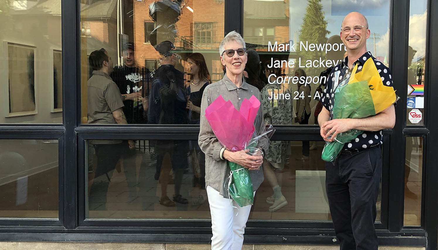
Mark Newport and Jane Lackey: Correspondence  @ Simone DeSousa Gallery

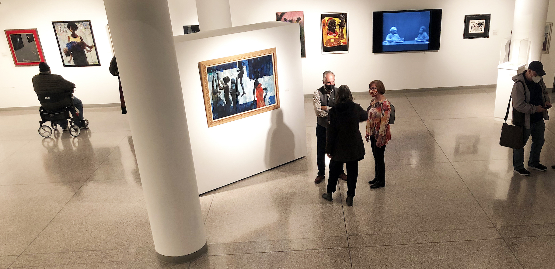
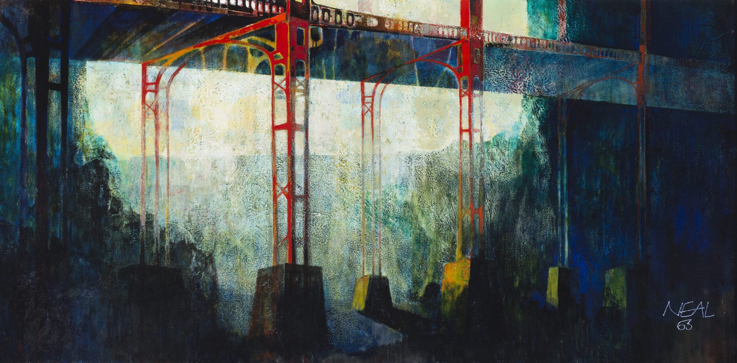
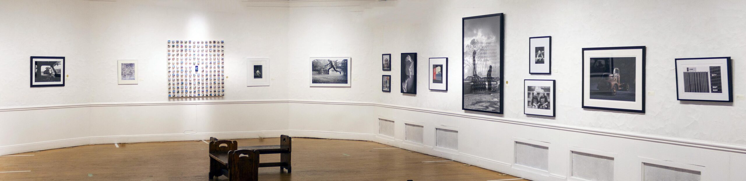
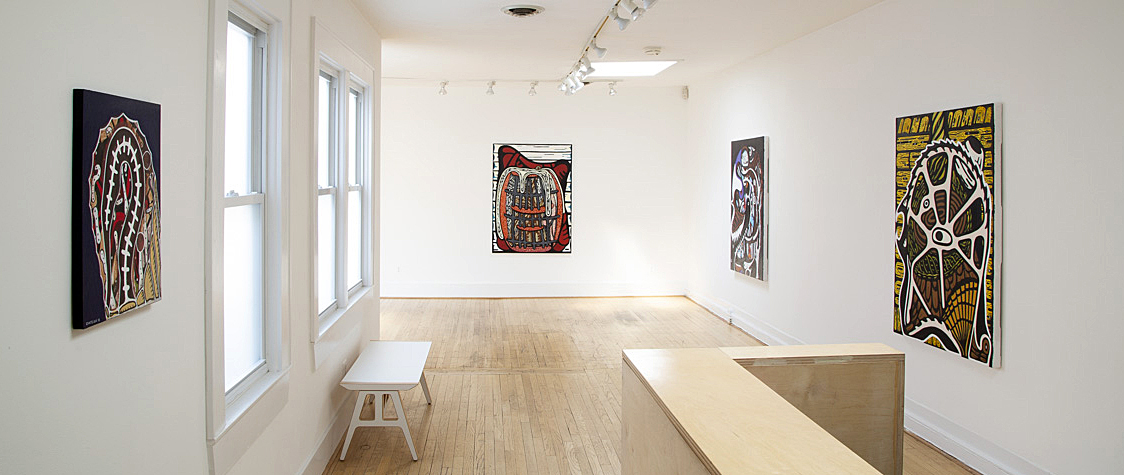
Installation image out front of Gallery. All images courtesy of Simone De Sousa Gallery

Former Fiber Artists-in-Residence, Mark Newport (2007-2023) and Jane Lackey (1997-2007), who served long tenures at Cranbrook Academy of Art, have reunited in a two-person exhibition at Simone DeSousa Gallery in Detroit. Though both have developed singular practices and careers, their show, self-titled Correspondence, showcases underlying similarities in their art-making processes. Indeed, despite their physical distance from one another–Newport works in the Detroit area while Lackey has resided in New Mexico since 2009–they remain in touch and together initiated the exhibition concept.

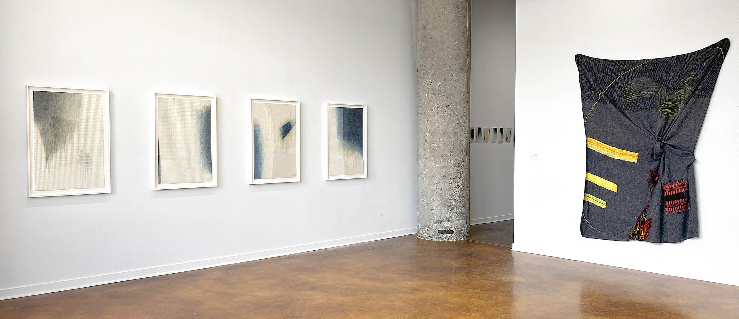
Installation view of Mark Newport and Jane Lackey: Correspondence

At first glance, observing their art on opposite walls in the main gallery, one might think the two clusters of art represent antithetical points of view and execution. Newport’s robust stitchery versus Lackey’s inclination to highlight the process of flowing; his darkling monochromatic palette, her startling cobalt blues; his army blanket supports, her meticulously hand-drawn grids on paper; his gnarly surfaces, her neat, calm meshes; his irregularly shaped compositions, her Spartan rectangles.

Yet correspondences, as Newport and Lackey remind us, emerge upon further viewing: their vertical compositions convey a kind of order and classical uniformity; asymmetric shapes and forms enliven and colorize the pictorial spaces; both employ open ended, ad hoc creative techniques; and repetitive titles emphasize the seriously serial explorations of mending and flowing, the common but enthralling modus operandi of these two makers.

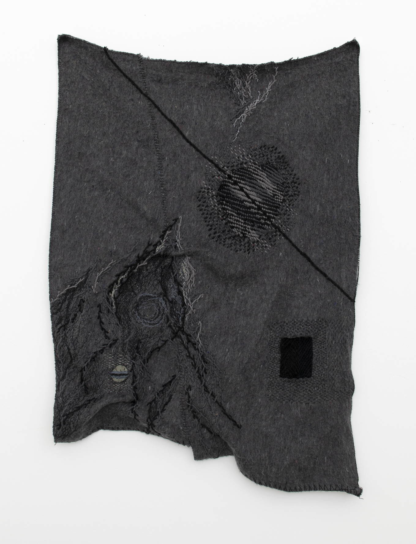
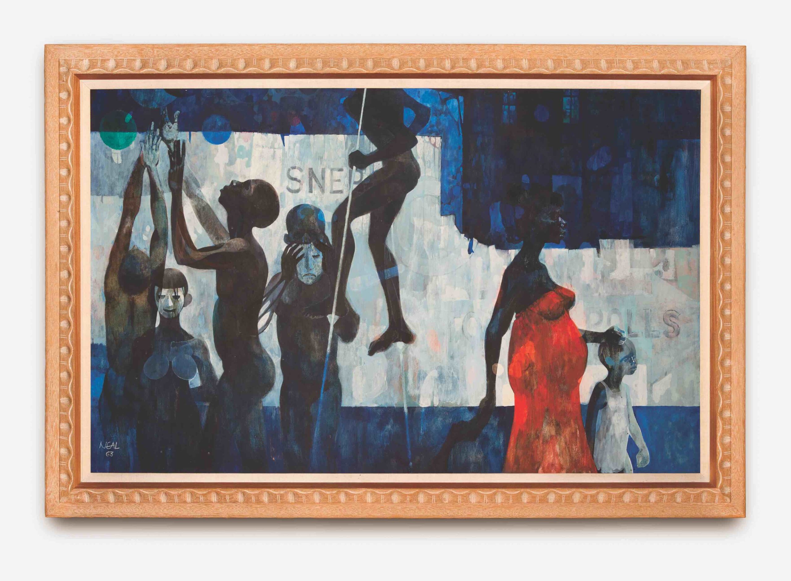
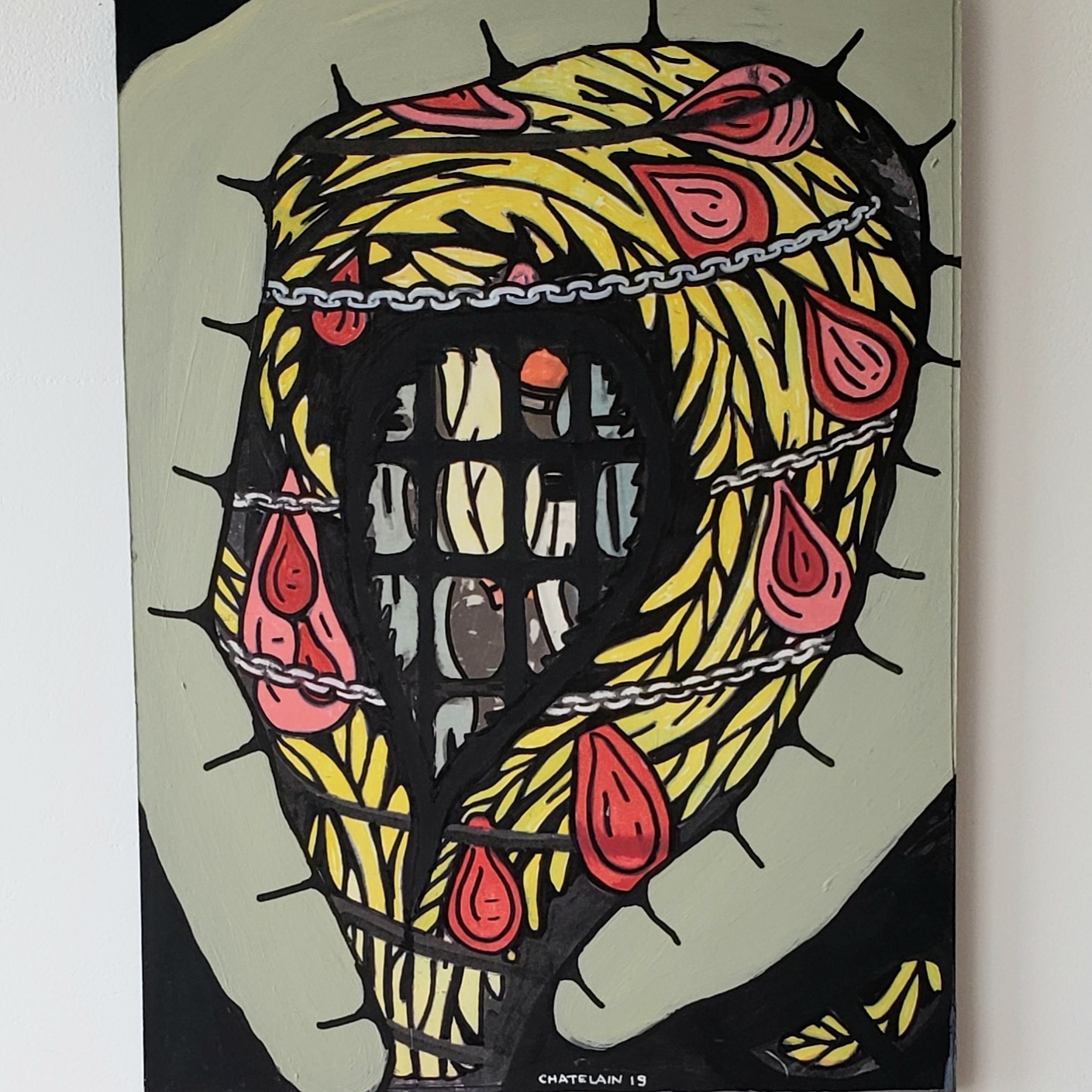
Mark Newport, Mend 21, Wool, acrylic, cotton, 40 x 28 in., 2021. Photo: George P. Perez

Mend 21 (2021), a prime example of one of Newport’s ongoing Mending series, began, like most, with a cut into the wool army blanket material, indicative of the inevitable tears and abrasions in a fabric used to warm and protect a vulnerable body. The subsequent mending of the cut, via darning and embroidery, leaves a physical reminder of the repair or “scab,” as per the artist.  Executed with thick or thin thread, the circular or rectangular halos surrounding these wounds add subtle color and texture to the gray wool ground of the blanket.

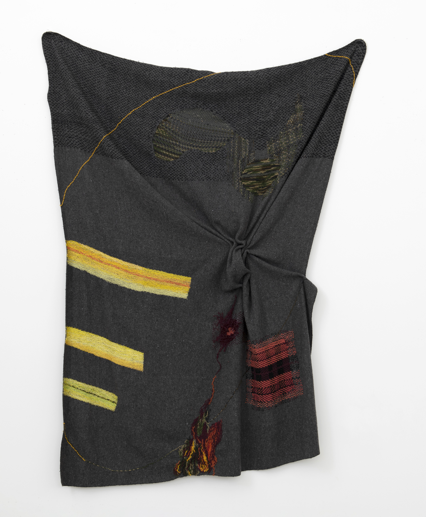
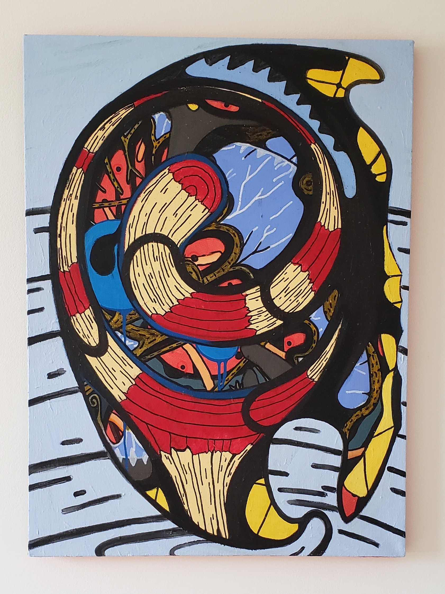
Mark Newport, Swathe, Wool, acrylic, cotton, 83 x 59 in., 2023. Photo: George P. Perez

Swathe (2023), the largest and one of the latest Newport works on view, is boldly and brazenly colorful, sporting three swaths of yellow at the left, a squiggly yellow line above, green, black, and brown horizontal stitching within two amoebic forms near the top, plus an organic oozing of multicolor hues at mid-center countered by a punchy red and black plaid patch at lower right. Moreover, the scrunched and bunched ball of fabric right of center heightens tactility and tautens Swathe’s irregular shape.

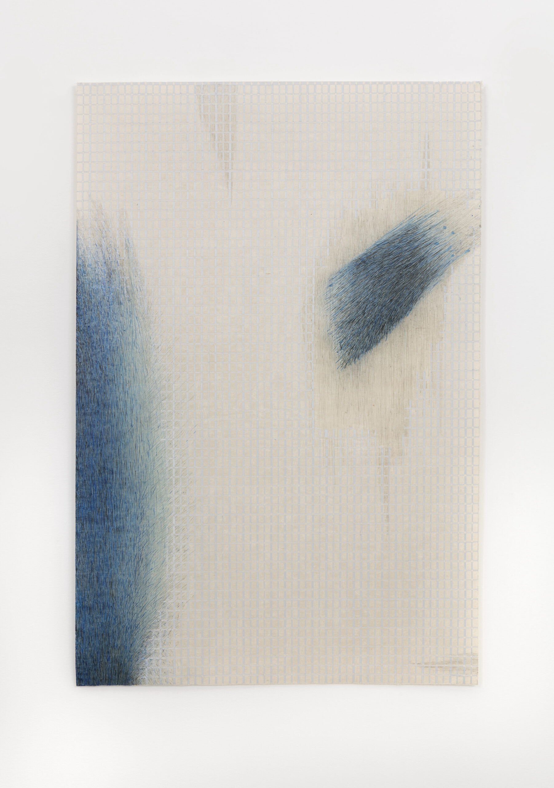
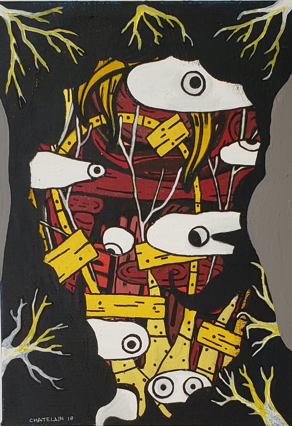
Jane Lackey, Almost being said, flow 3, Acrylic, ink, graphite, paper, 35 x 23 in., 2022. Photo: Addison Doty

Lackey’s Almost being said, flow 3 (2022), one of her identically titled drawings (with numerical designations), establishes the format for a quartet of spare, asymmetric arrangements of flowing cobalt forms encroaching upon precisely drawn paper grids. Like Newport, she too begins with consistent support, his an army blanket, hers a grid, that each artist then disrupts or interrupts. Here, in flow 3, two cobalt forms appear to be advancing toward the center, one on the left edging in slowly, the other at the upper right moving (hurtling?) comet-like toward the center. As Lackey’s lyrical titles imply, something undefined is being said, thought or felt, but provocatively, what that is, is only “almost” laid bare.

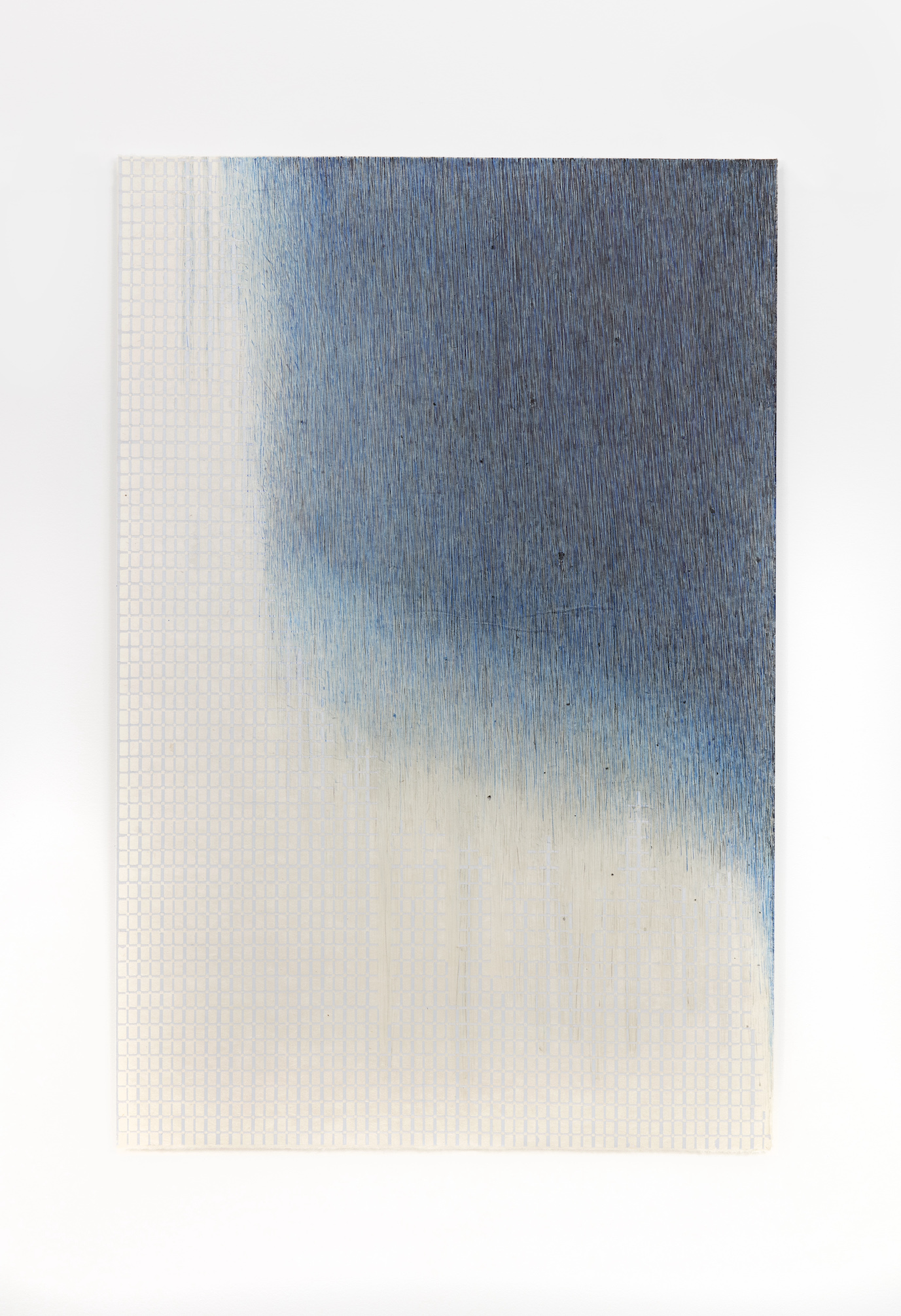
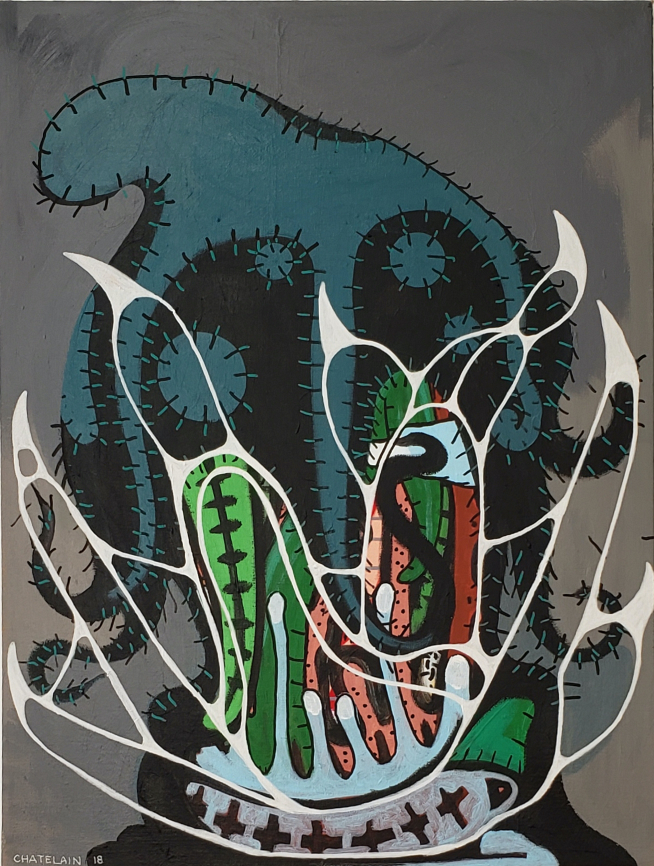
Jane Lackey, Almost being said, flow 4, Acrylic, ink, graphite, paper, 35 x 23 in., 2022. Photo: Addison Doty

Similarly, in Almost being said, flow 4 (2022), the slowly descending blue form appears to be on the verge of enveloping the tight, orderly grid. The tempo varies from composition to composition, evoking states of mind, emotional ups and downs, shifting moods and, as Lackey observes, “assertions of self within a plaid of connective tissue.”

Hence, Mark Newport and Jane Lackey: Together and apart, singular but connected, Midwesterner and Southwesterner, two makers linked across the miles via stitching and flowing. Correspondence, not competition, as they’ve confirmed, is the order of the day.

Correspondence is on view at Simone DeSousa Gallery, 444 W. Willis St., Detroit, MI, through August 12, 2023.

Harold Neal @ Wayne State University

Harold Neal and Detroit African American Artists: 1945 Through the Black Arts Movement at the Elaine L. Jacob Gallery, Wayne State University

Installation view of Harold Neal and Detroit African American Artists: 1945 Through the Black Arts Movement, Image courtesy of DAR

“Harold Neal is a people painter,” so goes the artist’s succinct, self-identifying description of his art, life, and career on the first page of the exhibition catalogue. But this is not a solo exhibition. While Neal deservedly headlines the show, the title adds clarifying information plus a timeline subtitle, finally weighing in as: “Harold Neal and Detroit African American Artists: 1945 Through the Black Arts Movement.” The other artists number ten, and the years actually extend from 1945 – 1980. It is, in fact, an extraordinarily ambitious overview of thirty-five years of African American art in Detroit, and presents both an exhibition and a probing, in depth catalogue, the result of a ten year project, initiated and produced by Julia R. Myers, Professor Emerita of Art History at Eastern Michigan University, who now resides in New Mexico.

Harold Neal, [Still Life], Oil on board, 12 ¼ x 15 ¾” 1950

Born in Detroit in 1924 (d. 1996), Neal completed his BFA at College for Creative Studies (1953) at the age of 29 after a decade of on and off enrollment. An early still life of bottles, Still Life, establishes stylistic hallmarks of his oeuvre: translucent layering of thinly pigmented hues, flattened and indeterminate space, and figural representation, a mode influenced by CCS teachers Sarkis Sarkisian and Guy Palazzola. Another early work post-graduation, its Title unknown, portrays a field worker sprawled in the midst of a parched, barren landscape. His striking yellow shirt and blue jeans, foreshortened pose, enlarged hands and feet, and sad expression convey the arid shortcomings of his condition. Notably, his head is farthest from the viewer, emphasizing his deliberate distancing and studied remove from those nearby. Intimations of Rodin’s The Thinker perhaps?

Harold Neal, Title unknown, Oil on board, 32 ½ x 24 ½” before 1958

As the feisty, contentious 1960s dawned in Detroit and across the nation, Neal’s subjects and point of view shifted. The Brown vs. Board of Education civil rights bill had passed in 1954 and Rosa Parks refused to give up her bus seat in 1955; Dr. Martin Luther King, Jr. and Malcolm X were promoting their campaigns for social justice for African Americans; the Black Arts Movement(BAM) (1965), Black Power (1966), Black Panthers (1966) and the “Black Madonna” (1967) at Central Congregational Church in Detroit hove into view; while the Detroit revolution of 1967 prompted the 1969 exhibition of Seven Black Artists at the Detroit Artists Market (a first for the Market) and the subsequent founding of Charles McGee’s Gallery Seven (1969-1978) in the same year.

Concurrently, against the turbulent backdrop of the decade, the Black Arts Movement (BAM), founded in 1965, “established” more or less clearcut guidelines that sought to enhance the potency, validity, and accessibility of Black visual art. The directives emphasized imagery that portrayed the experience of African Americans in order to engage Black audiences, and to reject abstract art that dominated the white art world at the time. Or, phrased more colorfully and pertinently, Neal asserted that “Artists must stop being specialists and must be like any other Black man fighting for his freedom [rather than] going along with tired white boys who introduce a series of dots one year and are hailed by critics.” On the other hand, a number of Black artists felt just the opposite, one of whom, Al Loving, queried: “Is art supposed to be propaganda for Civil Rights? That seemed to be the attitude at the time.”

Harold Neal, Status Seekers, Oil on board, 30 ½ x 47 ½” 1963

Resolutely, Neal soldiered on, producing in 1963 Status Seekers, one of the largest and most riveting compositions in the show. It’s a streetscape peopled with two vignettes, a group of adolescents on the left and a pregnant mother and child on the right. Two of the boys stretch upward toward balloons bobbing above them while another status seeker struts along on stilts, his head cut off at the top of the frame. Two others have donned white masks, as they too aspire towards success in the white world. Meanwhile, the woman in red strolls by defiantly ignoring the foolish boys from whose bogus goals she seeks to shield her young child.

Harold Neal, Man Span, Oil on board, 23 ½ x 47 ½” 1963

Another stunning and rather unexpected image from the same year, 1963, Man Span, represents a bridge raised high above the chasm it fords. Its tall, elegant red/orange columns support a roadway absent any sign of vehicular traffic. As Neal explained, laborers who built the structure are whom Man Span” celebrates: “Sometimes in seeking respite [from anger about the treatment of African Americans] I try to show through the paining of bridges, houses, and still life what the human hand is capable of in the brief period between its destructive endeavors.”

Harold Neal, Title unknown Oil or acrylic on board, 37 x 30” 1968

A disheartening but compassionate trio of images from the late 60s continue to broach the inequities of racial strife, beginning with Title unknown, Neal’s stoical portrait of a semi-shadowed woman displaying in her arms for all to see her dead, bloodied child slain by a National Guardsman during the Detroit rebellion of 1967. The mother and child, centralized in the composition, are redolent of both a classical madonna and child or Pieta composition. The date of the child’s death, 7-25, is incorporated into the light filled, graffitied urban setting that Neal often employs to contextualize his dramas.

Harold Neal, Title unknown, Riot Series?, Oil on board, 24 x 39” 1960s

In another Title unknown work, Neal advances his subjects so close to the surface that upper and lower parts of their figures are cut off by the picture frame, so observers all but merge with the pictorial space of the image. Here, a seated mother and child on the left are paired with a male figure on the right, his back turned to the spectator and his hands tied. Suspended in time and place, they wait for the inevitable. The savory pink, lavender, and red hues of their attire, plus a gray, overcast atmosphere, adds poignancy to the taut, anything-could-happen deadlock which fences them in and ties their hands.

Harold Neal, Rag Doll, Lamp black on paper, 28 x 47” c. 1967-1969

The third of these late 60s depictions is the most searing of the lot. Titled Rag Doll, it is chromatically limited to black and white and to a single figure, but is sizable in scale (28 x 47”) for maximum impact. Viewers witness an incensed Black boy who, with his bare hands, deliberately and furiously rips and tears apart a white rag doll, peeling off its arm and severing its torso. Kinship with Goya’s visceral “Disasters of War” echos here. Exhibited in the 1969 Seven Black Artists exhibit at the Detroit Artists Market, a breakthrough show curated by Charles McGee, its present day aura registers as fiercely and as hauntingly now as then.

Harold Neal, Checkers, Oil on board, 51 x 48” c. 1972-1973

By the mid to late 70s, Neal, along with many of his BAM cohorts, had ”cooled his fire”: “I don’t have time to be angry anymore….I can’t carry the burdens of oppression on my shoulders my whole life.” Checkers, from 1972-73, is suffused with light and transparency as onlookers and players mingle and merge around a floating checkerboard, one of the last of Neal’s paintings to appear in the show. Among subjects that continued to appeal to him were jazz and blues, which he referred to as “African American Classical Music.” Participation in outreach social programs, conferences, art councils, and teaching for many years at Wayne County Community College also provided an outlet for his socially progressive urgings: “I have awakened a lot of young people to their potential and I encouraged them to pursue alternative means of expression.”

A video interview from 1971 embedded in the show introduces visitors to Neal’s calm, composed demeanor even when asserting controversial and passionately felt points of view. He argues, for instance, that abstract artists “immunize” themselves in their studios, selfishly thinking they own their talent and style without acknowledging the societal responsibility for human intercourse. He asserts as well that the 60s expression, “Black is Beautiful,” is of manifestly lesser social and political importance than “Black is powerless, Black is hungry, Black is jobless, and etc.”

Lastly, writing in 1974, critic Charlotte Robinson observed that Black “social statement is almost never hanging on the walls [of] large art institutes or museums and rarely even in white galleries.” Well, in fact, here it hangs, on the walls of the Jacob Gallery at Wayne State University in Detroit for two more months. Do plan a visit.

Harold Neal and Detroit African American Artists remains on view through –  Jan. 20, 2022, at the WSU Elaine L. Jacob Gallery.  Contact the gallery in advance at [email protected] to schedule your visit.

Photography @ Scarab Club

50th Annual Photography Exhibition at the Scarab Club

Installation view, 50th Annual Scarab Club Photography Exhibition, Installation photo by Christopher Gene, all other photos courtesy of Scarab Club

A striking and expansive display of photographic sensibilities, currently on view in the 50th Annual Scarab Club Photography Exhibition, continues a long-standing tradition of welcoming and introducing current photographic practice. Juried by Ralph Jones, Detroit photographer, documentarian, educator, mentor, and exhibiting artist, this “unthemed” show (as per the Club’s Call for Entry application) is visually vibrant and emotionally rich. The spacious installation of the submissions of 38 artists enhances a diverse array of figurative and abstract images, formats both commandingly large and gem-like in scale, and bold, colorful pictures in tandem with austerely black and white compositions.

Technically, Matthew Raupp’s Detroit Photo Series (2020) might be termed a relief, projecting as it does some three inches plus from the wall. His compendium of 192 colorful, miniature views of buildings (2 x 2” each) represent sharply focused, frontal images of structures drawn from the precincts of Detroit. Each is individually mounted on a 2 “ wood cube imbuing them with the weight and heft of a three-dimensional structure. Fronts of houses, storefronts, banks, churches, and fire stations in various states of repair–intact, rehabbed, repurposed, or derelict– attest to the adaptability and resiliency of The D. Additionally, an iPhone mounted dead center zooms through the entire ensemble of facades, offering an alternative, fast-paced scan (so 21st century) through Raupp’s personal land bank.

Matthew Raupp, Detroit Photo Series, 48 x 48 x 3,” Wood blocks, photographic prints, iPhone


Detail, Matthew Raupp, Detroit Photo Series

Two vertical compositions, rather like exclamation points, punctuate one wall, making the most of the slender height of the format. In Kate Gowman’s five feet tall Scrapyard Fire (2012), no flames are in sight. Instead, a hazy atmosphere pervades the scene. The smoggy smoke of the fire, some distance away, merges with the gray, shapeshifting clouds and gracefully listing tree trunks, while two men quietly inhabit the crisply detailed foreground, one perched atop a wrecked car and the other standing nearby, while gazing toward the unseen fire. Aesthetically, the subtle tonalist merging of gray hues belies the alarming import of Gowman’s title. In contrast, Vincent Cervantez’s poignant The Unveiling (2021), a three feet tall still life of a white bridal(?) veil sprawled on a bed of brown, parched leaves, evokes loss, accidental or deliberate, perhaps a dream forsook, or even a violent encounter. Discarded objects and litter–masks, plastic bags and containers, whippets, and etc.–pervade the culture. Here, rather affectingly, an eddy of wind lifts the veil and threatens to whisk it out of sight.

Kate Gowman, Scrapyard Fire, 60 x 36,” Fine art print on Hahnemuhle paper

Vincent Cervantez, The Unveiling, 36 x 24,” Digital print

Affirmation rules as well in the Scarab Club’s 50th anniversary show. Tom Stoye’s Leap of Farith (2016) presents a silhouetted figure, legs spread wide (the print is 32” broad), head skimming the top of the frame, bounding through a spray of water. Its lithe, explosive energy swiftly transports the viewer aloft and across the expanse of paper. The small, square, quiescent People in a Pandemic (2020), by Anne Knight Weber, however, features four clustered, stationary figures (one adult and three children) on a vast beach as avatars of the endemic isolation of a pandemic. Sans a frame, water, wet sand, reflections, and azure sky shimmer and float free of the gallery wall heightening the glassy stasis of the scene.

Tom Stoye, Leap of Faith, 21 x 32,” Photographic print

Anne Knight Weber, People in a Pandemic, 11 x 11,” Photograph, acrylic glass

Other photographers focus upon the uneasy balance and oft tense interaction between figuration and abstraction. An emphatic zig zaging line rivets the view of Jerry Basierbe’s Steel Breakwater #3–Point Betsie, MI (2019), while in Hats(2016) by David Clements a swirling orange oval governs the foreground. In the former, the dark, zig zagging line of the breakwater thrusts the viewer into the silky, placid waters of Lake Michigan, a coastal locale frequented by the artist. It’s a harsh, slicing armature that connotes something of the blunt force of industrialization. In the latter, Clements presents a vignette drawn from his ongoing series documenting African American church services. Here, the elliptical orange confection up front instantly captures the viewer’s eye before noting another woman, also attired in a matching, eye-catching hat and coat, seated in the next pew forward.

Jerry Basierbe, Steel Breakwater #3–Point Betsie, MI, 18 x 18,” Digital photographic print

David Clements, Hats, 14 x 16,” Photograph

One of the smallest works in the exhibition also touches on fashion. Teresa Petersen’s Fashion for Women and Children (2018), a mere 3 x 3,” presents a fenced off storefront featuring pink and blue pastel raiment for women and children. Like Raupp, Basierbe, Clements, and others, she too scours particular locales for definitive subjects. Alas, here the fashions on parade are imprisoned behind a metal grate, teasingly short-circuiting a window shopper’s desires.

Teresa Petersen, Fashion for Women and Children, 3 x 3,” Photograph

Small, medium, or large, splendidly hued or chastely black and white, figurative or abstract, these singular examples may indeed spur a desire to encounter more of the photographs on display. And that is exactly what this golden anniversary exhibition at the Scarab Club proffers: all 38 selections remain on view through June 26, 2021.

The Scarab Club is located at 217 Farnsworth St. across the street from the Detroit Institute of Arts.

Car Design in the Motor City @ DIA

Detroit Style: Car Design in the Motor City, 1950 – 2020 at the Detroit Institute of Arts

Installation: counterclockwise, Firebird III, General Motors, 1958; 300C, Chrysler Corporation, 1957; Le Sabre, General Motors, 1951

As a visitor arriving at the Farnsworth Street entrance of the Detroit Institute of Arts to take in “Detroit Style: Car Design in the Motor City, 1950 – 2020,” you’ve just begun your journey. After entering the Farnsworth doors of the South Wing of the building, one begins a colorful and eye-catching hike across the width of the museum. The tour passes through the hallowed halls and treasure laden galleries of the Institute until reaching the North Wing and the now deinstalled modern/contemporary galleries and the exhibition entrance. There, a wide doorway (definitely not a columned portal) leads into the first show-stopping gallery of “Detroit Style.” Unlike any other gallery in the DIA, arrayed before you is a breathtaking trio of sleek, shiny automobiles seemingly floating on an expansive white vinyl plinth: a silvery gray Firebird III (General Motors, 1958), a pristine white 300C (Chrysler Corporation, 1957), and a lush misty blue Le Sabre (General Motors,1951). Their elegantly understated hues allow the clean lines, crisp edges and creases, wings, fins, and upswept taillights to protrude and project into space. After all, as a curator once wittily claimed, “Automobiles are hollow, rolling sculptures.”

This, the first and largest gallery, focuses on the 1950s in an exhibition that unfolds chronologically decade by decade. Organized and overseen by DIA curator Benjamin Colman, twelve cars in all are displayed, four from each of the Big Three manufacturers. (And, tactfully, a different car graces three distinct covers of the indispensable catalog–in red, silver, or blue, your choice.) Each of the sequential galleries showcases one or more concept and/or production vehicles. In addition to automobiles, the show offers design drawings, archival photos, paintings, a sculpture, and short videos in which designers discuss their works. (Access the videos at end of this text.)

In the opening gallery, for instance, devoted to the 1950s and presenting the cars described above, a drawing by Art Miller, Rendering of Automobile Interior (1952), features a cutaway view of a gleaming red and black interior and the startling sight beyond the opposite window of a tiny, low flying jet zooming by in the distance, an apt reflection of the influence of aircraft forms on auto design then as well as of the au courant lingo of the 50s: “The Forward Look.”

Installation: foreground, Corvette Stingray Racer, General Motors, 1959; background, Edward Ruscha, Standard Station, Amarillo, Texas, oil on canvas, 1963

In one of the subsequent galleries addressing the 1960s, a Corvette Stingray Racer (General Motors,1959) is backgrounded by Edward Ruscha’s Standard Station, Amarillo, Texas (1963). Sharp, crisp lines exaggerating length and emphasizing edges and creases earmark both objects. The iconic red, white, and blue gas station, defined by thrusting diagonals that recede into infinity, is silhouetted against a dark sky with criss crossing searchlights that highlight both the glowing filling station and silvery Stingray in the foreground.

Installation: left, Mustang, Ford Motor Company, 1967; right, Plymouth Barracuda, Chrysler Corporation, 1970; middle, John Chamberlain, Coo Wha Zee, painted steel, 1962

Moving further along into the 60s, two so-called pony cars, the Mustang ((Ford, 1967) and Plymouth Barracuda (Chrysler, 1970), enter the scene. Viewed head on, as here, these sporty, youthful, and spirited vehicles present contrasting hues, one gutsy black, the other flaming red, each with a broad, mouthy grille suggestive of a tense, one-on-one confrontation. Nestled between them is John Chamberlain’s brawny black and white sculpture, Coo Wah Zee (1963). Fabricated from discarded car parts bent and contorted into a tall, rough-edged abstraction, it is, as the title intimates, one “crazy” sculpture. Two drawings, the rakishly tilted 71 Barracuda Front End Facelift Concept (1968) by Donald Hood and Howard Payne’s smoldering Ford Mustang(1965)–a ripe orange body profiled on red paper–attest to the visceral appeal of these feisty, automative rivals.

Donald Hood, ’71 Barracuda Front End Facelift Concept, mixed media on vellum, 1968


Howard Payne, Ford Mustang, Prismacolor and gouache on red charcoal paper, 1965

Just beyond midpoint in the exhibition, rather like a palate refresher, the 4-door, aerodynamic Probe IV (Ford, 1983) comes into view. Its soft, pristine white hue, integrated forms, rounded corners, quiet, whispering demeanor, and four wheel covers minimizing the presence of tires and implicit speed, denote what one commentator described as a “wind cheating supercar.”  Accompanying its calm presence are a number of fluid, ovoid renderings by Howard “Buck” Mook, Maurice Chandler, Taru Lahti, and Ken Okuyama (c. 1982 -1991).

GT, Ford Motor Company, 2017


Kristin Baker, The Unfair Advantage, acrylic on PVC on board, 2003

The final gallery, sparely installed, is home to just two works: an electric blue, sinuous, teardrop shaped GT (Ford, 2017) and Kristin Baker’s large scale, mixed media composition The Unfair Advantage (2003). The swept-back lines of the low-slung GT, a reinterpretation of a racing car legend of 1966, telegraph power, speed, machismo. Baker, alternatively, presents a cautionary work, an updated Futurist scene (landscape, raceway?) that evokes jagged, colorful forms whizzing by AND, as a counterpoint, the blurred, roiling smoke and fire indicative of a catastrophic crash. Nothing like ending the show with a bang!

Videos, accessible here,  provide perspective on how Detroit’s iconic vehicles are created with this interview series featuring car designers Ralph Gilles, Emeline King, Craig Metros, and Ed Welburn.  The four designers share their insights on favorite cars, the use of materials, and the collaboration between designers and engineers.

“Detroit Style: Car Design in the Motor City, 1950 – 2020” is on display at the DIA through June 27, 2021. Keep in mind that to view the exhibition you will need to reserve in advance a specific day and time for your visit.

James Chatelain: Home is in My Head @ paulkotulaprojects

Installation Image, James Chatelain: Home is in My Head at paulkotulaprojects

“Home is in My Head” is the intriguing, tantalizing title of Jim Chatelain’s display of recent paintings at paulkotulaprojects. Delving into Chatelain’s concept of home is well-nigh irresistible given his usual reluctance to discuss the meaning and sources of his art. Linked to Detroit’s Cass Corridor artists of the 70s and 80s, Chatelain has worked in both abstract and figurative modes throughout his career.

For starters, he plucked the title of his latest display from the 1971 Jackie Lomax album and song whose lyrics describe a loner who discovers, after searching far and wide, that he only feels “at home” when living in his head. Hence, the dozen plus canvases in the show, dating from 2018 – 2020 (with one 2016 exception), focus on the “head” (for the most part) represented frontally or in profile, in bold, eccentric color ways and dark, emphatic contours.

Jim Chatelain, “Untitled,” acrylic and collage on paperboard, 20 x 15” 2019

Moreover, Chatelain’s visages, ranging from life-size to monumental, may be figurative or semi-abstract, as in Untitled from 2019 and Starfish, 2020. In the former, the actual-size head, wrapped in a vine of yellow leaves, is bound with both a crown of thorns and metallic chains. Large teardrops of blood, a recurring motif of the artist, surround the head silhouetted by a greenish aura, while an imprisoning grid offers a partial view of roiling forms within. This unsettling view inward is countered by the liberating, spiraling whiplash of Starfish, whirling out of watery depths (like a waterspout, dancer on toe, or—to stretch a point—the birth of Venus?) while enclosing within its black, red, and yellow contours a chockablock mash-up of fragmented forms.

Jim Chatelain, “Starfish,” acrylic on linen, 35 x 25” 2020

Trunk (2018), another small scale, life-size image, similarly bares Chatelain’s predilection to peel away an exterior surface to expose what is concealed. Here, the “trunk” (of a tree) is also, and primarily, the torso of a human body from armpit to groin, beneath which, after cutting away the bark, a phantasmagoria of staring eyes and layered lengths of wood in yellows and reds is exposed.  Flanked as well by grasping, finger-like nerve endings (or lightning, electrified tendrils?), both body and nature reveal more than meets the eye.

Jim Chatelain, “Trunk,” acrylic on canvas, 26 x 18” 2018

Layers of imagery also dominate the lurking, looming, twice life-size specter of 2018’s Untitled. The large, bristling head, with curling, upturned braids, appears to be wearing a balaclava, but one with a peak reminiscent of a loose-fitting stocking cap. Apparently attired in a black turtleneck, fingers extending downward and upward near the mouth or chin evoke a worrisome gesture. On the picture plane, a delicate white form, perhaps referencing a hat or boat, floats lightly and elegantly in front of the frightening, masked presence behind. The eerie Prussian blue, grass green, sky blue, and luminous white hues reinforce the impact of a stunning, double-take image composed of disparate elements.

Jim Chatelain, “Untitled,” acrylic on linen, 34 x 26” 2018

Four monumental images of 2020 (each 53 x 40 in.) dominate the show and confirm the ongoing importance of Chatelain’s “home in my head” variances. (Additional examples reside in the artist’s studio.) Two currently on view illustrate again the artist’s dichotomous figurative/abstract models that heighten the pictorial dynamic of the exhibition. And since both are untitled, Chatelain leaves us somewhat on our own to ferret out their mysteries. In Untitled, the sharply incised profile of a little over four foot tall head with wide open, saw-toothed maw ingesting tiny circular morsels startles. The spine-like tree trunk on the right curls around and into the brain that, subdivided into numerous chambers, is replete with multifarious shapes surging through the cavity, including several droplets of blood. Sentient life, in an ominous, darkling universe, seems rife with blood, sweat, and tears.

Jim Chatelain, “Untitled,” acrylic on canvas, 53 x 40” 2020

Untitled, however, is vessel shaped rather than head-like, with vaguely hieroglyphic or alphabetic shapes inscribed on black tablets/slabs crowned with several eye-like roundels. The flattened shapes and bold black, white, and red color scheme are regally enhanced by a wavy fringe of filaments (a cape, robe, or drapery?) that vivifies the perimeter of the composition. Of particular note, a surreal, floating hand stabilizes the composition and adds a human touch, perhaps suggestive of a stabilizing hand or the positioning of hands in a traditional half-length portrait.

Jim Chatelain, “Untitled,” acrylic on canvas, 53 x 40” 2020 (All images courtesy of paulkotulprojects)

All told, Chatelain has presented a discombobulating compound of heads (primarily) whose chameleon-like extremes present an ambitious, many-faceted hunt for Home. His dozen plus “homes” or dwellings encompass and express contradictory states of mind, moods, personas, temperaments, identities, attitudes, fears, and emotions, basically what we sum up as the human condition. Uncozy and unruly as his findings may be, all are ultimately revelatory re the universal quest to “know thyself.”

Jim Chatelain: Home is in My Mind is on view at paulkotulaprojects through April 4, 2020

Page 1 of 3

Powered by WordPress & Theme by Anders Norén