Critical art reviews of Detroit galleries and museums weekly

Author: Glen Mannisto Page 4 of 6

Writer

Susan Goethel Campbell @ David Klein Gallery

Susan Goethel Campbell: Faulty Vision, David Klein Gallery

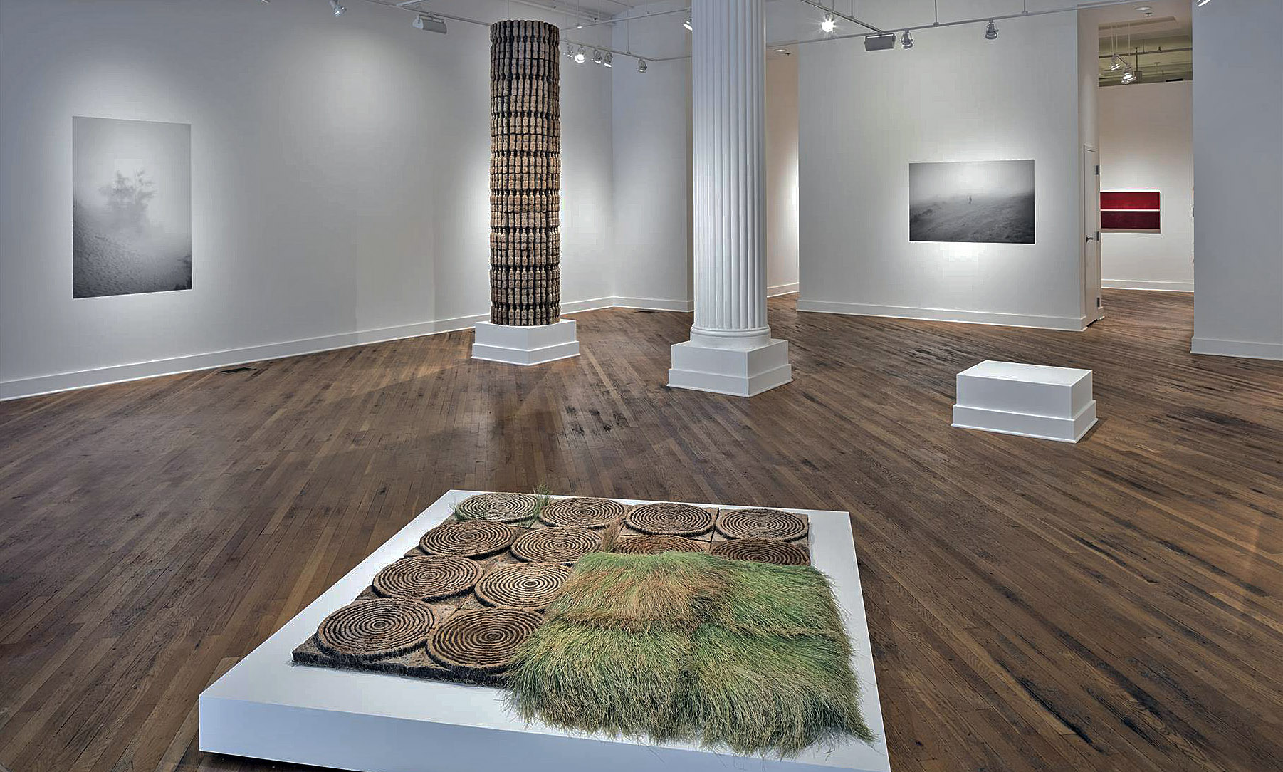
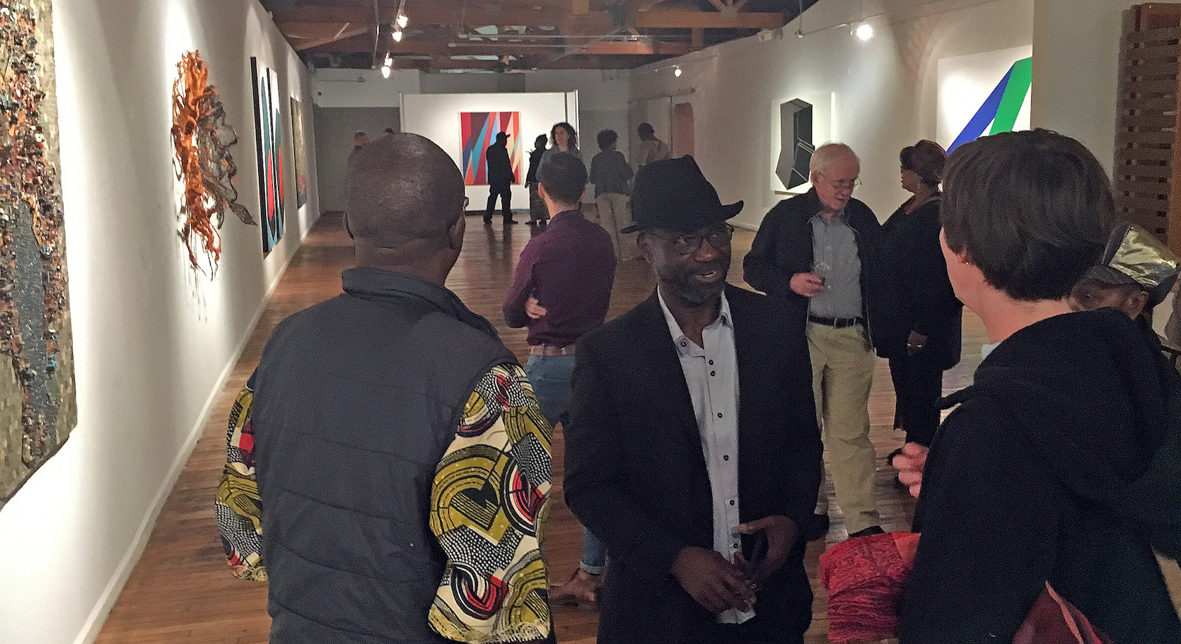
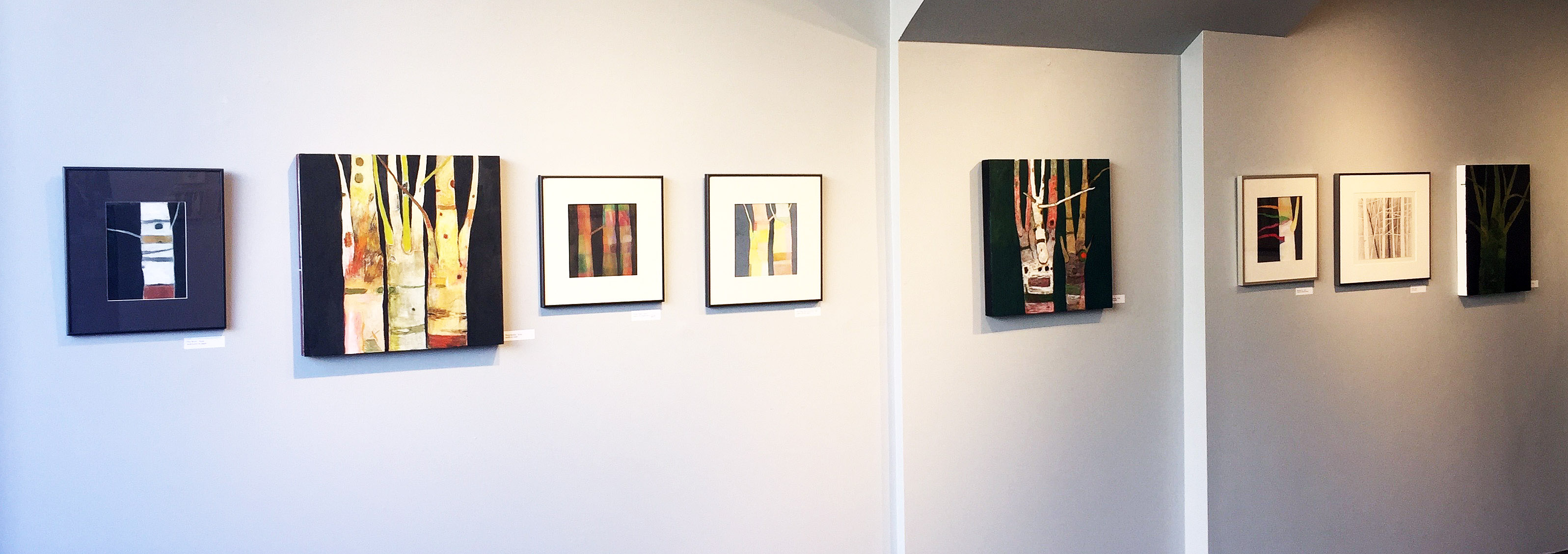
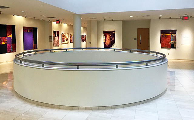
Installation image of front gallery.   All images courtesy of David Klein Gallery 2017

Susan Goethel Campbell’s installation “Faulty Vision” currently showing at the David Klein Gallery has all of the ingredients of the mise-en-scene of a surreal film. Like a Japanese garden it is challengingly eye-opening while meditative. In keeping with Campbell’s engagement with both architectural and “natural” space, “Faulty Vision” is designed as a response to the Beaux-Arts architecture of the Klein Gallery itself. The Grand Entrance, to use Beaux-Arts terminology, of the gallery, entering off of Washington Boulevard, Detroit’s premier Beaux-Art avenue, is activated by Campbell’s large, atmospheric black and white dune-scape photos seamlessly embedded into the walls; her uncanny, actual sized, cast earth and grass column echoes the classical Doric column next to it; magically engineered grassy, target-like images float in the middle of the gallery space; and black and white photos of planet-like orbs float around the space, all suggesting a strange landscape indeed. Each of the objects and images has evolved from the trajectory of recent related, but separate, projects that collectively comprise Campbell’s hybrid artistic practice. It is an elegant albeit enigmatic installation to contemplate.

Susan G. Campbell, “Dune No. 2,” 2017, Black and white digital print, 40” x 60”

Trained as a printmaker, it has become a method and process of her practice to see and think in multiple images and variations of those accumulations, as well to consider the processes of the “natural” world (germinating seeds and growth) and of the engineering processes of industrial manufacturing itself that compete with nature. For years now Campbell herself has become a kind of research and development factory, experimenting with organic materials such as seeds, plants, leaves, and even more ephemeral conditions like light, night sky and air itself. The overarching gesture then of “Faulty Vision” is to, it seems, if not challenge, then assay and respond to the symbolic permanence of that Beaux-Arts designed gallery space. Early in the twentieth century, Detroit and most American cities adopted a pared down version of Classical Greek and Roman architectural models, that have historically symbolized the enduring strength and permanence of European culture.

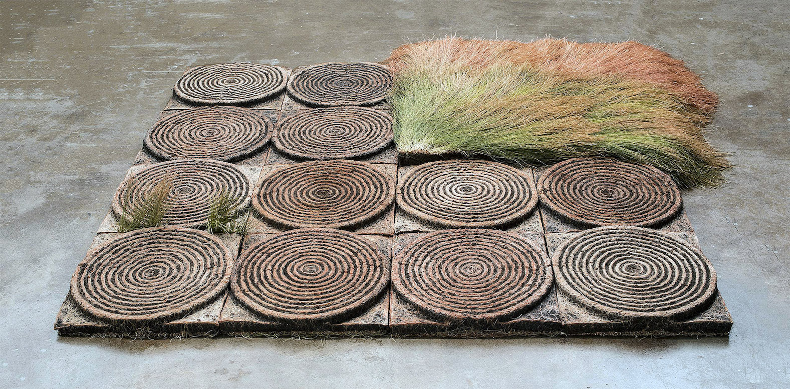
Susan G. Campbell, 4“ Ground no.6 (floor installation), 2017, 51”x51”

When closely examined the stunning earth work sculptures that are installed in the main gallery are all ironically modeled on what were once called “disposable” objects. Campbell’s column is made of hundreds of cast-earth and grass water bottles, grown in molds of the plastic bottles, to form a simulated, fluted Doric column. It is an over-the-top critique of the bombast of classicism and at the same-time beguilingly baroque.  Situated in the gallery’s windows facing Washington Blvd., as if window-displays of consumer goods, are stacks of cast-earth and grass cell phones modeled on the evolving i-Phone, 4, 5, and 6 series. (As in nature phones evolve too). And echoing larger engineered earthworks (such as center pivot watering circles in contemporary agribusiness) as in “Ground No.6 (floor installation),” suggesting also ancient Native American Mound-Builder’s “ruins,” as well as many ancient, rammed earth and mud constructions. All of the materials of Campbell’s sculptures are made of natural, decomposable materials and are serious parodies of the plastic and aluminum models.

At one point in a recent talk at the gallery, Campbell alluded to the earth work of artist James Turrell and fantasized an installation of an enormous field of her own cast-earth concentric rings. “I love multiple images of the same thing…like seeing a shelf of the same product in a grocery store.” Repeating any image, such as the cell phone shape or her concentric rings, is one of the basic tropes of modern art (Warhol) and architecture (Mies van der Rohe) and belongs in any discussion of printmaking as well as mechanical reproduction. Repetition seems to insure coherence and a sense of consistency and security, versus the chaos and uncertainty of the of fickleness of nature. Repetition also is the beginning of making a pattern that creates structure and strength.

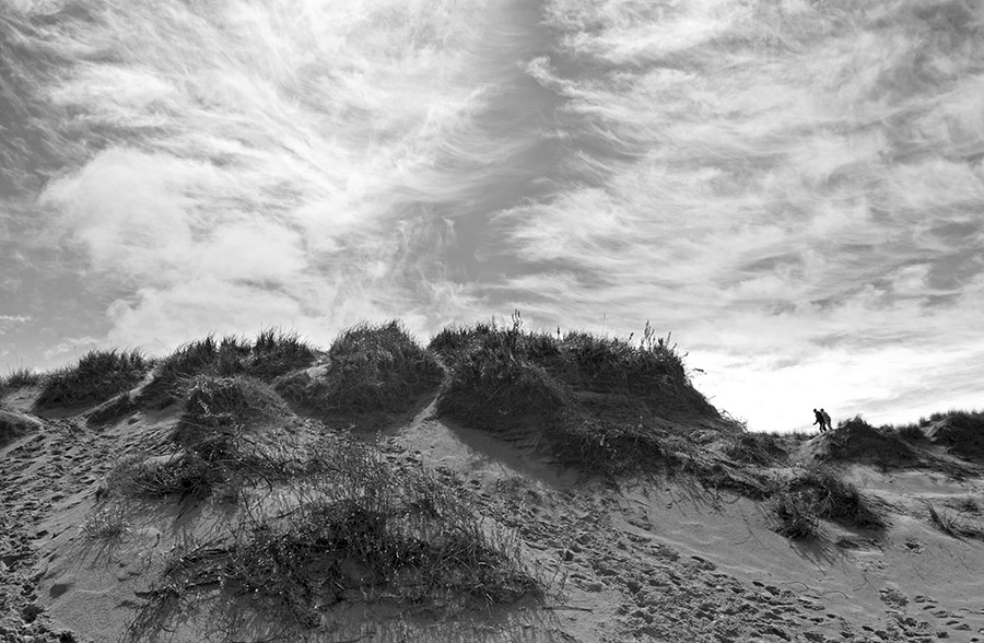
Susan G. Campbell, “Dune No.1,” 2017, Black and white digital print, 40”x62”

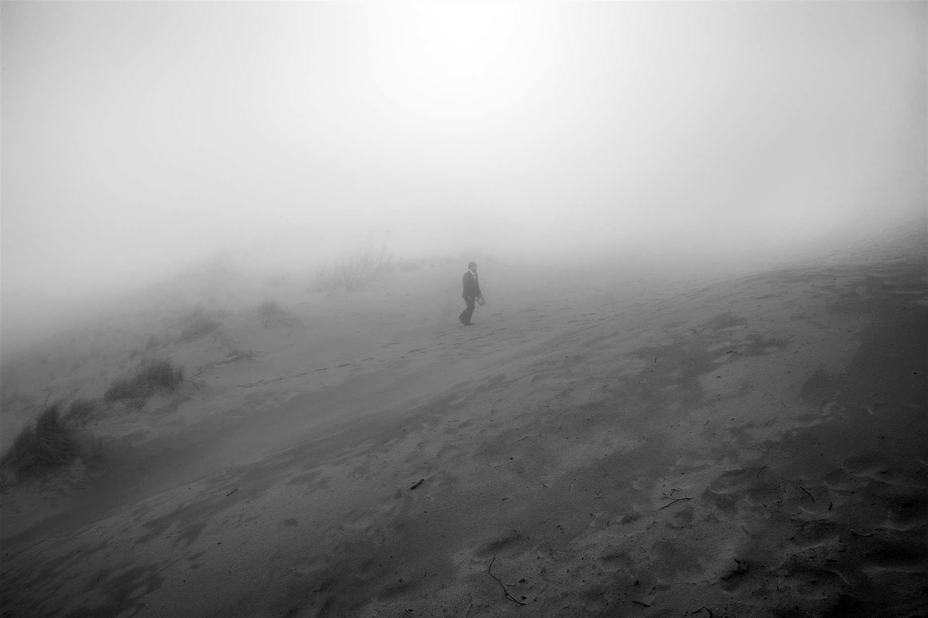
In the smaller rear gallery, there is a large B&W photo of a sand dune with two human figures seeming to lean into a struggled walk across the horizon. In the grand scheme of things, of the world around them, with enormous emotional sky overhead and menacing mounds of sand dune and dune grass underfoot, they seem remarkably inconsequential and existentially without destination. In a sense this image is a key to the whole exhibition in projecting a heroic, man against nature, Romantically Sublime, vision, in contrast to the constructed space of the gallery. While this photographed landscape captures the same organic materials as her engineered works—earth and grass, such as in Ground No.6– it is chaotic and foreboding, the exact opposite of Campbell’s built organic world. Three other dune photos, with haunting fog and solitary figures, also suggest a counter to the controlled order of Campbell’s engineered pieces and create a narrative tension to the whole exhibition: nature versus the built world.

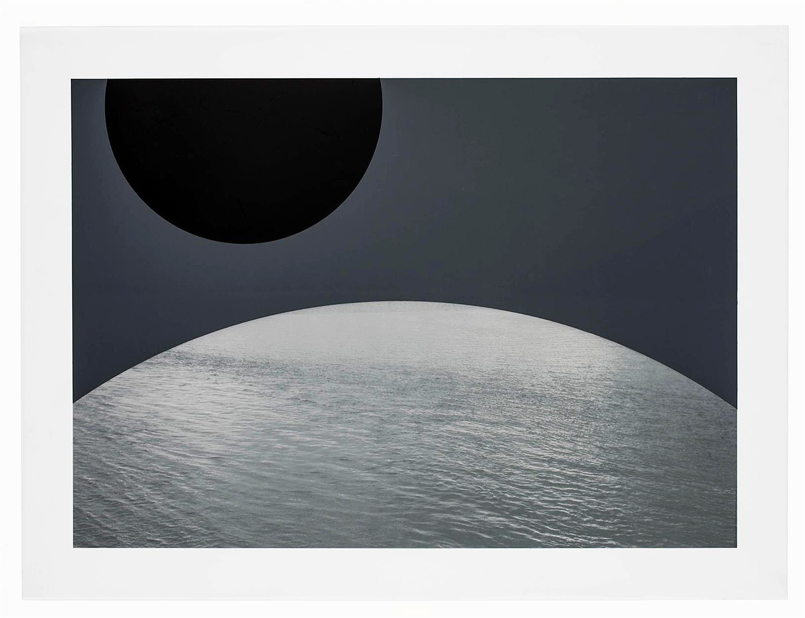
Susan G. Campbell, “Water Planet No. 5,” 2017, Digital print on polyester, spray paint 22 3/4 x 30 5/8″

A third group of images triangulate Campbell’s vision and offer a surreal contrast to the architectural and natural conditions of landscape or environment that determine the rest of Campbell’s projects. The “Water Planets” are a series of images of planet-like orbs pictured as composed of water, floating in a hauntingly empty space. “Water Planet No.5” has two truncated orbs, one eclipsed in shadow and one of water, situated in a matte gray ethereal space. Each “planet” exists in ultimate isolation and, one imagines, can virtually never touch another or conjoin with the other. The “Water Planets” are an uncanny and stunning invention and throw all of “Faulty Vision” into another realm of thought and are superior evidence of Campbell’s considered world.

In “Faulty Vision,” Campbell is responding to an architectural space with its own specific, highly evolved Classical ideology. The David Klein Gallery is not simply white walls upon which to hang her work. The Beaux-Arts history, of which the Klein gallery is a part, is virtually the result of the fantasy of authority and permanence that is western culture. It is the result of a weird evolution and Campbell’s fragile, water bottle, grass and dirt column, circles and i-Phones are a remarkable response to that history. There is an umbrella of ambiguity that protects the complicated equation of “Faulty Vision,” that allows for many readings and wonderings, and Campbell plays on that.

Susan Goethel Campbell: Faulty Vision, David Klein Gallery  Through December 16, 2017

Abstract Minded: Works by Six Contemporary African Artists

Curated by Osi Audu at the N’Namdi Center for Contemporary Art

Installation Image, all images courtesy of the N’Namdi Gallery

Curated by Nigerian born artist Osi Audu, “Abstract Minded: Works by Six Contemporary African Artists,” at the N’Namdi Center, is an exhibition that surveys a confounding issue in the history of modern art, which is the lineage of the use abstraction in contemporary African art. For most people, their first association with African Art is ethnographic and stereotypical otherness, but also the exotic richness, of “primitive African iconography.” Thanks to the Detroit Institute of Art’s great African collection, many of us have grown up with that legacy. But now it is truly refreshing to get a glimpse of internationally known contemporary African artists in N’Namdi’s iconic space.

Serge Alain Nitegeka, “Found Mass 1,” Paint of wood, 74 7/8”x43 3/8”, 2017


Each of the five artists represented in Audu’s selection employs abstraction in a unique and revelational way, showing the effect of over thirty years of economic globalization in general and on art practices in particular. Serge Alain Nitegeka is a Burundi-born artist living and making art in Johannesburg, South Africa. While there are only two of his paintings in the exhibition, Nitegeka’s work participates in a dialogue with the dynamics of geometric abstract shapes and, in his drama of the manipulation of tilted planes, of geometric, colored shapes engaged in a Constructivist tradition. We can go back to the beginning of the century to the Russian Supremacists and El Lissitsky to find the origins of this work. Much of Nitegeka’s inspiration, the gallery guide explains, comes from a fascination with the built infrastructure of Johannesburg itself, the highways and buildings and basic structure of its urban landscape, in other words, contemporary Africa. He has achieved an international reputation for his large-scale installations.

Elias Sime, “Tightrope Contrast,” Reclaimed electronic wires on panel, 73”x95,” 2017

Equally renowned is the work of Ethiopian artist Elias Sime, whose work echoes the bricolage strategies of many Detroit artists. In pieces composed of reclaimed electronic components — hundreds of cell phones, computer mother-boards, miles of color-coded wires — Simes constructs, with obsessive mastery, complex images of delicate line and color that are metaphorical in thinking about the interconnectivity and dependency of all of our lives on a global scale. They are also quite simply sublime in effect. From his “Tightrope” series, “Tightrope Contrast” is magical. Each of the eighty 8”x12” panels of which it is composed can be read as independent, abstract cartoon landscapes or topographical maps, suggesting an epic tapestry of tangled narratives.

From the same series, “Tightrope: Mobile2,” fiendishly composed of thousands of discarded cell phones, is a giddying delight when one thinks about the millions of voices and words that occurred with these phones and that the sculptural relief represents. It is a triumph in recycling, as well a majestic work of art!

For one gnarly reason, Osi Audu, the curator of the “Abstract Minded,” and Elias Sime have the most amount of work in the exhibition and that reason is the cost of insuring the works of art. Quite simply it is outrageously expensive to bring in and insure many high-profile artists’ works. Nevertheless, and thankfully, Audu and Sime are well represented with four works each.

Osi Audu, Self-Portrait, Yoruba Head, Graphite & Pastel, on paper, mounted on canvas, 2017

Sime and Nitegeka have focused on the material culture of contemporary Africa — buildings and highways, the technology of cell phones and circuit boards — translating these modern materials into geometric forms in the universal language of abstraction. Osi Audu, on the other hand, in a complex negotiation of the ethnographic history of the Yoruba philosophy, has turned the history of African cosmology back on itself to create conceptual self-portraits. Proceeding from the Yoruba belief in the architecture of the head as a model of the inner and outer head, of the spiritual and physical, Audu has explored African identity through its art. Employing the Ogoni, Benin, and Etsako peoples’ tribal masks, he has used that process of mind, the analytical process of seeing a form called abstraction, to invent alluring new shapes that he calls, without irony, “self-portraits.” In a sense, the process seems to negate the ethnographic reality of African culture on behalf of the currency of the global language of abstraction. However, the forms that have emerged become, in and of themselves, identities. The “Self-Portraits” become logos of the real. Audu’s strategy only succeeds because of their fundamental success as images; as enigmatic shapes, they carry a mysterious presence that is equal to that of the tribal masks themselves. “Self-Portrait: Benin Head,” composed of reflective graphite and light-absorbing black pastel, while carving a unique geometric shape, with a sense of inside and outside, of African spiritual interiority and physical exteriority, diagrams a presence that is complex and elegantly composed.

Nnenna Okore, “Threads of Time,” Cheesecloth, dye, wire, acrylic, 54”x54”x8”, 2017 of Time” Cheesecloth, dye, wire and acrylic 54″ x 54″ x 8″ 2017

Nigerian artist Nnenna Okore’s remarkable mixed media wall sculptures are composed of found and repurposed materials — threads, buttons, wire — and achieve their presence by mirroring the vital growing processes and unique forms of nature. The delicate webbing in “Threads of Time” inscribes, in the processes of tribal arts, her working hands in the abstract expressionistic process of the image. The braiding, matting, twisting, and weaving — akin to abstract painting’s vigorous expressionistic gestures — all echo tribal hair-style techniques and textile fabrication but simultaneously locate the object in both a cosmopolitan and a tribal landscape.

Odili Donald Odita, “Metropolitan,” Acrylic on canvas, 68”x 48,” 2017

Like Nitegeka’s Constructivist-inspired paintings, we would like to see more than one work by Nigerian-born Odili Donald Odita, but one senses in his painting “Metropolitan” the celebratory vision of interlocking splinters of light and color that are metaphors for the human imagination. And like Nitegeka, he has painted huge architectural installations that, while referencing artists such as Color Field painter Kenneth Noland, are original and awe-inspiring.

Osi Audu’s “Abstract Minded” exhibition places the idea of abstraction not in the tradition of Western art history, but rather in the history of ideas and philosophy. The process of abstraction that he characterizes in contemporary African art is a mode of thought that is fundamental to a worldview, rather than an art history term, and in a very real sense posits Detroit as a site of this dialogue.

Abstract Minded: Works by Six Contemporary African Artists

Curated by Osi Audu at the N’Namdi Center for Contemporary Art

N’Namdi Center for Contemporary Art    Through January 8, 2018


Joyce Koskenmaki @ CCC Arts Center’s Kerredge Gallery

Configurations, New Work by Joyce Koskenmaki at the Copper Country Community Arts Center’s Kerredge Gallery

Configurations, CCC Art Center’s Kerredge Gallery, Installation image photo of artist and director by Eric Munch. Photos of art courtesy of artist.

For many years, my wife and I have kept an eye out for the art work of Joyce Koskenmaki. Every time we pass through the town of Hancock Michigan on our return to our home in Michigan’s Keweenaw Peninsula we stop at the Copper Country Community Arts Center hoping to see, among other artists, a new Koskenmaki drawing or painting. Her remarkable palette, finely constructed surfaces, eloquent drawing and moody allegorical sensibility never fail to translate the northern landscape into unique lyrical compositions.

During our last trip, we had the opportunity for a brief visit to her studio in an old Hancock elementary school building, as she was preparing her paintings for her exhibition, “Configurations, New Work by Joyce Koskenmaki,” at the Community Arts Center. Serenaded by what sounded like Sibelius sonata, roughly, but touchingly, performed somewhere in a distant classroom by music students, we found our way to her studio.

A little hindered by a recent fall and surgery she introduced us to her studio and new work and as we explored she told me a little about herself and the new work. After studying painting at the University of Iowa and a full career teaching art in a number colleges, including eight years at Kenyon College, she returned to her home in the Keweenaw to settle and make art. Being of Finnish descent Koskenmaki might find a particularly homey familiarity in the Finnish culture there in Hancock–many streets have Finnish names, Finlandia University is located there and even the Kaleva Café is named after the visionary Finnish Epic poem, The Kalevala—and the atmosphere of this northern town smacks of typical towns in Finland. Most importantly the enchanting landscape of the Keweenaw, albeit much of the forests were decimated by a hundred years of copper mining, inspire Koskenmaki’s dialogue with nature.

She explained that at the University of Iowa she worked in a mainly abstract expressionist style and her encyclopedic website has many extraordinary examples of her abstract sensibility as well as an array of figurative and abstract oil paintings, water colors and pencil drawings.

Joyce Koskenmaki, “Two Old Birches,” acrylic on panel, 20”X20”

Koskenmaki knows trees. Unlike most landscape artists who struggle with the seeming chaos of the forest, Koskenmaki knows the tree through the forest. She knows how to see the bush, its unique moments and its articulate statements, like only a northern forest woman can.

She clearly listens to them and knows their idiosyncrasies. She knows their moods and the relationship between them and in characterizing them she uses all of her talents. Her drawing of trees could be said to be anthropomorphic but that would minimize their stature. They are their own beings. Their complexion is composed of amazing tinctures of light and dark from a panoramic cosmetic kit. Her drawing explores with delicate sympathy their articulate lines and are composed of deft touches of the brush and the spaces between them carry a rich theatrical presence.

In the Kalevala, this great oral epic poem of the Finland, nature is an active drama, and its characters—ancient mythic characters, trees, plants, the sky, animals, the sea—play out the drama of the origins of the Finnish people. It is a passionate battle between poets, warriors, and lovers in the northern wilderness. In the past Koskenmaki has illustrated the Kalevala with great understanding and brings that vision to her characterization of trees in the new work.

Joyce Koskenmaki “Three old red pines,” watercolor, color pencil, casein, “18×24”

In her watercolor of three old red pines the complexion of the bark is saturated in deep reds and orange and the prickly, out-reaching branches explain the edgy, tentative relationships of that world. There is a passage in the Kalevala of dialogue of three pines that she may be illustrating but the watercolor itself does the job of creating an almost Shakespearean stage for them.

Joyce Koskenmaki, Joyce Koskenmaki, Two old birches, acrylic on panel, 20”x20” “The Heart,” pencil and color pencil, 8”x8”

Koskenmaki’s drawings of the birch tree perhaps more than the watercolors show an anthropomorphic indulgence in the representation of their bark being sutured together like so many parts of the human body. Her own and her husband’s recent surgeries have perhaps sensitized her to this perception of the fragility of nature itself. In fact, in many of the birch tree renderings there is a direct depiction of the interwoven twigs and branch system that correlates to the architecture of the human heart. In all of her work there is an omnipresent sense of her own being, her dramatic hand, in the making of her work.

There’s an active art scene in the Michigan’s Keweenaw Peninsula area with many interesting painters especially. The nearby town of Calumet has two galleries including former Detroiter Tom Rudd’s Galerie Boheme which shows Rudd’s smart sculptural work and his wife, Margo McCafferty’s fine architectural landscapes. In the past the Copper Country Community Center has shown many Detroit artists including “Driven: Motor City Art,” (2007), an exhibit curated by Rick Vian and Sue Carman Vian which included an amazing selection of 21 Detroit artists.

Joyce Koskenmaki and Kerredge Gallery Director Cynthia Cote


“Configurations: New Work by Joyce Koskenmaki” continues at the Kerredge Gallery through November 4, 2017.


Sandwich Project @ Art Gallery of Windsor

Installation Image, Sandwich Project, image courtesy Cynthia Greig 2017

“The Sandwich Project” at the Art Gallery of Windsor centers around famed American artist Martha Rosler’s 1974 video, “Semiotics of the Kitchen,” a visionary send-up of the entrapment of women in the machinery of the kitchen. It features a very young Rosler parodying more famed cooking show host Julia Childs.

After more than forty years, and our global digital brain transplant, the six-minute B&W video remains mesmerizing both intellectually and as a performance. With deadpan facial and bodily gestures, Rosler punctuates an alphabet of the accouterments of cooking — Apron, Bowl, Chopper, Dish, Egg Beater — objects that traditionally have signified women’s domestic identity, but become as sinister as the crippling machinery of the factory.

As Charlie Chaplin’s Little Tramp had been pushed over-the-edge by the machine of the factory in his 1936 film Modern Times, thus defining the generation of pre-union, factory workers, Rosler’s Julia Childs dramatizes the enslavement of women in the signifying machinery of the kitchen.

Rosler’s video, however, is only a set-up for the rest of the engaging Sandwich Project, which was the brainchild of Windsor’s renowned Iain Baxter&, an early conceptual artist, painter and photographer, and was curated by Art Gallery of Windsor’s Jaclyn Meloche, also an artist, performance artist and writer. Baxter& conceived the Sandwich project as a play on “all things Sandwich,” to quote Katherine Mastin, AGW’s Director,

Sandwich, one of the earliest neighborhoods in Windsor, namesake of England’s once important port, was the origin of the name for the portable lunch, which (after the Fourth Earl of Sandwich) like this exhibition, composes layers of ingredients (often between two slices of bread). The word dredges up all kinds of history both in England and in Windsor, in the underbelly of which lies the War of 1812, a conflict that to some locals seems as though it was between Detroit and Windsor. In fact, Sandwich, Ontario was the site of important 1812 battles.

Iain Baxter&, “Iain Baxter as an open-faced sandwich” 1978

Iain Baxter&, born in England, his own art fraught with visual hi-jinks, was obviously quite cognizant of this back story in conceiving the project, which is ripe with delicious visual puns and ironies.

Likewise it’s the relationship of food to social and political history, popular culture and feminism, that Meloche ran with to create six independent exhibitions, each of which is self-contained, with moments of delightful humor and brilliant art, while at the same time executing an engaging critical perspective on food and culture. A video entitled “Food as Metaphor,” moderated by Meloche, which includes statements and discussion by the artists, punctuates the exhibitions.

Baxter&’s own contribution, entitled “Baxter&Food,” is a collection of more or less still-life photos of nourishment.  “Iain Baxter as an open face sandwich,” c.1978, is typical of his dadaistic play with art history in which he humorously features himself as both the maker and material of art. Equally the dada irony looms huge in “Still Life with Winter Vista,” 1996, which features a glass patio table laden with a cornucopia of tropical fruit and vegetables, with a classic Lake St. Clair winter landscape in the background. Baxter&’s energetic art prompts thinking about big issues like ecology, food and identity, rather than simply art stuff, yet at the same time his work has a subtle aesthetic valence that is hard to categorize. His “The Primaries,” composed of bottles of ketchup, mustard and blue Gatorade that he classifies as “found objects,” is not only a great commentary on our food culture and its ironic spectacality, but a rather wonderful conceptual sculpture.

Iain Baxter&, “The Primaries,” Found Objects, 2017

Of the six exhibits in The Sandwich Project, the one most provocative to the central issue of our food culture is “Food, Feminism and Kitchen Culture.” Introduced by Rosler’s video, the exhibition sets up a discourse on the landscape of the kitchen as an imprisoning construction of which women are the principle inhabitants.

Cynthia Greig, “Representation no. 29 (toaster), chromogenic print, 20 x 24”

If Rosler’s video sees the objects of the kitchen as an almost violent lexicon of possibilities for the construction of women’s identity —Apron/Women, Bowl/Women, Chopper/Women, Dish/Women — Cynthia Greig’s (Detroit’s best kept secret) manipulated photographs become escapes from the reality of the haptic world into a realm of diagrammatic ghosts, from realism to shadows of the real. In reducing photographs of common objects of the kitchen — toaster, milk cartons, coffee cups, French fry carton — to elemental outlines, they become ideas that hold us captive. These graceful, elegant shapes become enigmatic containers that define and thus limit ­— limitations to being, to exuberance, and diagrams that ultimately beckon language to elucidate and emancipate them.

Each of Greig’s diagrammatic images includes a referent to reality. A diagrammed toaster has images of freshly “toasted” bread popping out of it. The outlined milk carton has “spilled milk” next to it. A French fry carton has French “fried potatoes” sticking out of it. Each photograph posits the philosophical dilemma of what contains and what is contained. Pushed to their logical end, these images become a sort of dictatorial grammar of the kitchen.

Anna Frlan, “Kitchen as Factory [Mixing machine, blending machine,toasting machine]”, Steel, 2017

Complementing Greig’s skeletal works are Anna Frlan’s welded steel replicas of kitchen appliances. Actually, as if taking a hint from Greig’s diagrammatic images, Frlan’s are even more cage-like machines — a toaster oven, a blender, a mixer, a stove, a dishwasher. These drawings made of steel, at the same time as they resemble medieval torture devices, might suggest Piranesi’s images of Roman prisons. They are stunning, sinister signifiers of the role of kitchens in defining identity.

Each of the artists in this section of The Sandwich Project makes a stunning contribution to the discourse on Food, Feminism and Kitchen Culture. Marilyn Minter’s painting from her “Food Porn” series and Carly Erber’s crocheted “Salisbury Steak” make wonderfully opposite statements about women and representation of food. Christiane Pflug’s painting “Kitchen Door with Ursula,” 1966, and Annie Pootoogook’s “Tea Drinkers,” 2001, both reflect subtle personal takes on the complex psychology of kitchen life.

Sandy Skoglund, “Body Limits,” 1992

A related, borrowed exhibition, originating at the Akron Art Museum and curated by Theresa Bembnister, “Snack” is a tour de force of a generous selection of diverse representations of food, featuring Pop artists Andy Warhol, James Rosenquist, Claes Oldenburg and other contemporary artists’ takes on the western recreational activity of food and eating. Sandy Skoglund’s “Body Limits” documents a surreal tableau she created parodying a fashion shoot of two figures dressed in bacon.  French photographer Robert Doisneau’s “L’Innocent,” 1949, captures a typical Parisian gentleman’s existential encounter with his dinner in the window of a restaurant.

Robert Doisneau, “L’Innocent,” B& W Photograph, 1949

The Sandwich Project is no less than a blockbuster of an exhibition, a realization that surpasses expectation.  The fourth part, “Lunch,” collects a wonderful assortment of artifacts and images of the great pastime of noonday culture, including a wall full of school kids’ lunch boxes that in themselves are a history of midcentury pop culture, and a selection of early twentieth-century images from The Henry Ford Museum archives of Detroit cafeterias, diners, and hot dog stands.

Frederick Arthur Verner, “Untitled (River Scene, Sunset”), 1891, watercolour over graphite on paper

Two other exhibitions that bookend The Sandwich Project are AGW’s collection of nineteenth-century watercolors of the Sandwich area by artist Frederick Arthur Verner, and “Food and Film,” which features four short films on the production and distribution of food as a go-between in signifying Canadian identity. One of Verner’s watercolors features the Detroit River-front with typically English village-like architecture of early Windsor (Sandwich) in the foreground, replete with fishing boats, and a nascent Detroit industrial landscape on the far shore. During the nineteenth century, the Detroit River was famous for its astonishing fishing, supplying First Nation people and eventually Windsorites and Detroiters with bounteous whitefish and walleye. Verner’s watercolor thus becomes an ironic commentary on the devolution of food production in the area.

The Sandwich Project is a perfect summertime day trip or even two-day trip, and yields an abundance of food-for-thought about the business, culture, and representation of our relationship with food.  For lunch, Sir Cedric’s Fish and Chips is right around the corner from the Art Gallery of Windsor, reminding us of the Canadian predilection for things British. If, however your tastes are more inclined to American fare, there’s Lafayette Coney Island just across the border.

The Sandwich Project Continues through October 1, 2017

 Art Gallery of Windsor,  401 Riverside Drive West, Windsor, Ontario N9A7J1     519-977-0013

Bearing Witness: Carole Harris @ NCRC Rotunda Gallery

Carole Harris, University of Michigan, North Campus Research Center Rotunda Gallery, Installation Image

Talking in layers: walking into the enormous and alien territory of the University of Michigan’s North Campus Research Center to see the exhibition “Bearing Witness,” the quilt works of Detroit artist Carole Harris hanging in the building’s Rotunda Gallery. Dramatically lit, a series of Harris’ dazzlingly colored fiber works punctuate the security-conscious, antiseptic space. It is a research facility that was formerly Pfizer Pharmaceutical (think Revolutionary anti-cholesterol med Lipitor that paid for the amazing building complex) and that, after the economic “downturn” of the ’80s, was purchased by the University of Michigan to now serve primarily as a medical research complex.

Harris’ brilliant, lively and layered textiles offer a shocking, perhaps painful contrast to the generic, monochromatic, modernist architectural surroundings of the NCRC building.  As a child growing up in Detroit, Harris was taught embroidery and stitching by her mother, and, being “height challenged” and quite petite, she learned to make her own clothes so they would fit properly. In high school at Cass Tech she studied music and science before settling on art, and, after graduating from college in 1966, she began an interior design practice that she maintained until recently.

In an ironic twist, her magnificent, globally influenced art looks almost captive in this sequestered, post-industrial landscape. It’s a long distance from Harris’ vibrant life in Detroit to the strange, emptiness of the medical research center.

In a recent talk at Detroit’s Charles H. Wright Museum, Harris talked about her evolution as an artist and about deciding in 1966 to make her first quilt for her upcoming marriage. For a start, she used the simple, standard “pin wheel” pattern, and for “stuffing” used an old blanket: humble materials for a special moment. It’s a tradition for quilters to commemorate a birth or marriage by making one, and it was an auspicious moment for Harris and her husband, the playwright Bill Harris, the beginning of a marriage that has endured for over fifty very creative years.   While maintaining an interior design practice, she kept up her chops as a quilter and, like the jazz musicians she regularly honors in her quilt designs and titles, she played her scales: scissoring, stitching, splicing, editing, and learned her art form to perfection.

Harris’ fiber pieces at the Rotunda Gallery are a retrospective of the last twenty-five years or so of her work and feature what seem to be breakthrough visions for her. After years of using traditional forms, she recently began experimenting with works inspired by such diverse sources as the African Yoruba tribe’s Egungun textiles, Japanese Boro or “patchwork” folk textiles, architectural spaces derived from such American Abstract Expressionists as painter Richard Diebenkorn (especially his “City Scapes” and “Ocean Park” series), her childhood memories, or the storied erosion of historical buildings of the city in which she grew up, all with the astonishingly inventive, constant background soundtrack of black American music. In the process, Harris has quietly become an American master in a medium nurtured and influenced by black rural culture.

Carole Harris, Textile, Straight No Chaser, 60 x 69” 2006

The early work at the Rotunda Gallery reveals her break from traditional quilt patterns and shapes and, like much of the painting of the ’80s and ’90s (by Elizabeth Murray, Kenneth Noland, Frank Stella, et al.), explores ways of sculpting and lifting three dimensions to the flat surface of an abstract painting. “Outside the Lines,” 1994, posits an irregular shape, with a broad swath of negative space, corded fabric and loosely hanging strips, to create a sense of movement suggesting Harris’ homage to a Yoruba Egungun ceremonial dance that celebrates departed elders. Despite the radical break, Harris still uses basic quilt-making components such as individually composed “squares” and elaborate stitching to give texture and amazing painterly pattern to the surface.

Carole Harris, Textile, Way Across Town, Textile, 59 x 70” 2008

There are two straight-up stunning works that employ hard-edged, geometric shapes of vibrant color balanced by coal-black negative space: “Way Across Town,” 2008, and “Straight No Chaser,” 2006, both in homage to Thelonious Monk, and that show Harris to be a daring colorist with both quilts centering a rectangle of electric purple supporting an array of oblique wedges and squares of oranges and reds. Not always a compliment, to be called a colorist sometimes implies that one is artistically not up to snuff, but this is hardly the case, as both of these works feature eye-popping geometric invention, and there’s real graphic genius operating here. With their daring, geometric slashes and exploration of architectural space, they might even reference the agitprop designs of the great Russian constructivists El Lissitsky and Rodchenko, from whom Diebenkorn, one of Harris’ honored influences, certainly learned. Throughout this visual musicality Harris keeps up an overall rhythm with a running stitch, sometimes with curving arabesques, sometimes with an angular geometric backbeat.

Carole Harris, Textile, From Before, 58 x 45 2013

Harris’ quilts from the last couple of years suggest the influence of the Japanese phenomenon of Boro patchwork clothing. Japanese peasants, especially in the 19th century, being economically challenged, would patch their clothing with remnants of old, worn-out garments, creating a remarkably beautiful folk style of dress. Using the running stitch, sashiko, to bind the patches to the old clothing, they would create a decorative pattern. There are six works in “Bearing Witness” that use the Boro technique. “From Before,” 2013, uses a layering of remnants or swatches — one is hand-stained with a radiating pattern– that overall suggests a geographical mapping. The irregularly shaped “Other People’s Memories,’ 2016, layers found remnants of clothing in various colors and patterns and combine machine and hand stitching to create what feels like a fragment of an ancient textile.

Carole Harris, Textile, Other People’s Memories 39 x57” 2016

Likewise, three small seasonal “sketches” — “Spring Ascending,” 2016, “Fall Etude,” 2015, and “Winter Etude” 2015 — combine stained remnants, machine and hand stitching, burnt holes, and hand-stitched florets, to image topographical maps that indeed, in their lyrical beauty, echo Chopin’s Etudes themselves.

The last piece to come out of Harris’ studio just for the exhibition was indeed the title work.

“Bearing Witness” is a tour de force of contemporary image making. It amalgamates not only Harris’s quilt-making magic with the disparate influences of her far-reaching eye, but is a profoundly rich metaphor for the deep struggle of living, of the balancing of life’s experiences, of listening and watching and caring for the world. This sublimely visual layering of color, shape, and line is not only an act of art but — what resonates through in this process of layering the fabric of life by hand— is an act of deep caring. The title “Bearing Witness” is thus not misplaced on Carole Harris’ practice as a whole.

Carole Harris, Bearing Witness, Textiles, 42 x53” 2017

“Bearing Witness” continues at the Rotunda Gallery through August 23

U-M North Campus Research Complex, 2800 Plymouth Road, Building 18, Ann Arbor, MI 48109

Page 4 of 6

Powered by WordPress & Theme by Anders Norén