Critical art reviews of Detroit galleries and museums weekly

Author: Sarah Rose Sharp Page 1 of 6

Writer

Nabil Mousa @ Arab American National Museum

Flag of a Complicated Nation: Nabil Mousa’s Vision of the American Landscape at Arab American National Museum in Dearborn, MI

Image Courtesy of Artist

It is a complicated time in the United States, with polarizing politics pushing questions of what it means to identify as American. In truth, ideas of nationalism in most countries are increasingly complex, due to the up-tempo of immigration and displacement, and the generally more global nature of contemporary times. Flags, as a starkly graphic symbol of national identity, tend to fall short as representational entities for countries full of individuals with radically divergent backgrounds, experiences, and inter-cultural connections.

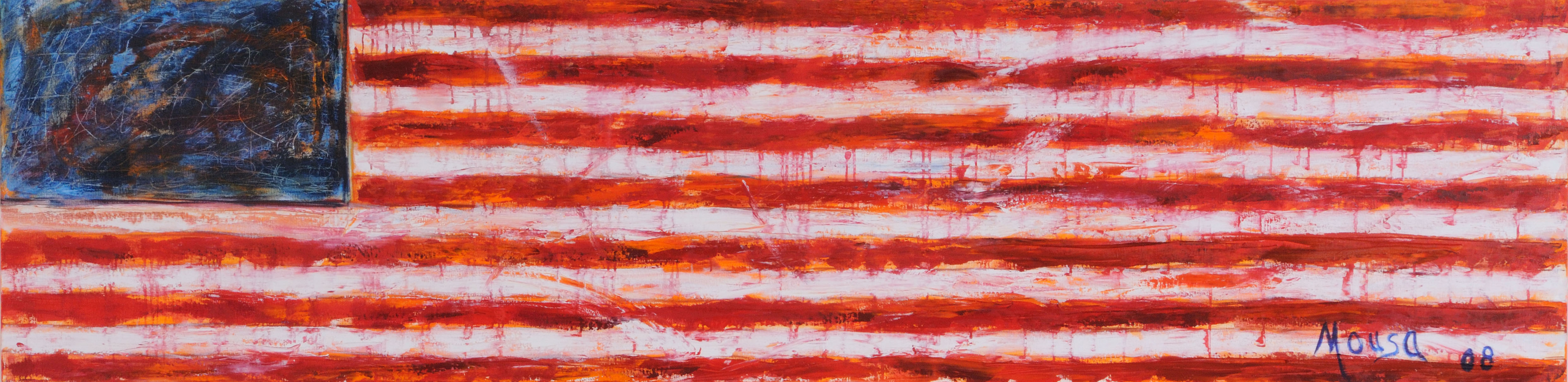
Nabil Mousa, American Landscape #38, Mixed Media on board, 24 x 96″, 2008

Perhaps this is why Nabil Mousa’s, American Landscape—a series that includes some 40 works produced by the artist between 2008 and 2012—feels so timely and resonant. Nine of these works are on display at the Arab American National Museum, and most of them incorporate the American flag, as a literal or symbolic material. The series is a way for the artist to reconcile his own questions of identity, both as a Syrian immigrant and an openly homosexual man. Mousa came to the States with his family in 1976, at the age of 12, and since coming out as gay, has been estranged by his family, according to their stringently Christian beliefs. It stands to reason that the flags he presents are emotional, messy affairs, with blurring lines, dramatic brushstrokes, mottled palette, and populated by little icons representing anonymous men and women of the LBGTQ+ community.

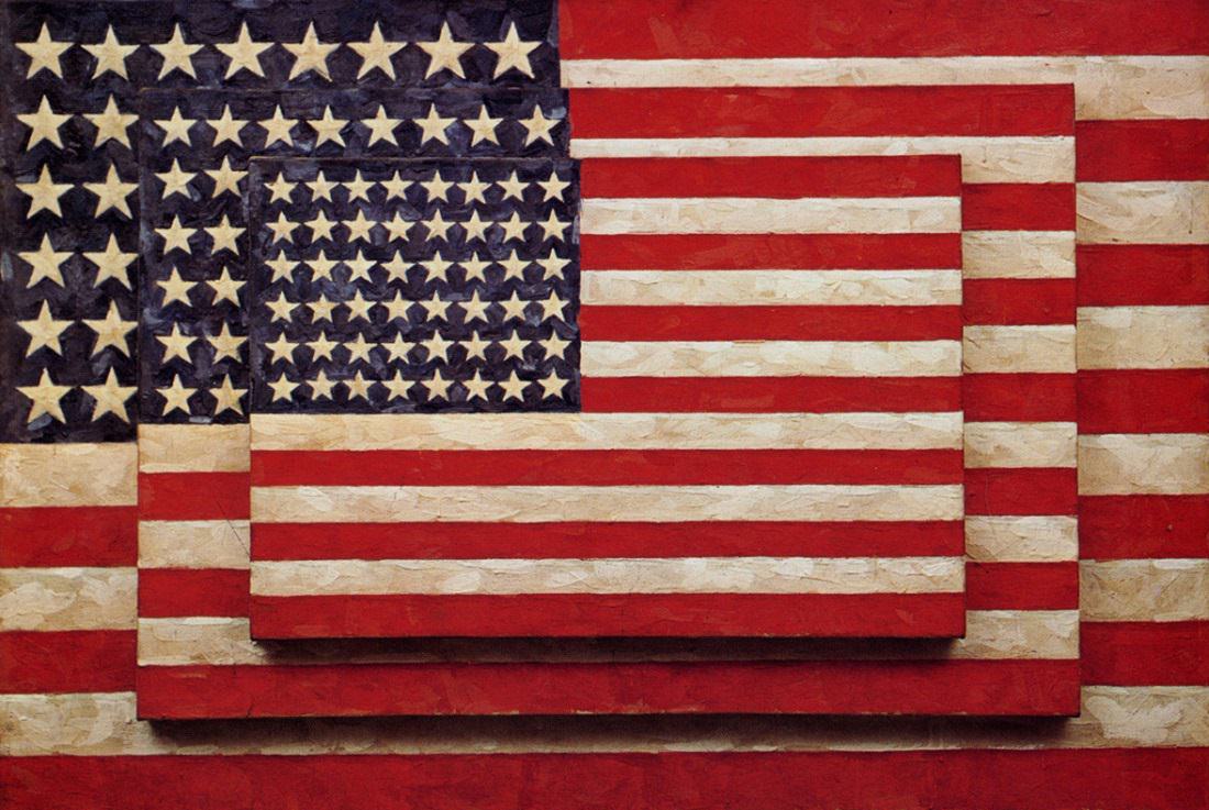
Jasper Johns, Three Flags, 77 x 155cm, Pigment & Warm wax, Image courtesy of the Whitney Museum

Flags in general, and the United States flag in particular, have a long history of use in contemporary are for their symbolic value. Jasper Johns first began to iterate the symbol with the encaustic painting Flag (1954-55), following his discharge from the United States Army, and returned to the flag as subject matter numerous times over the course of his career. Political artist Dread Scott first presented his controversial work, What is the Proper Way to Display a U.S. Flag? In 1989, prompting the passing of the “Flag Protection Act” in Congress. In protest, Dread Scott and two other artists burned a U.S. flag on the steps of the Capitol Building, which resulted in a federal court case that made it all the way to the Supreme Court in 1990. Artist David Hammons famously created the African American Flag, which is in the permanent collection at the Museum of Modern Art. Flags provide pre-loaded symbolism, and evoke strong feelings in those that choose to identify with them as a form of national identity, thus making them appealing to artists who question where they may fit in with such broad social representations.

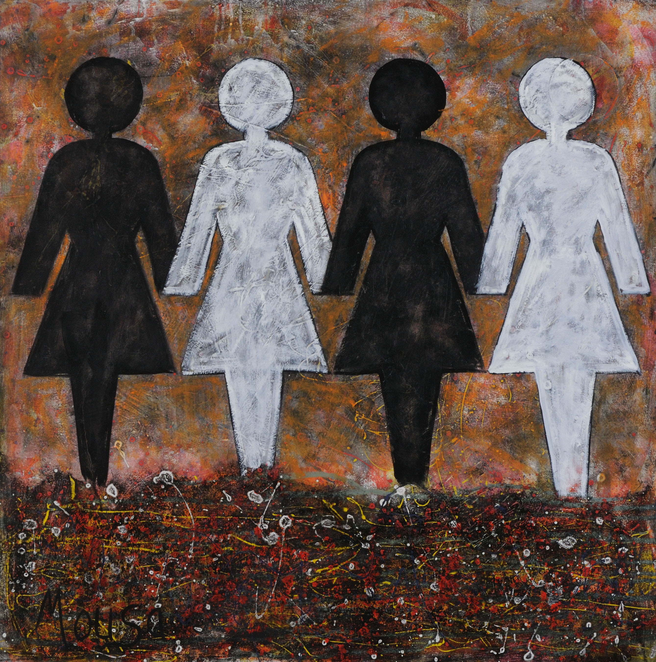
Nabil Mousa, American Landscape, # 34, Mixed Media on oil board, 48 x 48″, 2009

As a member of (at least) two populations that are often vilified, singled out, or marginalized, Mousa has a great deal of personal experience in alienated nationalism to work through in his paintings, yet with American Landscape, he has chosen to present these themes using some of the most universal symbols available—aside from the flag, the majority of figures in Mousa’s landscapes are the male/female icons designating gender on public restroom doors. In Mousa’s context, these figures appear exclusively in same-sex couplings or groups; four women holding hands across an apocalyptic and bleak multi-media landscape in American Landscape #34 (2009), or dozens of men holding hands in rows that fill out the stripes of a 12-foot-wide American Landscape #1 (2009), which dominates the entire entry wall of the gallery, and, as the largest work, serves as the focal point of the exhibition. The figures seem to blend with flag behind them, suggesting their invisibility, and in many of Mousa’s works, the flags themselves smear and drip, or even fragment—as in the case of American Landscape #19 (2009), which incorporates cut-up pieces of an actual U.S. flag in the foreground, obscuring portions of the large-scale male figures in the painting, including the place where they are (presumably) holding hands.

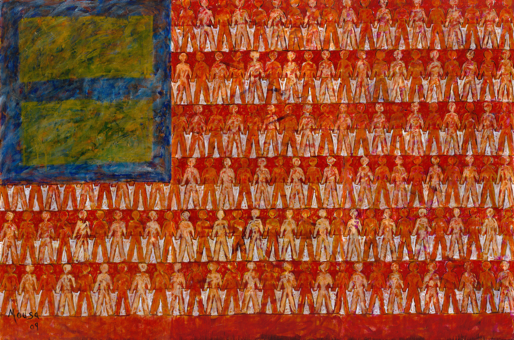
Nabil Mousa, American Landscape #1, Oil on Board, 90 x 144″, 2009

In some ways, Mousa’s work at AANM might be trading in the bluntest symbolism, but the emotive nature of his brushstrokes and the frenetic energy of such bold and colorful works in a relatively small gallery space make the work personal and the exhibition space feel extremely dynamic. Perhaps this is a show that seeks to connect with those who feel excluded by the conventional presentation of the flag, which blithely assumes a one-for-all American spirit that is obviously not borne out in issues of policy-making, opportunities, justice, or social equity. With American Landscape, Mousa has complicated the flag, and in doing so, raised a new version, which seeks to include people whose American identities are more complicated than simple red, white, and blue.

Nabil Mousa, American Landscape, #20, Mixed Media on Board, 96 x 72, 2009


Nabil Mousa: American Landscape continues at the Arab American National Museum in Dearborn, Michigan through April 8.

“Evidence of Things Not Seen” @ College for Creative Studies Center Galleries

Installation image & Four Artists: Rashaun Rucker, Sabrina Nelson, Richard Lewis, Mario Moore, 2017

The hardest part about drawing connections between the pieces in Evidence of Things Not Seen—a four-person show featuring works on paper by Richard Lewis, Mario Moore, Sabrina Nelson, and Rashaun Rucker, on display at CCS Center Galleries—is not the lack of bridges between the work, but the abundance thereof.

In simplest and most general terms, this is a drawing show, so all the large, stand alone works, as well nearly two dozen small works in Nelson’s Baldwinning series, are aesthetically unified as hand-drawn, mostly in graphite and charcoal. These are also all artist of color, dealing with issues of Black representation, and presenting Black subjects. Despite each artist having radically different interests, influences, and approaches to the way they look at their subjects, the gallery is utterly harmonious and unified in its aesthetics. Black on black, in shades of grey.

Installation image, CCS Center Galleries, 2017

Then, too, there are an abundance of interpersonal connections underpinning this group of artists. Lewis and Nelson were studio mates during their undergraduate years at College for Creative Studies (where Nelson now teaches), and she and another close fellow, poet Jessica Care Moore, appear as characters in Lewis’s works. Nelson is also mother to Mario Moore, who looked up to Lewis, by way of his connection to Nelson, and followed his exact educational path, starting from Cass Technical High School, through undergraduate studies at CCS, and on to pursue an MFA at Yale. Just as Lewis and Nelson hang together in one generation, Moore and Rucker represent the next (literally, in fact, because Nelson is Moore’s mother), and it is fascinating to see the generational divisions and similarities between the two cohorts.

Richard Lewis, Rent Party, 48 x 60″ Charcoal, Pencil 2016

For example, one might highlight the magical realism present in the works of Lewis and Rucker, who both favor the fantastic and the uncanny, rather than the more directly representational portraiture of Nelson and Moore. Rucker presents a body of work around a single theme: the visual merging of portraits of young black men with the bodies of pigeons. With mug shots as his source material, Rucker is seeking to emphasize the correlation often made between young, urban, black male populations, and undesirable vermin, such as pigeons. Faces morph into beaks, a head springs from the body of a pigeon, or wings and beaked head emerge from the twisted legs of a fallen human body. Likewise, Lewis’s subjects occupy a time-compressed and surrealistic world, where Sabrina attends a rent party with James Baldwin and Frida Kahlo, or drives home at night with an nkisi figure in the passenger seat. These nkisi are a traditional African spiritual sculpture form, often covered with individually driven nails, and seen as protector spirits, both in terms of their cultural origins, and in terms of Lewis’s repurposing of them as subjects.

Mario Moore, Lucia, 2015, Graphite on Paper

Or perhaps one could draw another parallel between Nelson and Lewis’s tendency to make cultural references, while Moore and Rucker are making portraits from everyday figures. In addition to using his studio-mate as muse, Lewis’s tableaux are recast and reconstructed scenes from film noir features, such as Shipwrecked and Saints and Sinners. Nelson, of course, takes James Baldwin as her muse, and the corner of the gallery devoted to her work is papered with nearly two dozen examples of individual portraits she has drawn of the writer, in addition to filling four complete sketchbooks with nothing but drawn and stitched James Baldwin portraits.

Sabrina Nelson, Baldwinning, 2016-17, Sketchbook drawings, Glclee prints, micon ink, gold ink, silver ink, thread, and video

“One of the reasons I started drawing James Baldwin is because Jessica Care Moore invited me to the James Baldwin conference in Paris,” said Nelson, during a tour of the gallery. “She was doing a plenary there with three other artists, called “What Would James Baldwin Do?” It was about him being an artist, and as an artist, what is your responsibility in the world? What do you say, and what is your weaponry? For her it is her poems, and for me it is my hands and my drawing and my painting.”

Sabrina Nelson poses with her many images of James Baldwin.

One sees the love of reading and writers transferred from mother to son, as all of Moore’s hyper-realistic, large-scale portraits feature women in his life, taking a break from reading to look at the viewer. Despite Moore’s extremely straightforward and beautiful renderings of women—many of whom were classmates at Yale, as well as his girlfriend—contain their own sly cultural references, in the telling detail of the book they are reading. But more arresting in these works is the ease and comfort with which these women seem to meet the gaze of the artist and the viewer on entirely their own terms. Unlike Rucker’s pigeon-hybrids, who seem to search the viewer for evidence that they can be seen at all, Moore’s women let you know that they are not to be objectified.

Richard Lewis, They Drive by Night, 26 x 40″ Conte crayon on Rives BFK

One could weave connections through these powerful works for days—the energy fairly radiates between them—but there’s only just time to catch this show before it closes, so I’ll end with an admonition to take some time with it before the December 16th closing. One can hardly build a case for the connections within Evidence of Things Not Seen, after all, if you don’t go see it for yourself.

Evidence of Things Not Seen continues at CCS Center Galleries through December 16.

Keith Haring @ Cranbrook Art Museum

Dark Haring Rises: 30 Years After its Installation, Keith Haring’s “The Detroit Notes” reappears at Cranbrook Art Museum

Keith Haring at Cranbrook Art Museum, 1987 Photograph by Tseng Kwong Chi, 1987 © Muna Tseng Dance Projects, New York Art work: © Keith Haring Foundation, New York.

Keith Haring is internationally known for his ebullient and evocative figure drawings, rising to art world fame in the mid-1980s on a wave of graffiti-influenced NYC street culture. Like many of his contemporaries, Haring was part of an early wave bringing art to market as a prestige commodity, and like many of his fellows, he died at a lamentably young age due to complications connected with AIDS—in Haring’s case, at the age of 31, in 1990.

Keith Haring, Apocalypse (1988), by Keith Haring and William S. Burroughs (installation view)

As part of its Fall program, the Cranbrook Art Museum presents a small suite of works by Haring that bookend his career, Keith Haring: The End of the Line. The centerpiece of the exhibition is a reconstruction of a temporary mural, “The Detroit Notes,” installed at Cranbrook in 1987, bracketed on either side by a gallery of very early and very late work by the artist.

Cranbrook Art Museum Director Andrew Blauvelt poses in the reconstruction of “The Detroit Notes” 1987 mural by Keith Haring

“There was the sort of public persona of Haring, and the kind of drawing that he would put out in public, versus the kind of things that he would do post his AIDS diagnosis,” said Andrew Blauvelt, Director of the Cranbrook Art Museum, by way of introducing a wall of documental photographs taken by Haring’s friend, artist Tseng Kwong Chi, who also died of AIDS in the 1990s. These photographs capture Haring at work adorning New York City subway station advertisements with his signature iconography, and are mounted opposite a rare example of one of the actual billboards. In the piece, Haring’s work is juxtaposed with and ad for Perdue Franks asking, “Should you buy a hot dog from this man?” and demonstrates the artist already in command of the cartoonish and highly abstracted figures that would populate and morph throughout the course of his career.

Also on display is Haring’s thesis project from SVA, a video titled “Painting Myself into a Corner,” wherein the young artist does literally that. “He did a lot of work that was floor-based, [Jackson] Pollack-esque,” said Blauvelt, “and then picked up the kind of iconography that he was known for. That video showed him working in a performative way, and we wanted to pull that out, because he always thought of his practice as performative.“

This aspect of Haring’s work stands in conversation with another of the shows in the Fall program, Maya Stovall’s Liquor Store Theatre Performance Films, which combine cultural anthropology, dance, and performative public spectacle into improvisational encounters between Stovall (and other dancers) and random Detroiters on their way in and out of liquor stores.

Blauvelt and Senior Curator Laura Mott point out details in the Keith Haring mural

“A lot of these historical art figures, like [Jean-Michel] Basquiat and Haring, didn’t quite fit into easy categories, and the same is true of Maya Stovall,” said Blauvelt. In her first solo museum show, Stovall presents a set of existing works, including those that were a part of this year’s Whitney Biennial, as well as a new piece in the series commissioned by Cranbrook. Just like Stovall’s newest video work, Haring’s mural was a commission for the museum, and the exhibition happens to coincide with the 30-year anniversary of the mural’s presentation, which was also accompanied by a lecture.

“I started drawing in the subway in New York City in 1980,” said Haring, during the lecture, which took place on September 25, 1987. “…The situation sort of presented itself almost by accident. …For the first time, it seemed like I had made something that made sense to be in public because it had a kind of communicative power.”

Indeed, while Haring’s style is instantly recognizable, it is perhaps the somewhat blank nature of his figures that make them so accessible and universal. But the Cranbrook murals reveal a new phase in Haring’s works, what Blauvelt characterizes as “dark Haring,” and speculates foreshadows the public revelation of his AIDS diagnosis.

“He’s officially diagnosed in ’88 or ’89 with AIDS,” said Blauvelt. “But I think he understood that he was going to succumb to it, because most of his friend by that time were diagnosed.” Though Haring’s themes were often political and social, the work at the end of his life and career took a turn toward the deeply personal, and the scale reconstruction of “The Detroit Notes”—including a video of Haring executing the project—captures some of this new style.

The original subway advertisement billboard ‘vandalized’ by Haring during his run of subway art in the early 1980s.

Haring worked for two solid days on the mural—which was always understood to be a temporary installation—first laying down washes of orange, yellow, red and green, then circling back to doodle in black paint over the backgrounds. Though definitely expressing a Surrealist bent—dismembered robot-aliens and frightening, mythical demon-beasts—the work is nonetheless some of Haring’s most figurative, giving faces, albeit grotesque and monstrous, in place of the usually blank bobble-heads for which is he is best known. Bodies are rendered with genitalia, and in various states of dismemberment, televisions blare telescoping stacks of figures, a rosary hangs from a disjointed robot spine. The imagery is immersive and disturbing, and the reconstructed hallway closes in on the viewer as did, perhaps, Haring’s unshakable sense that the demons that were claiming so many of his art world brethren were closing in on him, as well.

Those looking for respite are unlikely to find it at the end of the mural hall, where the final gallery presents two late-life collaborations between Haring and notorious beat poet William S. Burroughs—Apocalypse (1988) and The Valley (1989). One is a series of illustrations made by Haring in response to an existing text by Burroughs; the second presents large-scale prints combining Haring’s images with a new work by Burroughs, developed in conversation with Haring after hearing of the artist’s interest in his writing. It is a fine meeting of two souls on the brink of darkness—Burroughs, who had written himself up from darkness (that included “accidentally” shooting his second wife, Joan Vollmer) to flourish as a gentleman junkie, and Keith Haring, who had gone from rising star into meteoric fall, finding himself at last in a corner he couldn’t paint his way out of.

Keith Haring: The End of the Line runs through March 11, 2018 in the Wainger Gallery of the Cranbrook Art Museum.

Domestic Transcendence @ David Klein Gallery

With it’s commercial focus, David Klein Gallery present work that, at times, places a higher value on aesthetics than challenging the dominant paradigm—but a trio of solo exhibits, which opened on Saturday, September 17, 2016 collectively present a playful push and pull around the subject of gender roles and interpersonal relationships.

dk2

Derick Melander, Night Sky, 2016, Folded clothing, wood and steel, 48 x 48 x 6 inches All images Courtesy of Sarah Rose Sharp

Welcoming viewers is a front window display by Derick Melander, working in the typically female-dominated realm of folded laundry. Melander’s meticulous towers and tableaus, rendered in compressed and expertly folded garments, are not only visually pleasing, but carry an intense allure for anyone with OCD aesthetics. Night Sky (2016), on the lefthand side of the gallery’s entryway, goes so far as to depict a Van Gogh-like scene, with the fold lines, punctuated by tight rolls of concentric garments, echoing the swirling brushstrokes of one of the late painter’s most popular works, The Starry Night (1889). Other works present more abstract chroma-towers, that create ombre fades through hundreds of stacked garments, resembling soft core samples or geologic strata.

dk10

Kelly Reemtsen, Presentation, 2016, Oil on panel, 44 x 44 inches

With the gentleman handling the laundry, the gallery’s main room makes way for the ladies of Kelly Reemtsen’s “Over It.” The series is thematically tight, featuring three to five foot oil paintings of women in party dresses, standing on ladders or chairs, and wielding tools. Her subjects are largely generic, depicted from the shoulders, waist, or knees down, wearing lavish skirts and dresses and high heels that evoke a sense of 1950s housewife pageantry. They clutch their tools—sledgehammers, axes, shears, and chainsaws—with calm determination, or trail them coquettishly behind their backs. Already balanced in their frivolous footwear, they seem stable atop footstools and chairs, even kicking back one flirtatious foot off an A-frame ladder in Social Climber (2016). These are not women dressed for the occasion of home demolition or tree removal, and therefore the implication is a little more sinister—as the title would suggest, Reemtsen’s subjects are fed up, and preparing to take some kind of action. This clash of girly accessorizing and a hint of violence is echoed in Reemtsen’s Fuck the System sculptures (Siren Red, Frosted Pink, and Hot Pink, respectively), which feature Oldenburg-scale tubes of lipstick in stainless steel with a dazzling chrome effect, their contents stubbed out onto their pedestals like discarded cigarettes.

dk3

Kelly Reemtsen, installation view

Even the finish of Reemtsen’s paintings warp the edges of gendered labor; the artist manages to administer a thick veneer of stucco to the background of the paintings that would impress the most seasoned contractor. When one considers the language of labor, it is striking to realize that there are gender-coded words for what amounts to the same action—ask a man what “detailing” a car actually means, and he will be forced to admit that it is “cleaning.” The control and appeal that Reemtsen achieves in her identity-neutral portraits mirrors the restraint and artifice that is the daily work of presenting a polished, female-coded facade to the world, and it is heartening to see that women are generally expressing the sentiment that they have had enough of it.

dk7

Kelly Reemtsen, Slammed, 2016, Oil on panel, 60 x 36 inches


All this gender-bending veers into the abstract world of feelings as we progress to the heart of the gallery, where Emmy Bright’s “Why Don’t You Want This?” rounds out the show. Bright presents a collection of silkscreen prints on paper and newsprint, that playfully juxtapose words, sketched out images, and fields of color. These works successfully leverage simple wordplay and open-ended diagrams to create a surprising depth of meaning; Bright is acutely sensitive to the workings of the heart, and manages to spin out a collection that reflects a kind of emotional complexity belied by their visual simplicity.

dk8

Emmy Bright, Tragedies of Desire (Black & White), 2016, Silkscreen on paper (edition of 5 + 2 AP), 25 x 29 inches

Having created this visual lexicon of emotional placeholders, Bright goes a few steps further with the creation of More Stupids: A Tarot. This small edition tarot deck, featuring Bright’s prints as 44 oversized tarot cards with an accompanying book of interpretations, aims to shuffle and deal these fundamental feelings into readable form. Never one to leave her viewer hanging, Bright spent a week following the opening performing scheduled art card tarot readings, where visitors were treated to an emotional forecasting by Bright, or her alter-ego, Dr. Ladybear. The tarot deck collects highlights from Brights “Three Stupids Practice,” a daily process wherein she goes to the studio and makes “three things that are stupid and wrong in some significant way.” As her gallery guide states: “If they are good, they are also right in another significant way.”

dk4

An assistant lays out selections from More Stupids: A Tarot during opening night

In fact, Emmy Bright has it very right, and her sometimes-poignant, sometimes-funny, and exceedingly gentle explorations of emotion provided a beautiful counterpoint to the spirit-draining world outside the gallery walls. If these three artists can take joy in the mundane, draw the line at oppressive categorization, and open their hearts to the possibility of connection, perhaps they can inspire us all to do the same.

David Klein Gallery


Sanford Biggers @ MOCAD

Sanford Biggers Subjective Cosmology opens at MOCAD

sb8

Sandford Biggers, From the Moon Medicin performance, All images Courtesy of Sarah Rose Sharp

The MOCAD kicked off their Fall program this weekend with an opening-night throwdown for Subjective Cosmology by Sanford Biggers on Friday, September 9, followed by an artist talk and walk-through of the exhibition on Saturday, September 10. While most art exhibitions feature an opening celebration, the events unfolding around Subjective Cosmology, including a performance by Biggers’ musical group, Moon Medicin, were integrated with work on display—and a continuation of Biggers’ larger body of work—acting as a kind of charging ceremony, or christening of sorts, for the show.

“I’m not focusing on one particular type of media in this conversation,” said Biggers, during the slide show and lecture portion of his artist talk at MOCAD, “because I consider myself to be a conceptual artist and an inter-media artist.” Indeed, the work within Subjective Cosmology runs the media gamut: kinetic inflatable sculpture in vinyl, multi-layer staged video art and footage collage, live musical performance, found object assemblage, fiber wall mosaic, and even a tiny, delicate origami-style paper horse. There is media-within-media; an object sculpture based on a large-scale industrial spool is displayed in one corner, but also appears in some of the video footage, being rolled around by figures wearing the same feature-obscuring masks donned by the members of Moon Medicin in live performance adjacent to the video collage (and subsequently displayed on a coat rack in the midst of the exhibition). Video clips projected on three walls of the exhibition alternately display process videos of the creation of a recent series of small bronze sculptures, formed by “ballistic sculpting” (aka being augmented by being shot through with bullets).

sb7

Sandord Biggers, From the Moon Medicin performance 2016

Biggers deals almost exclusively in “ethnographic objects,” picked up through his international travels and residencies. Just as he engages with myriad media, Biggers seems to create no boundaries for himself in terms of cultural source material, resulting in a final product that might be considered ethnographic collage. This practice recently drew some fire from critic Taylor Aldridge, with particular focus on a piece titled Laocoön—the original appeared at Art Basel Miami last December, and there is a scaled-up version of the same work currently on display at the MOCAD. The supine figure on display in the piece is instantly recognizable as the titular character of the cartoon show Fat Albert, and his labored posture, made kinetic by a cycle of slight inflation and deflation, signals a dying breath that triggers a host of loaded connotations. Most immediately, one thinks of the show’s creator, Bill Cosby, who has fallen from hallowed status in the wake of rape accusations—but the positioning and the association with breathing cannot help but conflate the figure on display with the victims of lethal and excessive force in a wave of high-profile conflicts with police officers around the country. The leveraging of this loaded imagery has spawned its own kind of art-world fetishization of black bodies—much as the horror of sexual violence against women has become almost banal in its pervasiveness as subject material for wildly popular TV shows like Law & Order: Special Victims Unit, or Criminal Minds.

sb2

Sanford Biggers, Moon Medicin costumes on display; according to Biggers they have now been retired and there will be new costumes at the next performance.

Certainly, Aldridge is entitled to her objections around the context and impulses at work in Laocoön, but it strikes me that the question raised by Biggers’ work is more one of appropriation on a broad level. Perhaps Biggers is trading in trauma associated with recent news events, but he deals equally in trauma associated with the slave trade—as with Lotus, an etched glass piece that mashes up renderings of the cargo hold on an 18th century slave vessel with the traditional Buddhist symbol for purity; as with Blossom, which brings the haunting subtext of the American jazz standard, “Strange Fruit,” to bear on the “Jena Six Incident,” involving an altercation between black and white students in Jena, Louisiana; and in Shuffle, Shake, Shatter, a three-part film/video suite on display at the MOCAD, which explores identity formation while abstractly retracing the North Atlantic Slave Trade route, from Europe to the Americas and finally Africa.

sb11

Sandford Biggers, Video projections (still view) 2016

“I was thinking about appropriation, and what does it mean to use these symbols,” said Biggers in his artist talk, referring specifically to a series of works that involved obscuring and embedding objects in plastic Buddha statues, such as B-Bodhisattava. “I realized…all bets were off. You can put anything you want to in this [clear-cast Buddha].” Cultural appropriation is a sticky subject, particularly when one is in the position to capitalize on the potential suffering or ideas of others, and Biggers work raises questions in terms of who is entitled to claim certain cultural cache—and potentially profit from it—and who is not. The most de facto stance is to draw racial boundaries with respect to certain cultural traditions, but the fact of the matter is, the bulk of Americans are descended from willing or unwilling transplants from other places, and one’s ability to claim any given heritage can be tenuous, depending on who you ask.

sb9

Sanford Biggers, Sleeping Giant (detail view) 2016

On some level, Biggers appears to be skimming the surface of so many different cultures that his work at the MOCAD merges into a kind of living collage—it feels unclear, at times, if the whirl of symbols and signifiers have actual meaning, or if we merely live in a society so densely programmed with media referencing other media that you can create a sense of meaning by the old Mortal Kombat strategy of simply mashing a lot of buttons at once. Moon Medicin kicked off their MOCAD performance with a cover of “Fly Like an Eagle,” wearing cartoonish masks, in front of video clips from Cool World and Who Framed Roger Rabbit—both movies that juxtaposed animated and “real” world imagery. The meta-ness of the moment was perhaps enough to feel as though something was going on, but what, exactly, is left pretty widely open to interpretation.

sb5

Sanford Biggers, Seen, 2016

In fact, Laocoön references a statue, which references a piece of somewhat ambiguous Greek mythology. The eponymous subject of the story committed a transgression—in some versions he drew ire from Athena for attempting to reveal the military gambit of the Trojan Horse, in others he disrespected a temple of Poseidon—and was punished with the death of his sons. That Biggers has chosen to double-down on the presentation of this contentious work (literally tripling the height of the piece in this iteration) underscores a double-bind that is as ambiguous as the variations on the tale: Laocoön was either punished for doing wrong, or for being right. In his grasp-and-mash-up, is Biggers doing wrong? Is he right, and all bets are off, when it comes to cultural appropriation? Does this practice enhance understanding and bridge cultural divide, or does it wedge a dangerous foot in the door for people to perpetuate sensationalist imagery and culture-grabbing for their own gain? When does collage as a form generate richness in meaning, and when does it become mere sensory overload?

When dealing in cultural imagery this heavily loaded, these are the questions every responsible viewer must ask and decide for themselves—and Subjective Cosmology is perhaps more fertile ground than most to meditate upon these thorny considerations. As the title would suggest, what you read in Biggers’ cosmos is entirely up to you.

MOCAD


Page 1 of 6

Powered by WordPress & Theme by Anders Norén