Critical art reviews of Detroit galleries and museums weekly

Month: October 2019

Your Very Own Paradise @ OUAG

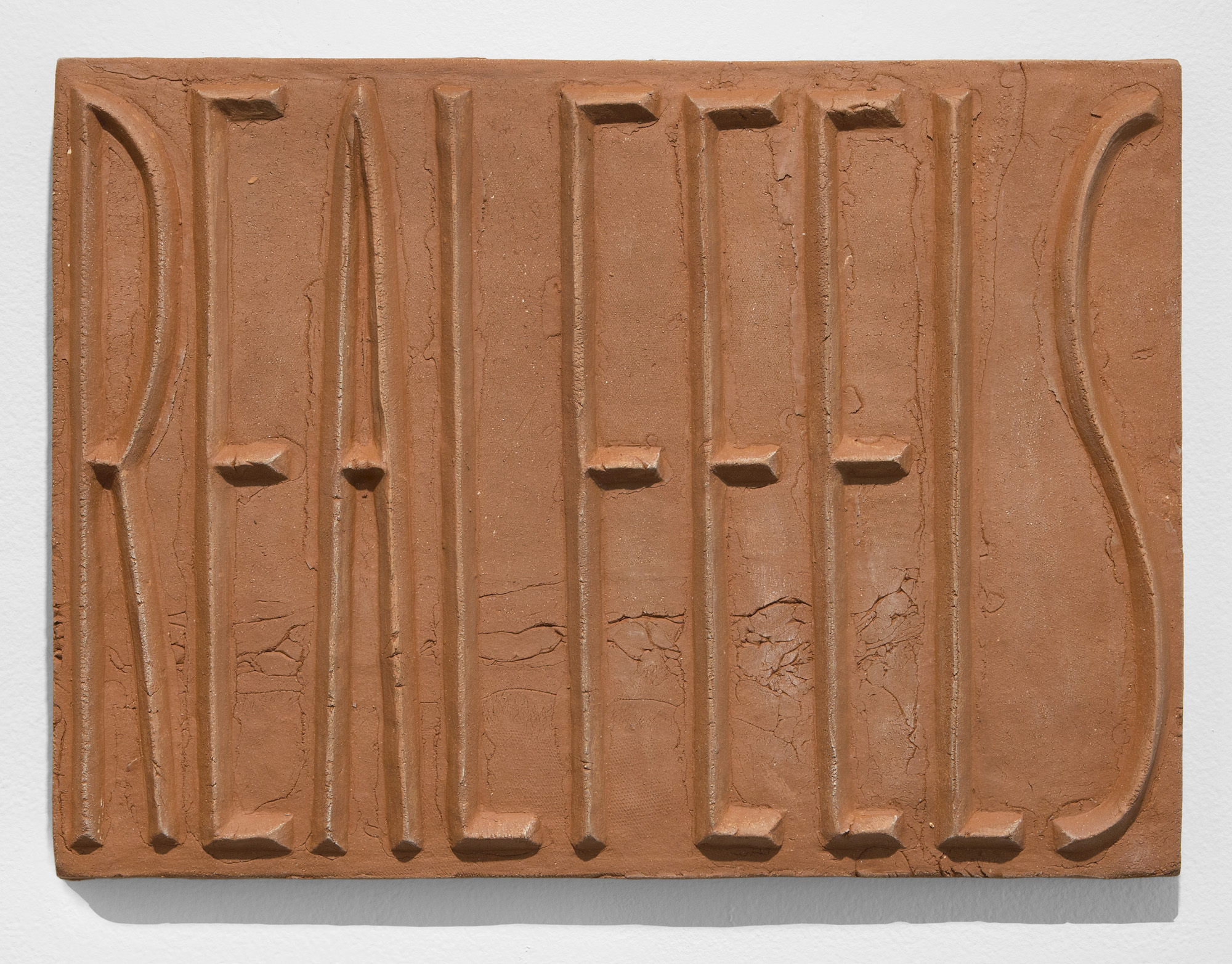
Oakland University Art Gallery presents Thirteen Artists Work

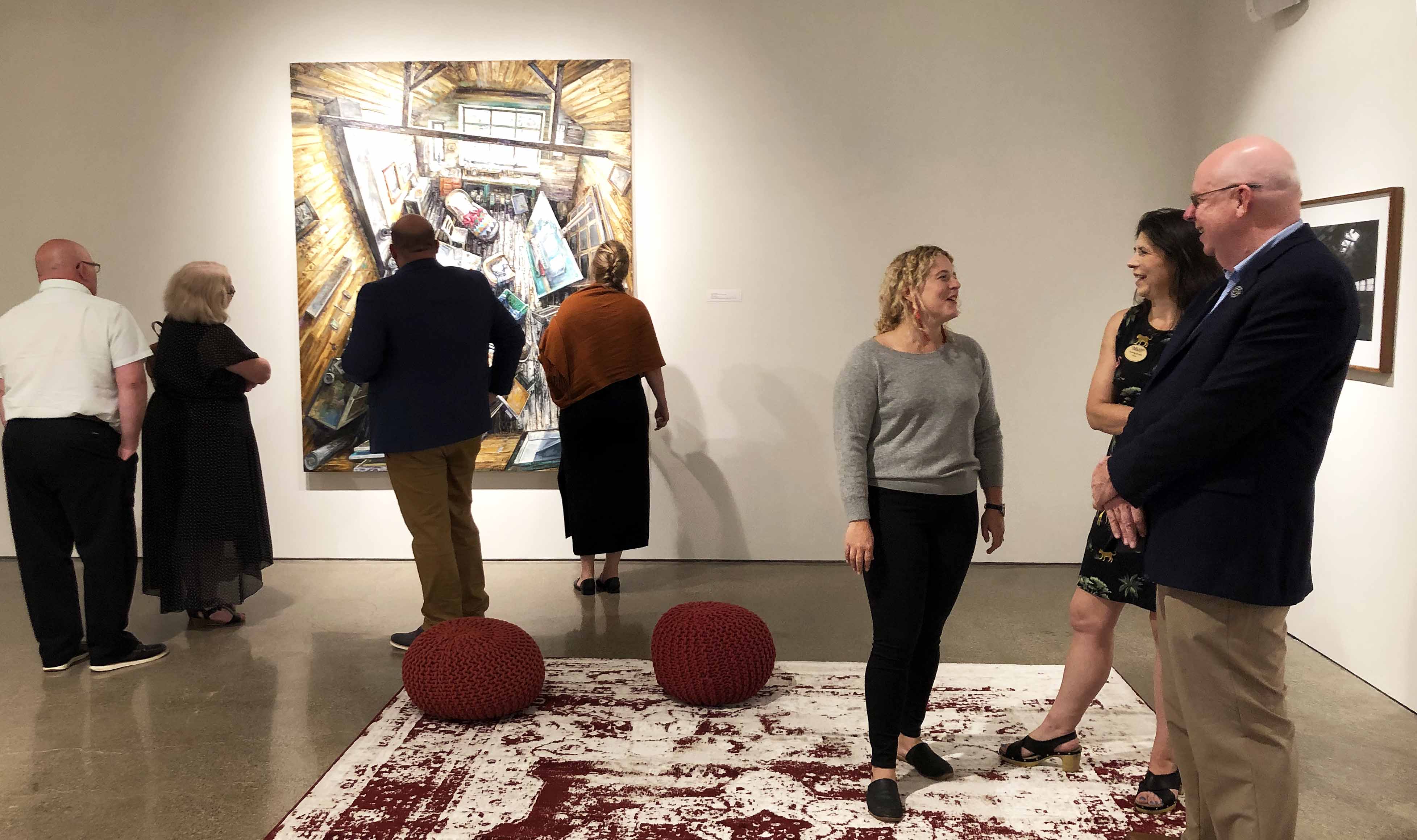
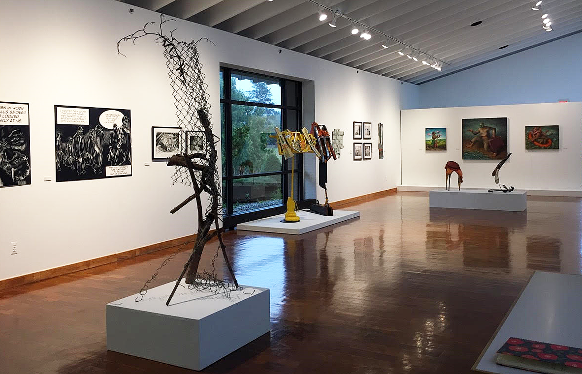
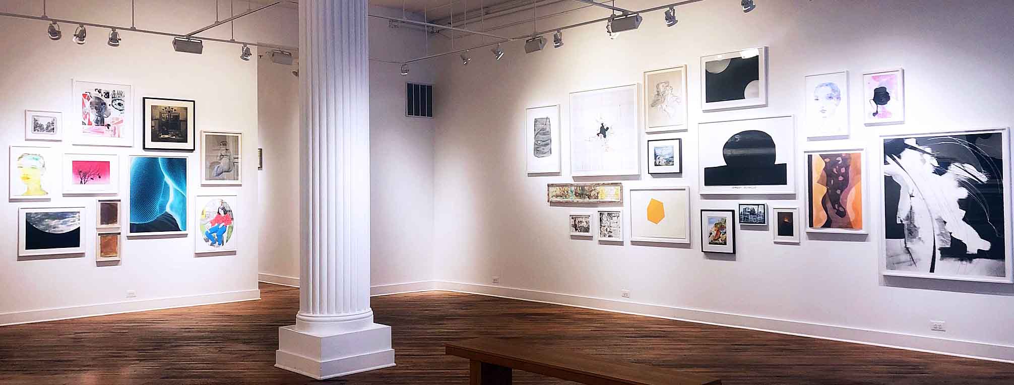
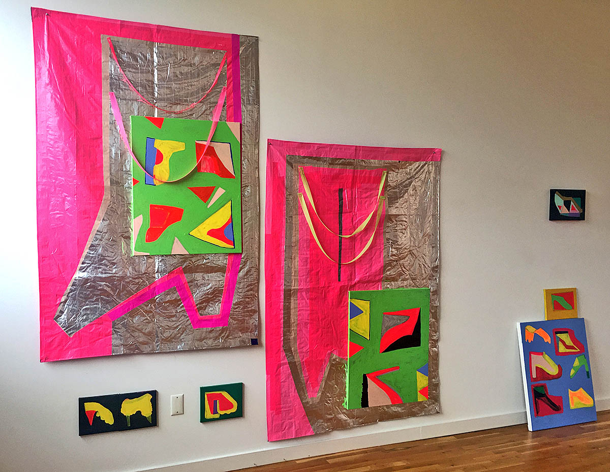
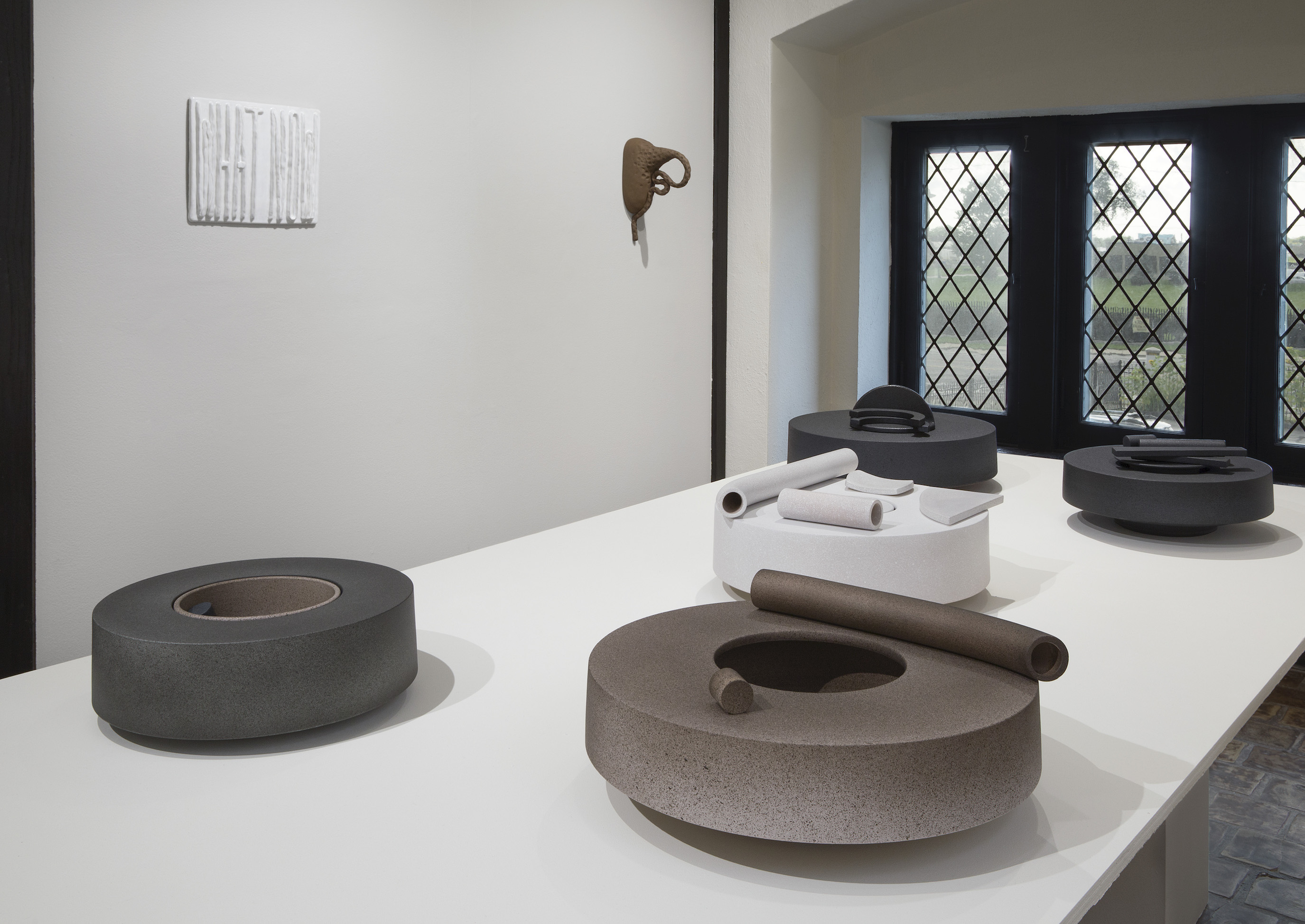
Your Very Own Paradise, Installation 2019, All Images Courtesy of DAR

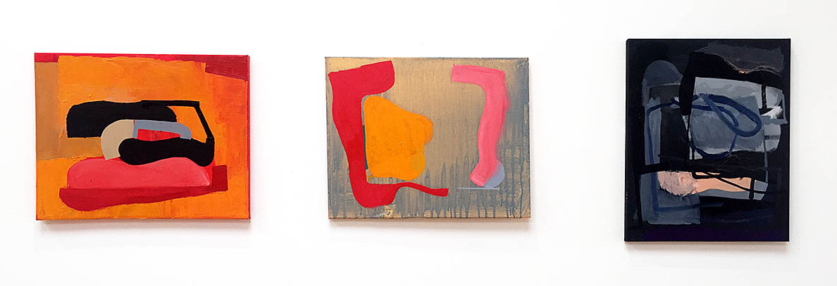
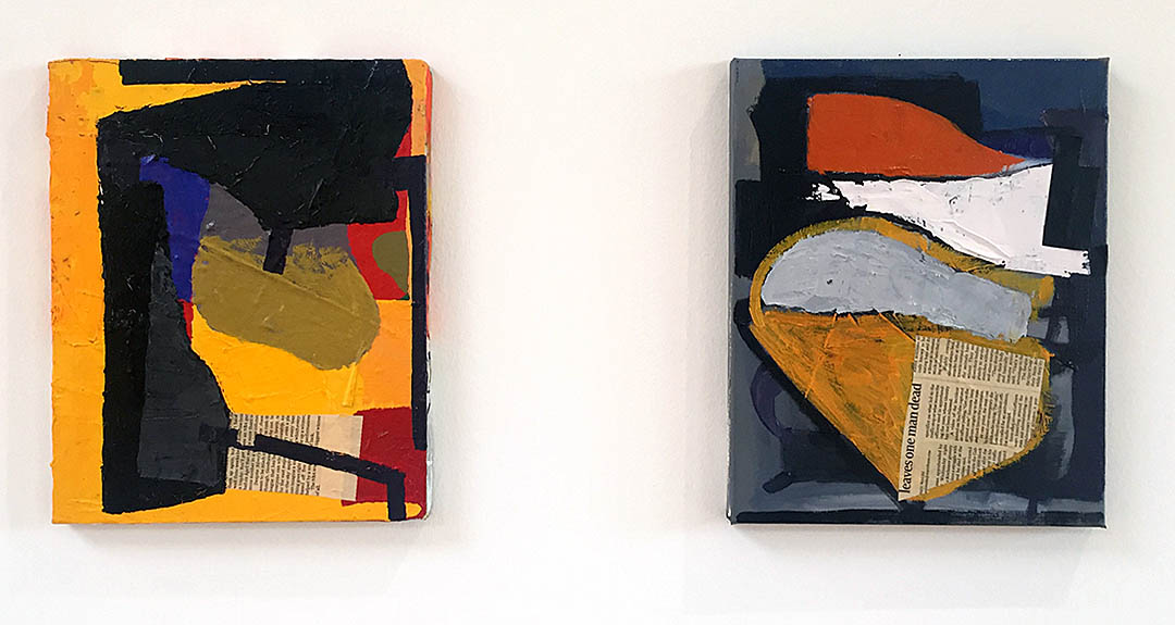
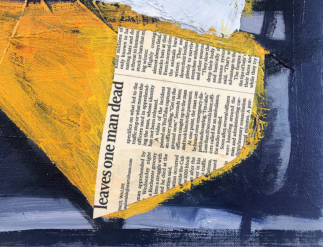
Oakland University Art Gallery opened its fall exhibition schedule with Your Very Own Paradise, artwork from far and wide with oil paintings, photographs, and sculptures on September 7, 2019.  Based on a curatorial premise that perception is reality, Director of the OUAG Gallery, Dick Goody, brings together thirteen artists whose ‘very own paradise’ differs significantly in expansive motifs and varying types of personal identity.

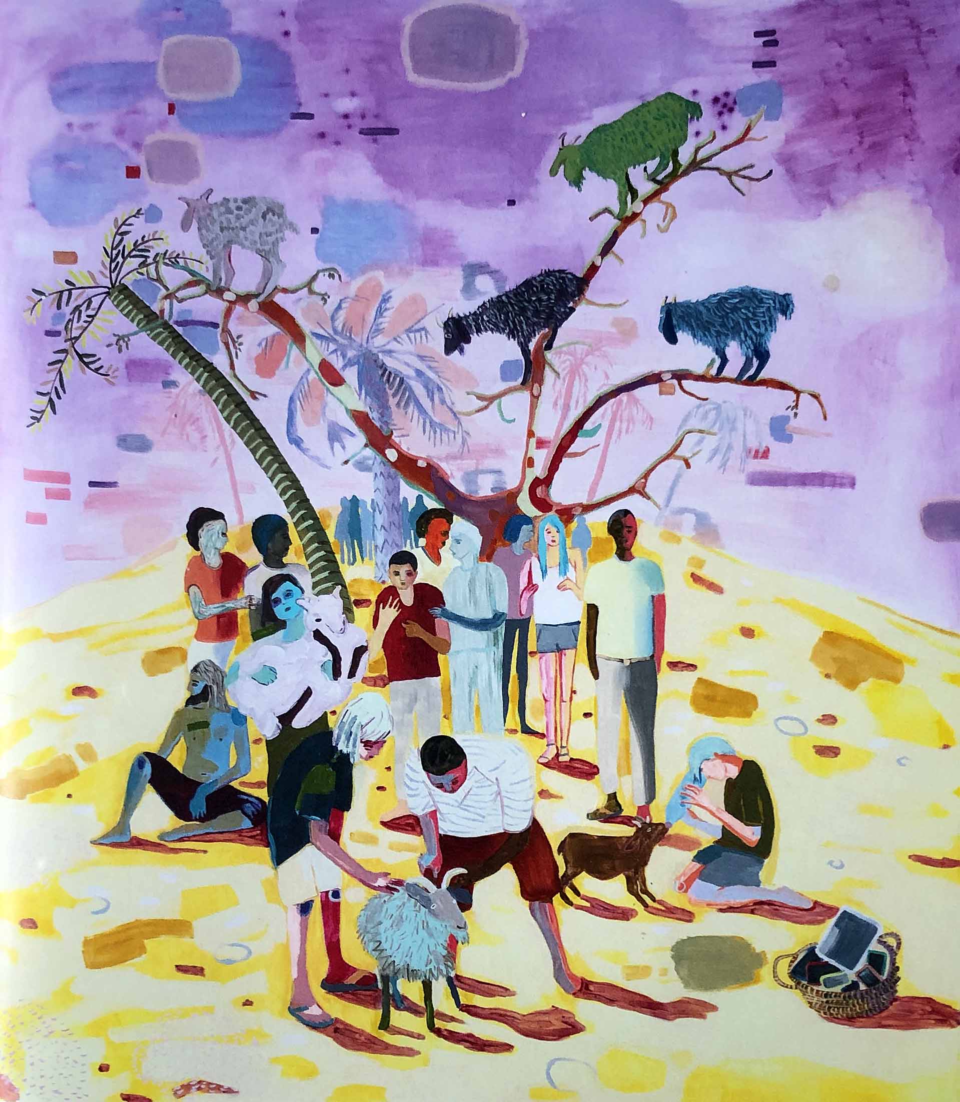
Melanie Daniel, Goat Love In a Digital Age, Oil on Canvas, 54 x 48″, 2018

In the painting Goat Love in a Digital Age, artist Melanie Daniel creates this crowded narrative where people are trying to reconnect on a surrealistic globe of isolation. This expressionistic portrayal of figures of all nationalities seems to find themselves in a desolate environment, using these goats as a means to reconnect with nature.

Melanie Daniel lives in Grand Rapids, Michigan, and earned her MFA from Bezalel Academy, Israel, and is currently the Padnos Distinguished Artist-in-Residence at Grant Valley State University.

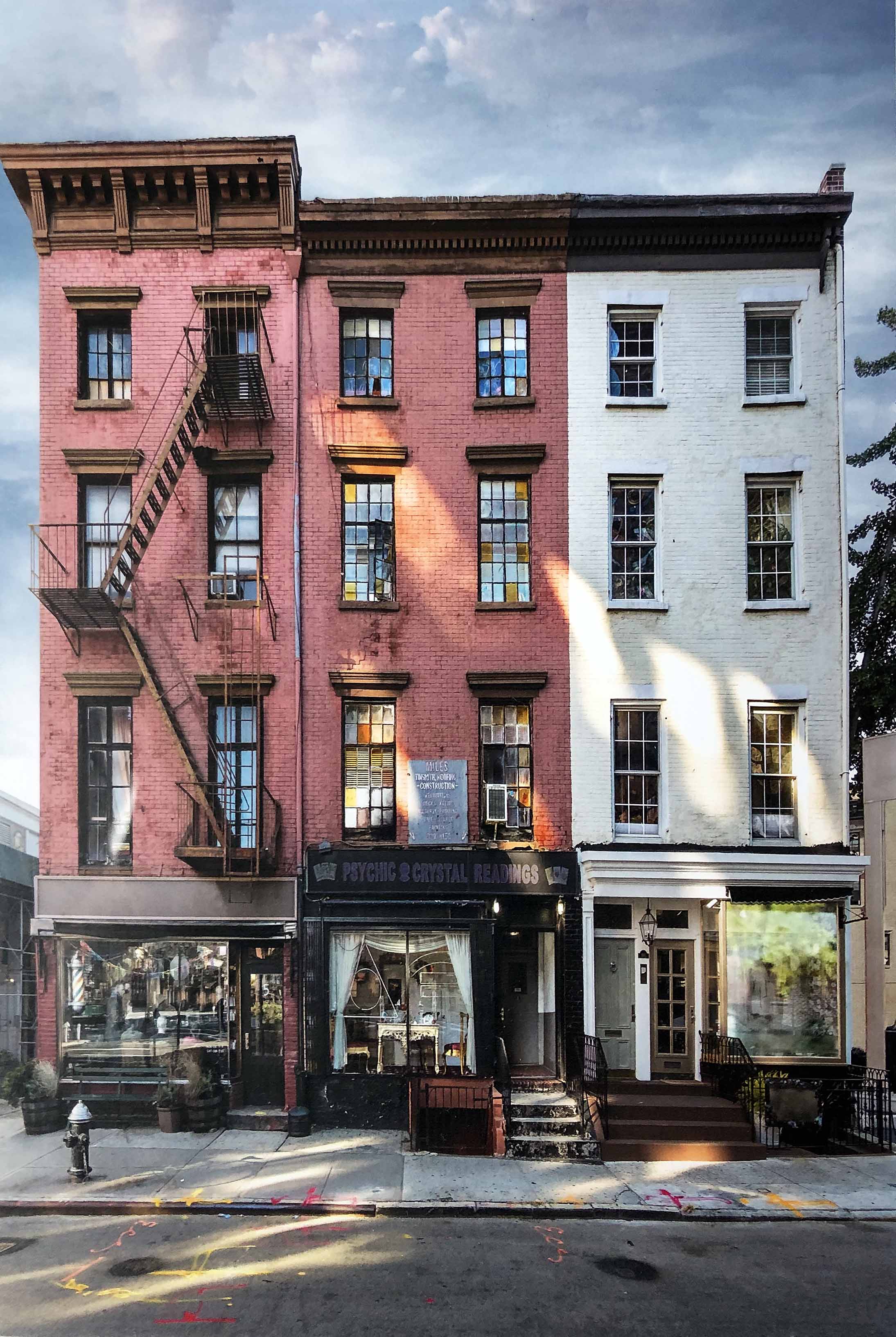
Marc Yankus, Tinsmith, Archival pigment print, 38 x 27″, 2015

For a city dweller, buildings are his paradise, both in structure and composition.  Marc Yankus is a photographer, and from his series, The Secret Lives of Buildings: Tinsmith, he captures an incredible pallet of light, shape, and color. His architectural detail of these facades, always formally placed, without the presence of people, is quiet and an ethereal slice of New York City that takes on a personality.  He says in his statement, “ I have walked by these buildings every day for the last 20 years.”

Marc Yankus’ fine artwork and publishing experience span more than forty years. His work has been included in exhibitions at the Brooklyn Museum and the South Street Seaport Museum, New York, the George Eastman House, Rochester, New York, and the Library of Congress, Washington, DC.

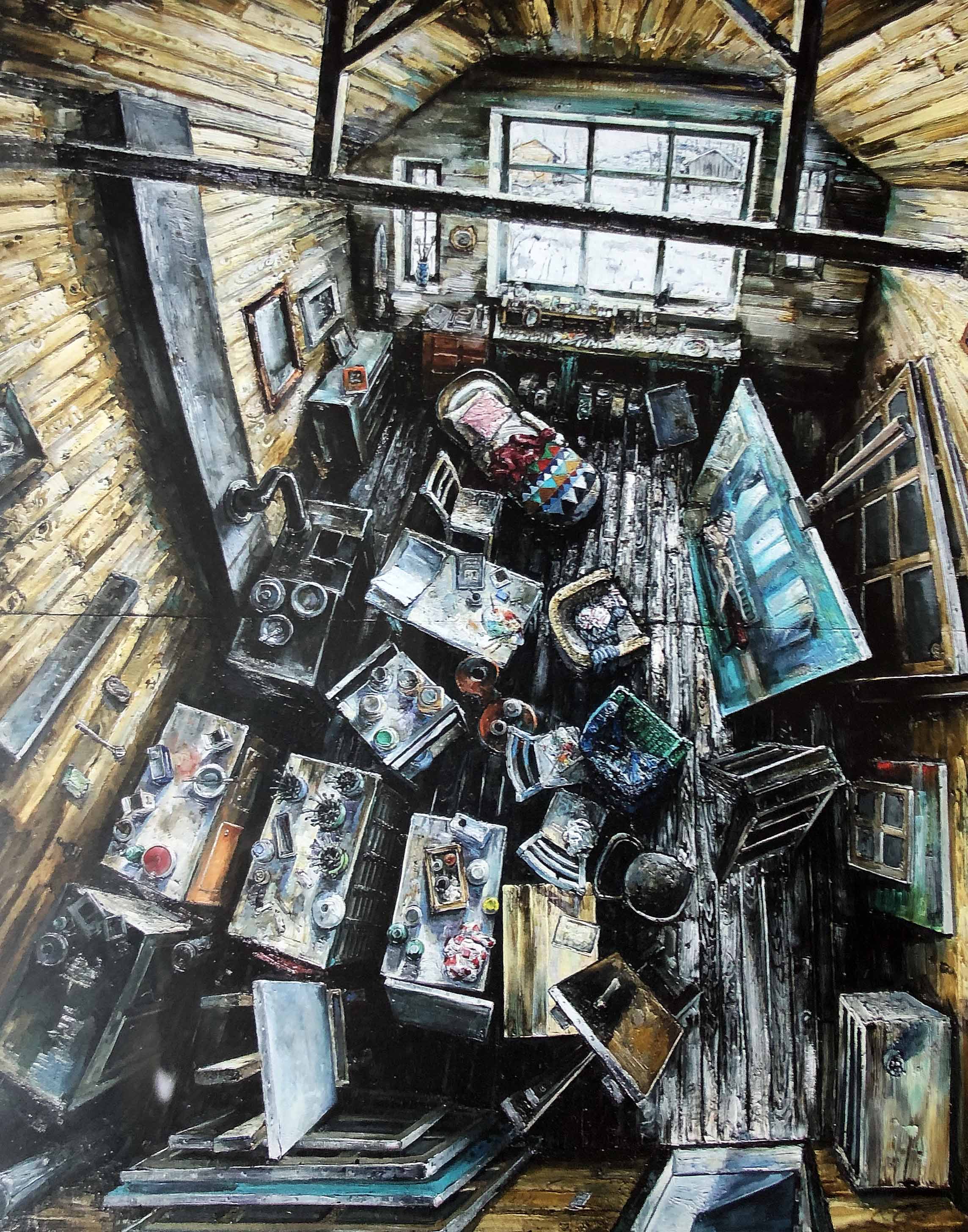
Amer Kobaslija, Northern Light III, Oil on panel, 86 x 72″, 2011

In the work Northern Light III, this large oil on panel presents the viewer with an interior aerial belonging to the famous painter Balthus. Amer says in his statement, “I get to understand the paintings through the act of making them, each piece individually and as a series – one work in relation to the other. Making is thinking.  These paintings are a reflection of my surroundings, the place where I live, and the people I encounter along the way.  As a painter, my aim is to engage with society – not to judge or impose answers but reflect on the place that I love and think of it has home.”

Born in Bosnia in 1975, Amer Kobaslija fled the war-torn country in 1993 for Germany, where he attended the Art Academy in Dusseldorf. Amer Kobaslija is a painter who was offered asylum by the United States and immigrated to Florida, where he completed his BFA in Printmaking at the Ringling College of Art and Design in Sarasota, FL. He then went on to earn his MFA in Painting at Montclair State University in New Jersey. He currently lives and works in Orlando, Florida

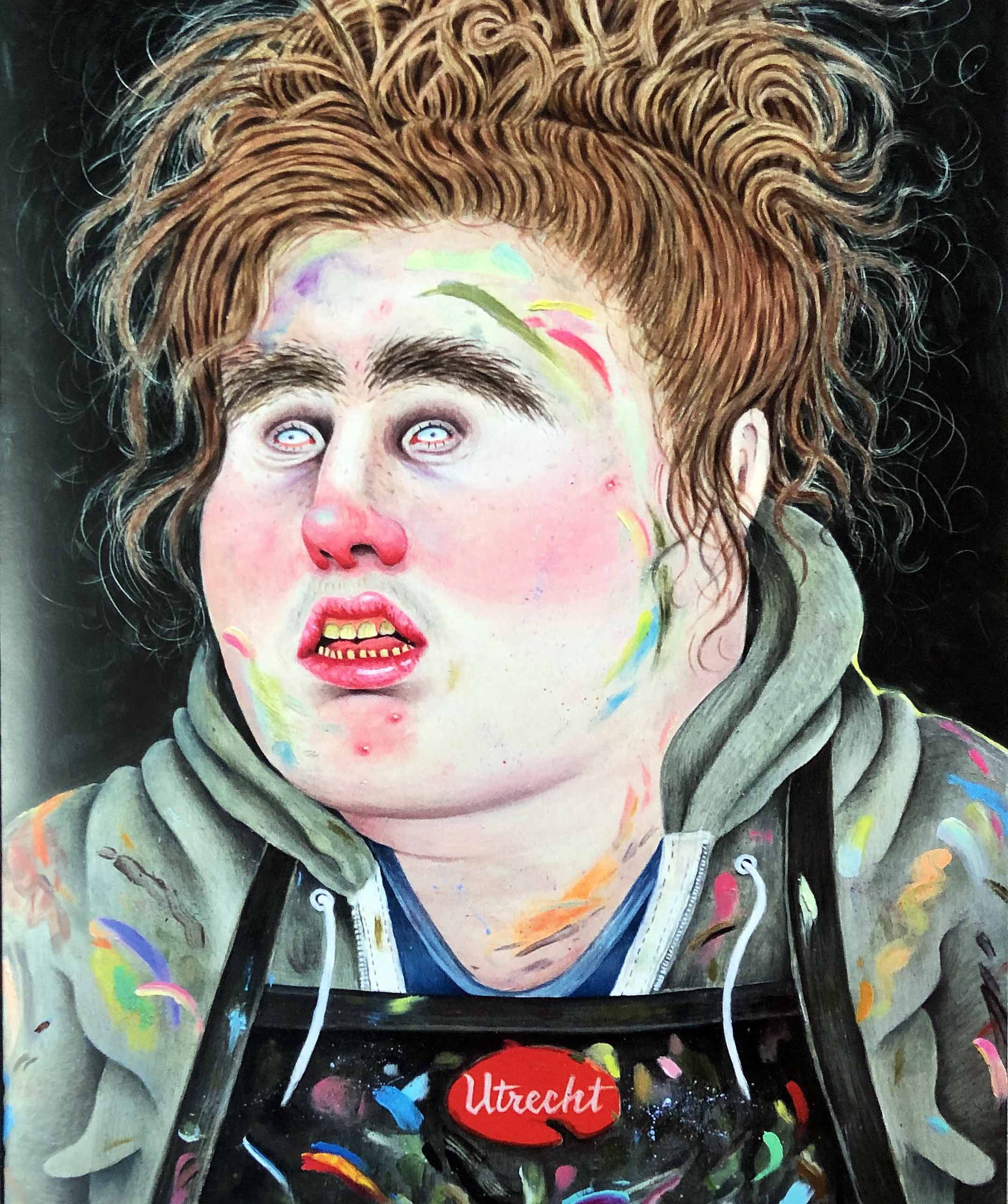
Rebecca Morgan, Self Portrait Post MFA Wearing the Smock of a Former Employer II, 2017 graphite and oil on panel 20 x 16 inches Courtesy of the artist and Aysa Geisberg Gallery.

The painting, After Work Sunset, oil, and graphite on panel, is an example of where the artist Rebecca Morgan uses herself as the subject for what could be described as a self-portrait, but she is playing with her audience, a kind of cathartic moment where she manipulates the image as though she is laughing at herself.  She seems to be looking to illustrate emotional discomfort. Much of her work devotes itself to embracing the discomfort, the flaws, and oddity as a way to turn it into lightness.

In her statement, she says, “The face jugs, cartoons, and paintings represent a kind of blissful ignorance: they’re totally fine with looking so hideous and awful; it’s of no consequence to them. Though covered in acne, wrinkles, and blemishes, their confidence and contentment is the ultimate acceptance of self-love. They’re blissfully unaware, unruly, wild and untamed.”

Rebecca Morgan received a BA from the Bloomsburg University of Pennsylvania and her MFA from Pratt Institute, NY.

In mounting this kind of exhibition,  it presents the question, what is the role of the university gallery?  Much like other educational institutions, like the Wayne State University’s Elaine Jacob Gallery where the sole mission is to bring in work from outside Metro Detroit, the OUAG Gallery has over the years provided a mix of both Detroit Metro art work and then at times, Goody imports artists from all parts of the world. Both exist in an environment not depended on sales for its existence, providing a venue that contrasts with the average contemporary gallery.

Your Very Own Paradise has been created to explore the notion that requires the artist to rise above convention, play with reality, and deliver an exhibition by the works of Nick Archer, Enrique Chagoya, Melanie Daniel, Maira Kalman, Amer Kobaslija, Andrew Lenaghan, Tayna Marcuse, Rebecca Morgan, Lamar Peterson, Orit Raff, Simon Roberts, Thomas Trosch, and Marc Yankus.

Your Very Own Paradise, Oakland University Art Gallery, through November 24, 2019


Copying and Invention in East Asia @ UMMA 

Imperial winter dragon robe, China, early 19th century, embroidered silk. University of Michigan Museum of Art, Gift of Elizabeth Henshaw Gasper Brown in memory of Horace, William and Helen Lou, 1989/1.34

In Western visual culture, copying is sometimes freighted with duplicitous or subversive undertones.  Marcel Duchamp’s notorious LHOOQ, a defaced poster of the Mona Lisa, is hardly flattering to the original, after all.  But drawing mostly from the University of Michigan Museum of Art’s permanent collection, the exhibition Copies and Invention in East Asia showcases the many ways the artists of China, Korea, and Japan actively copied and referenced pre-existing visual motifs across borders and across time.

There are over a hundred works on view which snugly fill the UMMA’s spacious Taubman Gallery, mostly gleaned from the past (the oldest artifacts coming from Han Dynasty China, about two millennia ago), though there are a smattering of 20th century and contemporary works on view.  The chronological and geographical scope of this exhibit is ambitiously large, so the show is compartmentalized thematically; there’s a section on literati painting, for example, and another on the auspicious animal symbols that recur.

Seifû Yohei III, White teapot and sencha pitcher with stamped dragonfly designs, circa 1893-1914, porcelain with clear glaze. University of Michigan Museum of Art, Bequest of Margaret Watson Parker, 1954/1.512 and 503

A set of ceramic bowls by the celebrated artist Seifu Yohi III are a case-study for how Japanese art imitated and synthesized the visual cultures of the territories conquered by imperial Japan.  Yohi intently studied pottery from China’s Ming and Song Dynasties (of which there are some examples on view), and his artistic output is one of respectful mimicry.   Employed by the imperial household, his work, characterized by its fine, milky-white glaze, reflected the interest Japanese patrons had in Chinese art.

Yamamoto Baiitsu, Blossoming Prunus Branch, after Wang Mien, 1847, hanging scroll, ink on paper. University of Michigan Museum of Art, Gift of Mr. and Mrs. C.D. Carter, 1970/2.156

Copying at its most literal is demonstrated by the Japanese landscape painters who replicated their original Chinese models, right down to the signatures of the original artists, though their intentions were never deceptive.  An elegant ink painting of a wispy tree branch by 19th century Japanese artist Yamamoto Baiitsu is an example, its architype being a 14th century work by Chinese artist Wang Mian.  And an impressively large hanging scroll demonstrates how even within China itself, artists would directly copy preexisting Chinese paintings.  Wu Wei’s Travelers on a Mountain Pass (painted, incidentally, at exactly the same time Leonardo was dabbing away on the Mona Lisa) is a tribute to a painting by the 10th century artist Li Cheng, though Wu’s painting is more abstract, retaining a definitive personal style.  This is also a painting that advances the case for seeing art in person; cinematic in scale, this work practically engulfs the viewer, an effect that would get lost in translation if reproduced in a book.

XU ZHEN ® Eternity-Aphrodite of Knidos, Tang Dynasty Sitting Buddha, 2014, glass fiber-reinforced concrete, marble grains, sandstone grains, mineral pigments, steel. Courtesy of James Cohan Gallery, New York ©Xu Zhen

For me, the most visually compelling works are the several contemporary sculptures on view.  South Korean artist Chul Hyun Ahn’s deceptively simple light sculpture Two Circles, placed right at the show’s entrance for maximum impact, comprises two colored circular florescent lights positioned concentrically between two mirrors, framed and mounted on the wall; stand directly in front of Two Circles, and the illusion is that you’re staring into an infinity of circles eternally receding into the distance.  Chul Hyun Ahn’s sculptures are abstract references to Zen Buddhist ink paintings, characterized by a reductive though elegant simplicity.  Approaching copying with a wry sense of humor, sculptor Zu Zhen created a literal mash-up of two iconic images in Eastern and Western visual culture: a seated Tang Dynasty statue of Buddha seems to sprout (where its head should be) an upside-down reproduction of the Aphrodite of Knossos.

Copies and Invention in East Asia, to its immense credit, takes a comparatively niche topic and makes it interesting, accessible, and visually punchy.  It’s a diverse show, ranging in scope from 2000+ year old Chinese burial objects to a set of countertop Buddhist stupas fresh off the 3D printer.  It’s a show that playfully gives tangible expression to the Japanese literary critic Hideo Kobayashi’s assertion that “Copying is the mother of creation.”


Textures of Detroit @ Kreft Center Gallery

Installation Kreft Gallery, Textures of Detroit, 2019

Installation , Textures of Detroit, Kreft Gallery, 2019

Textures of Detroit is an exhibition of work that revolves around the theme of visual and tactile textures of Detroit.  It’s an intimate, multimedia show of six seasoned and accomplished contemporary Detroit artists (Peter Bernal, Matt Corbin, Roy Feldman, Carol Harris, Carl Wilson, and Ann Smith), whose sometimes rugged and gritty work is almost a foil to the chic polish of Concordia University’s Kreft Center Gallery.

The exhibition opens with a fine salvo of woodblock prints and linocuts by Kresge fellow Carl Wilson, who last year enjoyed a show at the Grand Rapids Art Museum. It’s not hard at all to imagine these as still frames from noir film; they seem like storyboarded images or concept art for black-and-white cinema, evocative of soulful and morose saxophone riffs.  In one graphic-novel style image, we see a line of beleaguered workers trundling toward the beginning of their shifts at some industrial job.    In another an elderly woman sits alone in a dark room illuminated by a solitary hanging bulb, and nurses a glass of indeterminate substance.

There are several textile works on view by textile artist Carole Harris, who creates fiber art that seems almost painterly, and, at times, even sculptural.  Her color palate is rusty and industrial; it’s no surprise to learn she draws inspiration from aging architectural structures.  Move in close, and her arrangements of patchwork abstractions reveal a dizzying network of swirling stitch-work that recalls the pirouetting clouds of Van Gogh’s Starry Night.  Her works subtly reference the time-worn textures of urban Detroit, and they exude an undeniable beauty.

Roy Feldman, “Untitled,” Silver Halide print on Kodak Endura paper. Image courtesy of the artist.

A quintet of photographs by Roy Feldman, a Detroit-based photographer and Emmy-Award winning filmmaker, presents a set of images of multi-layered urban interiors, each characterized by disorienting reflections which lend the set an air of magic-realism, an effect the photographer here achieves by capturing images of people taken ether reflected in mirrors or viewed through windows, a device which misleadingly lends the images the initial appearance of being double-exposed. In one instance, we see the side of a cropped face of a woman applying eyeliner; she holds out a small, circular mirror which reflects her eye as it seems to gaze back directly at us, though seemingly disembodied like a hovering object from a painting by Rene Magritte.

Roy Feldman, “Untitled,” Silver Halide print on Kodak Endura paper. Image courtesy of the artist.

Ann Smith and Mark Corbin both create sculptures from found objects and detritus, though their respective styles are certainly distinct, Corbin’s works rhyming more with the unrefined assemblage-style works of Detroit’s Tyre Guyton (of the Heidelberg Project), and Ann Smith’s works clearly more fussily worked and refined; the curvaceous metallic wisps of her Squash Blossom are a sort of cursive in 3D.   Together, along with the fiber works of Carole Harris, this ensemble presents Detroit texture in the most literal sense.

Carol Harris, In the Spirit, 69 x 71″ textile, 1992

Like the Copies and Invention show on view at the UMMA, Textures of Detroit takes a relatively niche point of departure and delivers an immensely satisfying result. It’s eclectic, for sure, but these multimedia works seem to come together not just through their application of tactile and visual texture, but also through the understated affection they seem to exhibit for the Motor City, its textures, and its people.


SALON @ David Klein Gallery Detroit


“SALON” Gallery 1 Installation View. All photos are courtesy of David Klein Gallery.

At the David Klein Gallery, Detroit, the exhibition “SALON” ambitiously presents 90 works by 39 artists across a range of media, with sundry formal intentions in diverse dimensions, all the while accomplishing the near impossible task of curating a ruminative viewing experience in which a spirited dialogue between each work translates into an expansive conversation with its audience. “SALON” summons and breathes new life into old models of art viewership and cultural discourse that once placed an emphasis on wide-eyed pluralistic wonder.

“SALON” Foyer Wall Installation. 

The term salon originates as a social event that flourished during the Enlightenment. A crucial practice in “the age of conversation,” the salon collected persons of intellectual and cultural significance within the home of a well-to-do host to allow for an absorbing, investigative conversation on a wide-ranging set of issues. These were intended to be regularly recurring conversations around art, literature and politics to satisfy a hunger for knowledge while refining the tastes of all participants, mingled with a dose of amusement as egos politely debated for intellectual superiority. The salon also came to be identified with a series of academic art exhibitions beginning in 1667, at the Académie des Beaux-Arts in Paris. Work chosen to be exhibited by a juried system, jostled for space in dense groupings that covered the wall from top to bottom. With the rise of public museums in the 18th century, a similar method of presentation was followed. Work that had once been displayed in private collections, often serving as the backdrop for salon conversations, and were ordered as closely grouped arrangements to juxtapose formal contrasts more immediately, was replicated in the new public displays.

“SALON” Gallery 2 Installation View.

Crowded together to view a salon exhibition, the public was at times overwhelmed by the tightly clustered variety of works, but also in a state of awe and wonder, delving into vigorous conversation. With the advent of the “white cube” display methodology with neutral walls, controlled lighting and the spatial isolation of individual works of art inducing a hushed distance among viewing patrons, the salon approach was no longer the de facto system. The white cube environment, the earliest known iteration being an 1883 exhibition at London’s Fine Art Society by American artist James Abbott McNeill Whistler (1834-1903), was initially intended as an innovation to eradicate distraction, disconnecting art from the world and imposing more rigorous viewing criteria upon the viewer: there is only one way to see the artwork, and it is thus. Subsequently, what was innovative has now become conventional, with institutions and galleries continually questioning how to liberate the viewing of art from the impulse of Modernist constraint.

“SALON” Gallery 1 North Wall Installation.

At David Klein, the use of the salon as both conversational gathering point and display methodology, stimulates an adventurous public viewing space. Rather than filling every wall from top to bottom and side to side, the work in the exhibition is broken down into intriguing groupings displayed on eight separate walls in the two gallery spaces. It would be a fool’s errand to extract a work or two from each group and create a “best of” series of highlights as the basis for an exhibition review. There is no star amongst the roster of artists here, culled from the gallery’s extensive exhibiting family. This is a group effort; each work assists the other as contrasts are amplified to deepen the conversation. Such collective resonance is where the true joy of “SALON” resides as hierarchies are erased. The graphic sits beside the painted. The drawn beside the photographic. The representational beside the abstract. The minimal beside the dense. The humorous beside the solemn. And so on and so forth. Such juxtapositions are the stuff of wildly active viewing. The exhibition hums with a vitality.

“SALON” Gallery 2 North Wall Installation

As a viewer moving from wall to wall, from conversation to conversation, one approaches the whole of each arrangement, marveling at the curatorial decisions resulting in unexpected formal juxtapositions. These configurations are the result of thoughtful installation on the macro level as well as care for content on the micro level. As one drills down into individual works, crowding in closer, examining each piece on its own terms, something occurs moving from one close inspection to another: the experience of the prior work lingers a bit more on the way to settling into the next. Like the exquisite sound design in a Robert Altman film, the voices overlap. On the north wall of gallery 2, the energetic collisions of Alisa Henriquez brush up against the hard-edged purity of Matthew Hawtin which finds a partnership with the carefully observed humanity of Mario Moore which is confronted by the mediated spectatorship of Jessica Rohrer which dissolves into the formal filigree of Janet Hamrick which simultaneously eases and bumps into the heightened temperature of Corine Vermeulen. There are many such moments throughout “SALON.”

“SALON” Gallery 1 South Wall Installation.

Realistically, “SALON” is an exhibition about availability. The works chosen are bite-sized morsels representative of a larger body of work by each artist, serving as distilled entrées into their concerns. Framed for ease of hanging and transportability, the majority of works priced at a modest level for a larger audience, such market concerns go hand-in-hand with the formal accessibility of the exhibition. Free of viewing images in isolation in support of a single voice, the communion on display in “SALON” is a liberating and welcoming experience. Rather than being instructed where to place one’s focus, there is a choice of attention. In an era in which digital platforms tailor our viewing habits with surgical precision, employing harvested algorithms to produce ever narrower windows on the world, it is good to be reminded of the virtues of pluralistic viewing. “SALON” is a social event that invigorates the necessity of wide-ranging cultural conversations, reinforcing a community of expression.

“SALON” Gallery 2 East Wall Installation.

“SALON” is Jamie Adams, Elise Ansel, Emmy Bright, Mitch Cope, Carlos Diaz, Joel Grothaus, Janet Hamrick, Matthew Hawtin, Alisa Henriquez, Patrick Hill, Scott Hocking, Cooper Holoweski, Trisha Holt, Cyrus Karimipour, Trevor King, Andrew Krieger, Stephen Magsig, Kim McCarty, Clara McClenon, Mario Moore, Carrie Moyer, Brittany Nelson, Marianna Olague, Judy Pfaff, Benjamin Pritchard, Kelly Reemtsen, Jessica Rohrer, Tylonn Sawyer, Robert Schefman, Julie Schenkelberg, Lauren Semivan, Clinton Snider, Rosalind Tallmadge, Corine Vermeulen, Liat Yossifor, and Elizabeth Youngblood.

“SALON” is on view at David Klein Gallery Detroit Until November 2.


Gyan Shrosbree and Jim Shrosbree @ Nx.ix Gallery

“Sense of Place” installation view; all images by Ryan Standfest

For the inaugural exhibition of the new Hamtramck gallery Nx.ix, gallerist Nicole McIntyre has curated a formally exuberant conversation between the work of Gyan Shrosbree and that of her father Jim Shrosbree. “Sense of Place” presents over 37 paintings in a large, bright, unobstructed space that is extended further as corners, baseboards, hallways, and those places generally left unconsidered in white cube installations, are teased out for a fuller sense of the place itself. Nestled above cabinets, hugging corners and leaning on the floor, groupings of the works into pockets great and small are an echo of what is unfolding within the pieces themselves.

Both bodies of work by Gyan and Jim Shrosbree are from 2019 and were created independently of one another. By bringing them together for this exhibition, Nicole McIntyre has initiated a dialogue in which abundant similarities and contrasts reside, so that the respective languages ultimately challenge each other’s construction. All of the works pursue their own memory by revisiting and revising the very spaces and forms they establish. Each artist in their own way challenges the infrastructure buried within the construction of their images—simultaneously excavating and burying, revealing and concealing. In many of the works, forms find themselves painted and repainted, pulled out, isolated, replaced and interrupted by textures, colors and structural devices intended to both complicate and simplify.

“Sense of Place” installation view: works by Gyan Shrosbree

Gyan Shrosbree employs the recurring image of shoes throughout her work here. And yet they are also not shoes. The image of a shoe is present, but then exaggerated, caricatured, and abstracted into a reductive icon. The association of the shoe nevertheless lingers. That lingering connection with the body results in a proposition for the viewer: how would I need to physically adapt to this new shoe? We exist in a culture of feminine bodily deformation in which shoes bind, constrict and shape physical identity. To draw this conversation into the realm of formal abstraction is not without merit.

Gyan Shrosbree, detail of “I Will Never Share A Closet With You”, 2019, acrylic on canvas

In the paintings of Philip Guston, shoes are self-contained, heavy and inert things that get heaped and piled. They are abstractions of a shoe—the idea of a shoe arrived at via recollection rather than representation,  with emphasis placed on their thick leather soles often upturned and held in place with oversized tacks. Detroit artist Tyree Guyton makes use of the shoe in both painting and installation as the cast-off remnants of a population uprooted, moved, and unmoored, gesturing toward an itinerant homeless life on the street. His large scale paintings of shoes become totemic, celebratory, larger than life street signs reflecting a history of migratory traffic.

Gyan Shrosbree, “I Will Never Share A Closet With You”, 2019, acrylic, ribbons, glitter, push pins on canvas, various dimensions

From a distance, a grouping of Gyan Shrosbree’s canvases in “I Will Never Share A Closet With You”, suggests a wilder, more organic expression of Peter Halley’s day-glow abstractions from the 1980s. But a closer viewing reveals forms immersed in a folk art, painted sign sensibility. In her work, the shoe serves as a memory vessel, for the foot to return to again and again, always confining to a set shape, to a path taken daily. However, with each return Gyan Shrosbree makes to the body of the shoe, to render it from memory, the shape changes, softens, metamorphoses, allowing for an elastic formal existence. Humorous shapes emerge, and there is an echo of self-taught art, hand-painted signs and memory, in which images are arrived at through recollecting an image and repeating it with the alterations memory gives way to. The compositions suggest the structural rudiments of commercial advertising and merchandise catalogs—both online and printed, with overlapping and adjoining panels for each style. But in these paintings, the commodity grid is also just as fractured as the product. Gyan Shrosbree employs materials that have been associated with lowbrow craft production and the cultural assignation of feminine tastes. The liberal application of glitter, day-glo paint, streamers, and reflective tape signals the opposite of restraint and cranks up the heat in the images. There is a notion of embedded joy in these images. In a work such as “Silver Slippers”, the layering on of such material signals a destabilization of traditional “value”: high art strategies of abstraction are married to low-art techniques of throwing a shiny party. This keeps the work deceptively light, while beneath the skin, deeper structures are being carved up and dismantled.

Gyan Shrosbree, “Silver Slippers”, 2019, acrylic, tape, bubble wrap, and thread on canvas, 40” x 30” each

Jim Shrosbree, (left) “Once and Upon (rojo), 2019, oil on canvas, 16” x 20”; (center) “Talla-Hasee (rinse)”, 2019, oil and acrylic on canvas, 16” x 20”; (right) “Finding Out/Looking In”, 2019, oil on canvas, 20” x 16”

With a more subdued palette and a smaller scale, Jim Shrosbree’s paintings in the exhibition explore a process of editing and revising pathways. Moving from the concrete—from finite limitations of language to fragmentation—his spaces toggle between boundlessness and containment. There is a layered history on each canvas—a bit of string and tape buried beneath a skin of paint, a patch of collaged newspaper embedded in a window of pigment allowing us a glimpse of narrative transformed into visual texture. The paint handling moves from thin to thick, dripped to smeared to brushed. Shapes of color on the verge of amorphousness arrive near temporary definition, while pipeline frameworks settle in to add a note of stability.

Jim Shrosbree, (left) “Biggest Winner of All”, 2019, oil and collage on canvas, 14” x 11”; (right) “Leaves One”, 2019, oil and collage on canvas, 14” x 11”

Many of Jim Shrosbree’s works here, use collage with newspaper fragments sourced from the Minnesota newspaper The Star Tribune. These shaped clippings—primarily serving a visual purpose with the rigors of functional, readable, black and white text contrasted against the liquidity of paint and color—have the added effect of locating the work as a place. Reading the text to gather every little piece of evidence, can tilt toward a structure. Akin to little scraps of memory, they summon the paintings of the German Dadaist Kurt Schwitters, who would embed used train tickets in his work. Similar to displaying the remnants of daily travel, the newspaper fragments in Jim Shrosbree’s paintings are a glimpse into daily dispatches from a specific time and place. In this sense, his work functions as both a recording and a clouding of that recording. That record is ultimately a memory of the procedures set upon by the painters hand—the accumulated marks and passages that both build upon and eradicate each step taken.

Jim Shrosbree, detail of “Leaves One”, 2019, oil and collage on canvas, 14” x 11”

Taking a stroll from the gallery in Hamtramck down Joseph Campau street, lined with storefronts both vacant and active, there is a resonance with what was experienced at Nx.ix. One passes windows covered over with yellowing newspapers. Another dirty window has stacks of dusty and sun-blanched shoeboxes leaning against it. Hand-painted sales signage in vibrant day-glow colors adorn shop windows. Facades show evidence of older shop names painted over while others are simply ghostly traces of what has slowly faded away.

In Gyan and Jim Shrosbree’s paintings, a sense of place is a sense of one’s place, as we attempt to locate ourselves by constructing a new place in the form of an image, out of and on top of the memory of where we have been. The act of building this new image reflects the ways in which the memories at the foundation of what we are building, complicate and simplify all at once. We abstract prior experiences as they evolve into newly shaped experiences and images. We rework the surfaces and apply a fresh coat of paint to old layers that will eventually resurface to share its history.

“Sense of Place” is on view at Nx.ix Gallery until October 14


Inspired @ Pewabic Pottery

Inspired, Installation image, Pewabic Pottery, 2019 Photo: PD Rearick

Climbing the narrow, delayed-gratification-stairway to Pewabic Pottery’s second floor galleries, even for the umpteenth time, anticipation mounts until, at the top of the stairs, sightlines to left and right reveal the shiny artifacts of a new exhibition. The current show, confidently entitled “Inspired,” does indeed proffer an eclectic array of ceramic art created by four artists working in diverse, distinctive ways. The display, conceived and installed by Pewabic curator Darlene Carroll, features makers who lead ceramic programs that Pewabic’s co-founder, Mary Chase Stratton, played a role in establishing.

Inspired, Installation image, Pewabic Pottery, 2019 Photo: PD Rearick

First up, Susan Crowell’s Huckleberry (Vaccinium myrtillus), a single, gigantic, four lobed sculpture of a grain of huckleberry pollen (as seen under a microscope) measuring 12 ½ inches in diameter, is indeed “voluptuous,” as she declares. Its purply-blue glaze and plump, spherical forms embody the lush, caress-me allure and inkling of a tasty, delectable huckleberry. Other of Crowell’s jumbo flora include a lemon yellow cluster of Hazelnut Pollen (Corylus avellane), each pod about the size of a softball, and a nectar-from-the gods spill from wall to pedestal of fourteen, luscious pink Rose-Bay Willow Herb (Onagraceae) triangular pollen forms. Crowell has taught ceramics at the University of Michigan’s Penny W. Stamps School of Art & Design since 2005, and at the Residential College since 1972.

Susan Crowell, “Huckleberry (Vaccinium myrtillus),” Stoneware with vitreous engobes, stains, glazes, 12.5 x 12.5 x 12 in., 2019

No less alluring is Jessika Edgar’s I want to touch you to be happy inside. A two foot tall ice cream treat—chocolate topping layered over an exotic coppery colored flavor-of-the-week—slumps atop an animate, tri-legged stool, itself ensconced on a glitzy, solid gold pedestal. This popular icon, centralized, pedestaled, and overblown suggests desire incarnate, as does the title, albeit meltingly short-lived in the end. Another suggestive Edgarian title—Get it while you can—coupled with an organic, roly-poly torso festooned with acrylic pearls resting on a mid-century biomorphic end table with canted legs, its top covered with faux fur, embodies as well the contemporary appeal of faux, formless, and real.  Edgar is an assistant professor and coordinator of Ceramics at Wayne State University.

Jessika Edgar, “I want to touch you to be happy inside,” Ceramic, glaze, copper leaf, variegated metal leaf, osb board, 50 x 30.5 x 30.5 in., 2019

Ian McDonald, artist-in-residence and head of ceramics at Cranbrook Academy of Art, presents, among other examples of his ceramic practice, a trio of Shade Vessels, ranging in height from 12 to 16 inches. Severe and minimalist, with precise horizontal ribbing, two are glazed in hushed lavender hues, while the third sports a smoky greenish hue, soft palettes somewhat unexpected on such stark shafts. Hollow and formally composed of cylinder and bowl-like forms, they are however unitary, integral vessels, reminiscent perhaps of trees, umbrellas, or even observation towers that provide protection and shelter. Also on view is a suite of broad, darkly hued, table-hugging bowls (five to six inches in height and up to 17 inches in diameter) that McDonald dubs Low Works.

Ian McDonald, “Shade Vessels,” Stoneware with glaze, left to right: 16 x 10.5 x 10.5 in.; 12 x 7.25 x 7.25 in.; 15 x 11 x 11 in., 2017-18 Photo: PD Rearick


Assistant professor and head of Ceramics at College for Creative Studies, Ebitenyefa Baralaye weighs in as conceptualist and relief sculptor of this collegial foursome. Working in “raw,” unglazed terra cotta, Baralaye’s plaques of mazes, furrowed fields, and enigmatic phrases highlight transitional issues of “feeling, engagement, and displacement.” Real Feels reads a rectangle of raised text, 15 x 20 ½ inches in size. The vertically stretched out letters suggest an emotional tension or anxiety, a state corroborated by the inversion of the identical terms to “Feels Real” on a second plaque (not in the show). Another of Baralaye’s panels on exhibit (glazed white, as it happens) quietly and poignantly asks What Now. His words and low-key art serve as discreet prompts to action for both academe and audiences alike as a new semester and year loom ahead.

Ebitenyefa Baralaye, “Real Feels,” Terracotta, 15 x 20.5 in., 2019 (courtesy David Klein Gallery) Photo: PD Rearick


Inspired
remains on view at Pewabic Pottery through October 21.


Powered by WordPress & Theme by Anders Norén