Critical art reviews of Detroit galleries and museums weekly

Category: Paintings Page 27 of 45

Gertrude Kasle Collection & See Through @ UMMA

Exercising the Eye

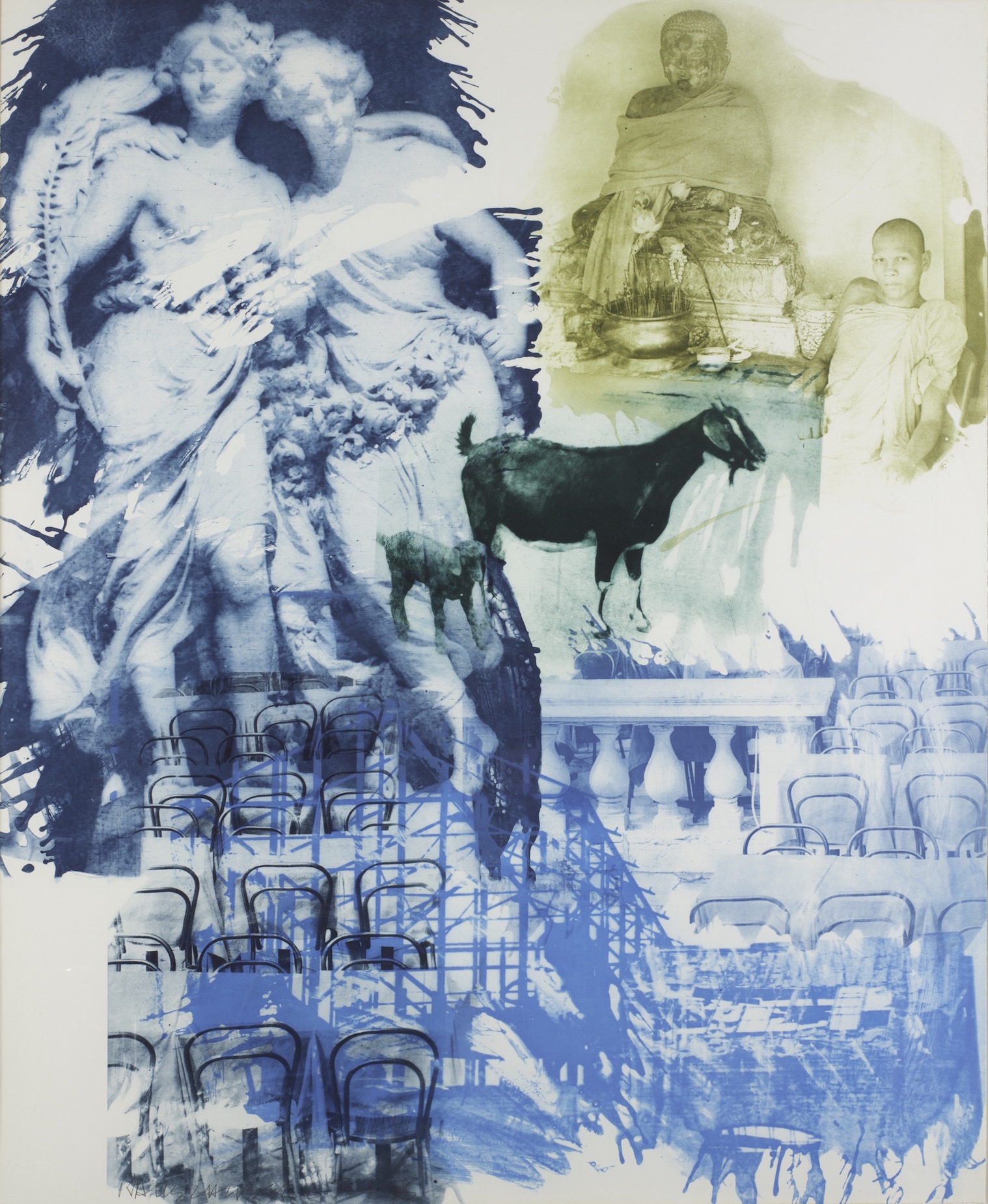
Robert Rausehnberg, Intermission(Ground Rules) Intaglio, 1996

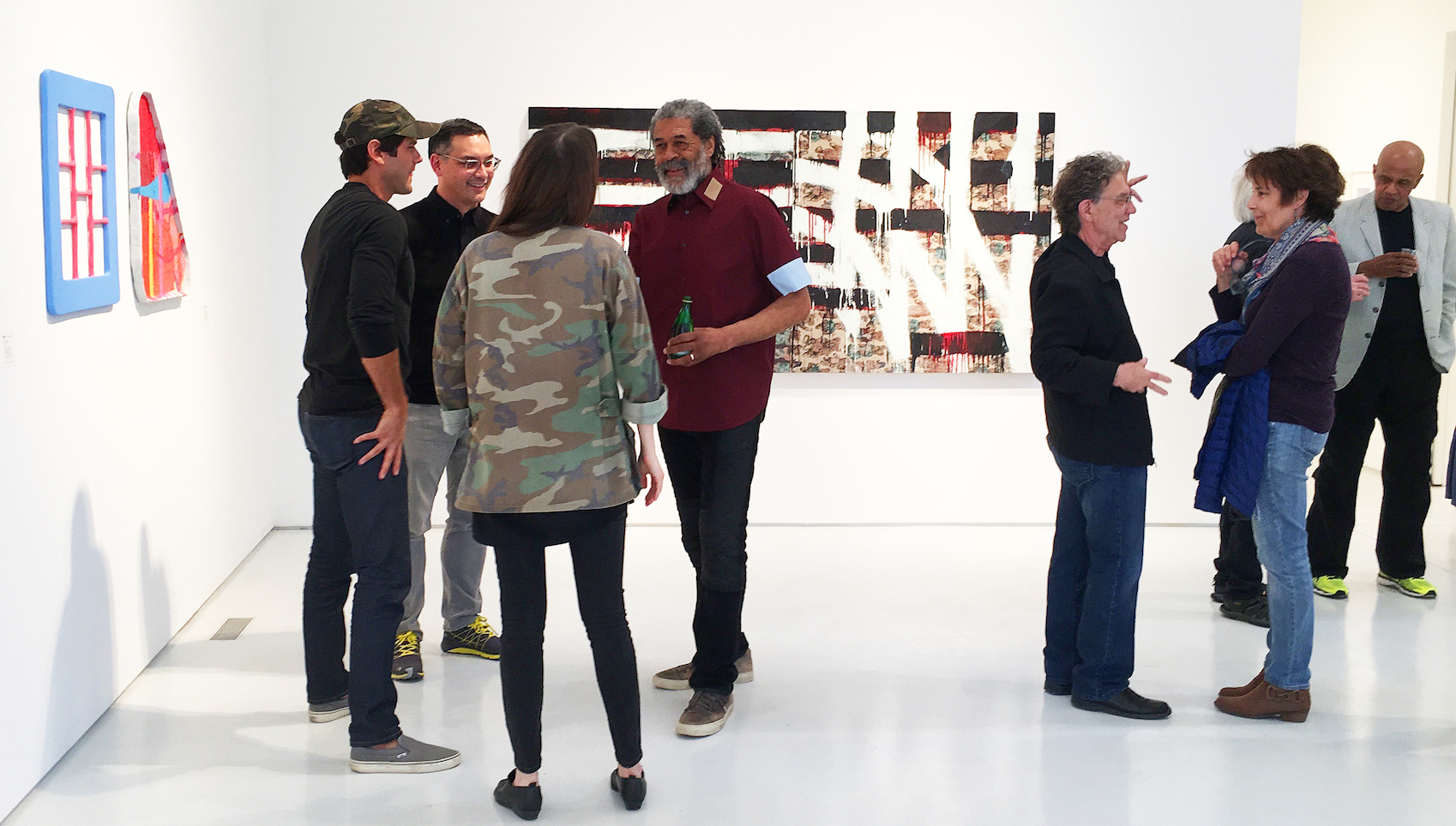
In 1965, Gertrude Kasle established a gallery in Detroit’s Fischer Building with the intent of introducing the New York School of abstract expressionism to the Midwest.  The gallery lasted for 11 years, during which she acquired and exhibited works by luminaries such as Willem de Kooning, Robert Rauschenberg, and Grace Hartigan.  An alumnus of the University of Michigan, Kastle subsequently donated her muscular collection of American postwar art to the university’s art museum, and through July 22, Exercising the Eye celebrates Kasle’s visionary, connoisseurial eye.

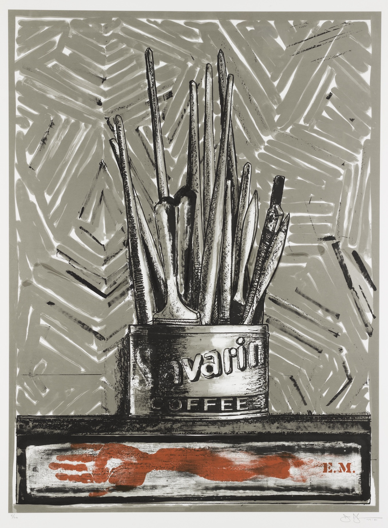
Jasper Johns, Savarin, Color Lithograph on Paper, 1977

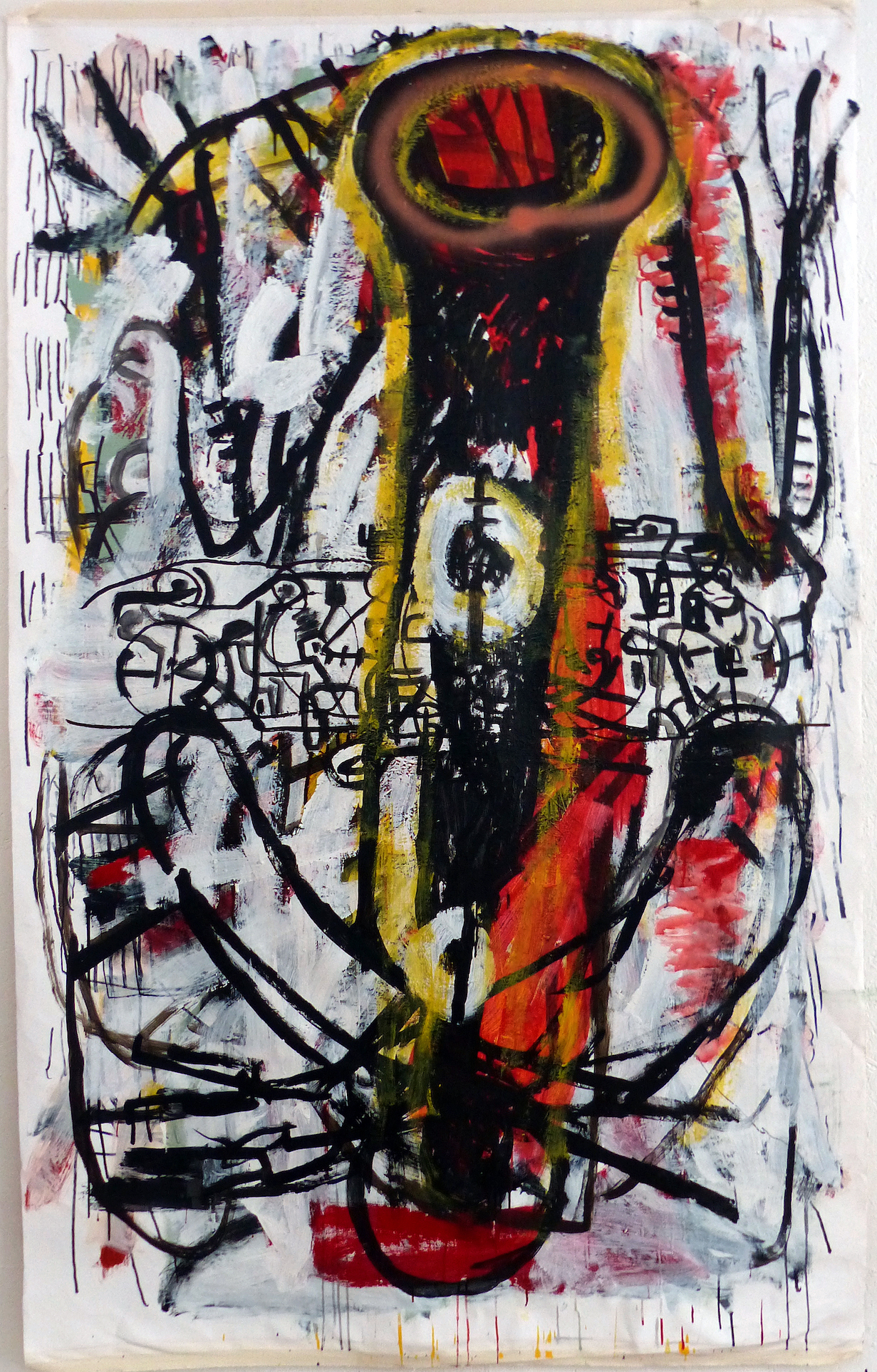
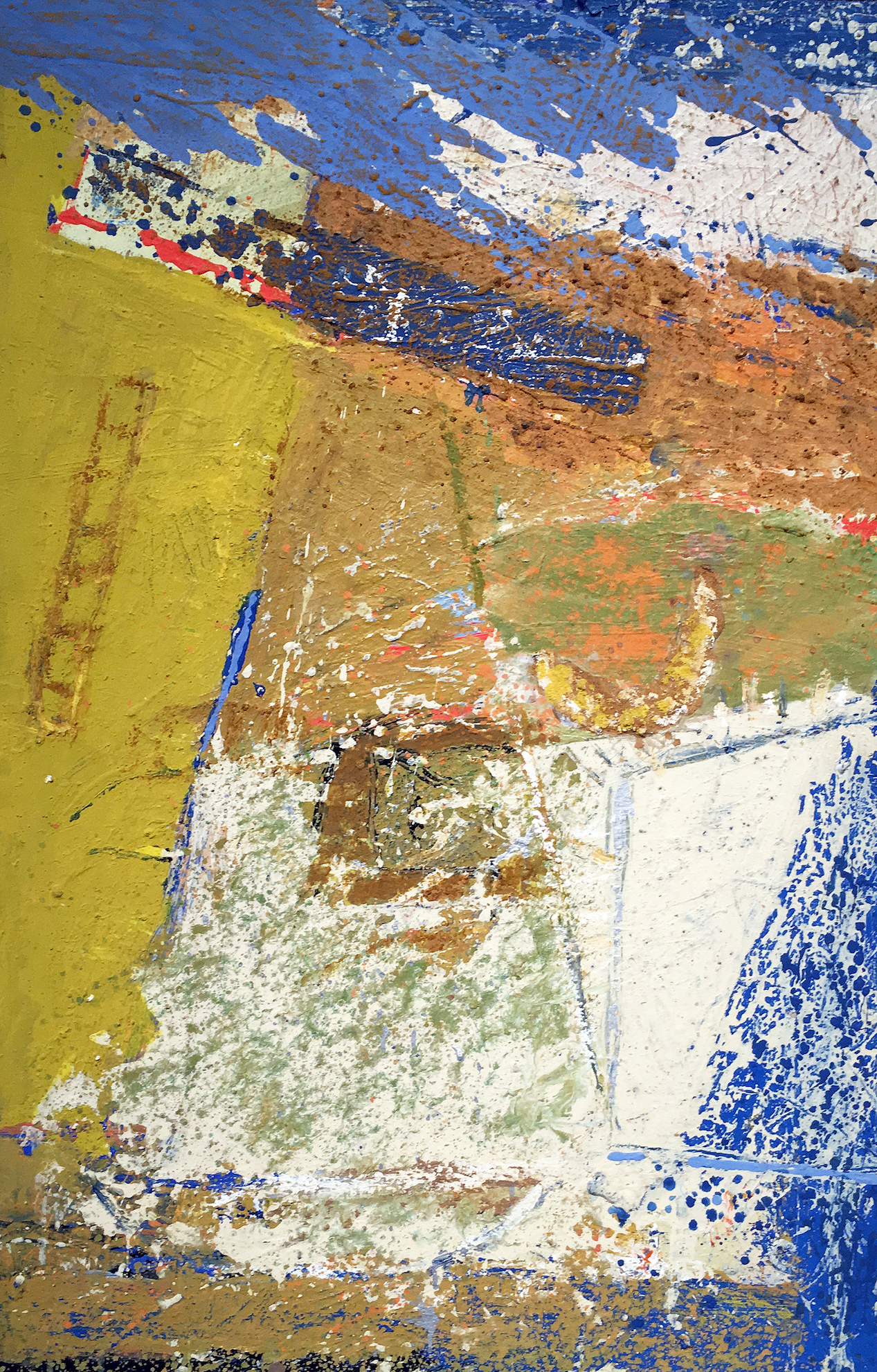
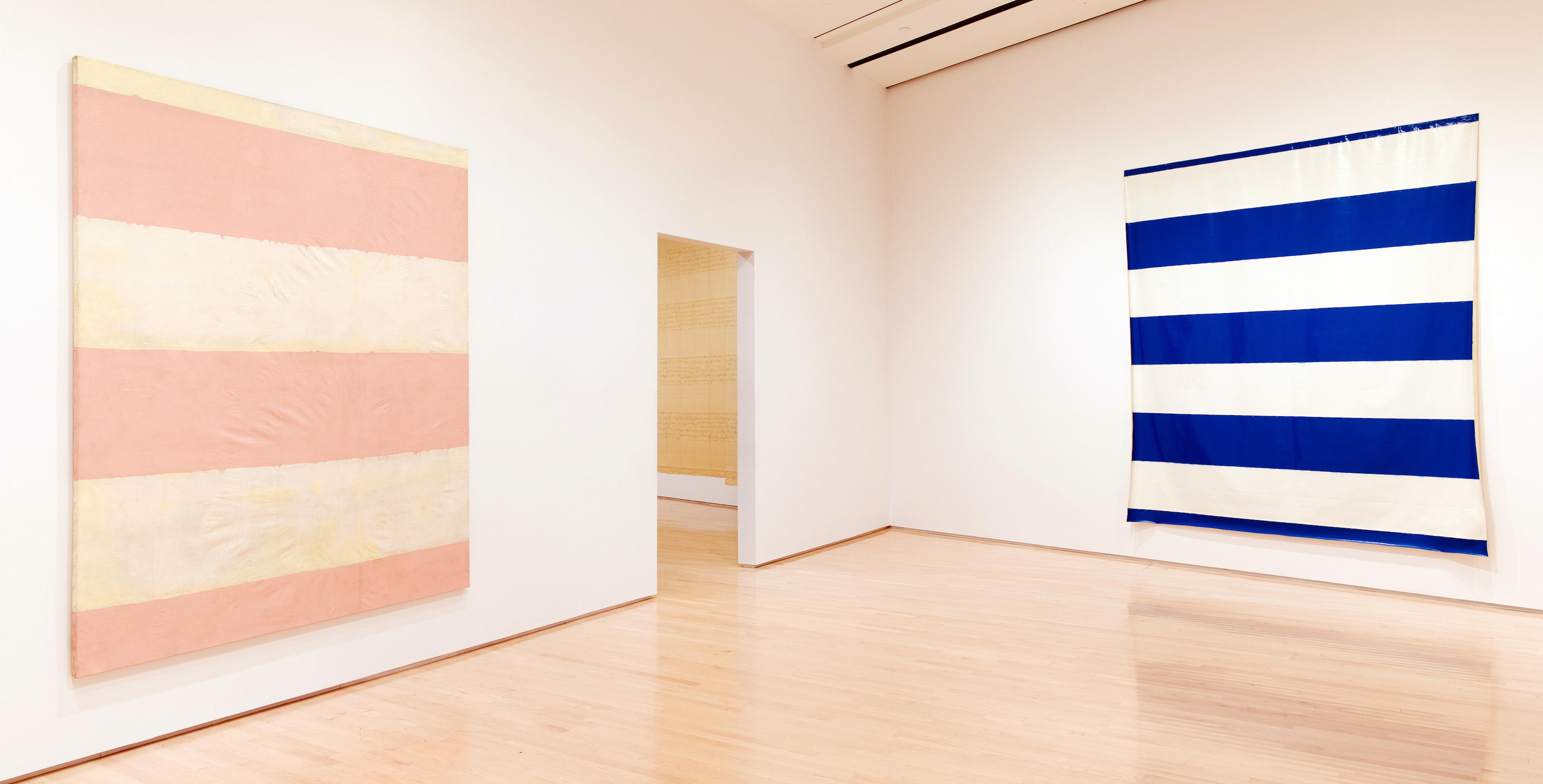
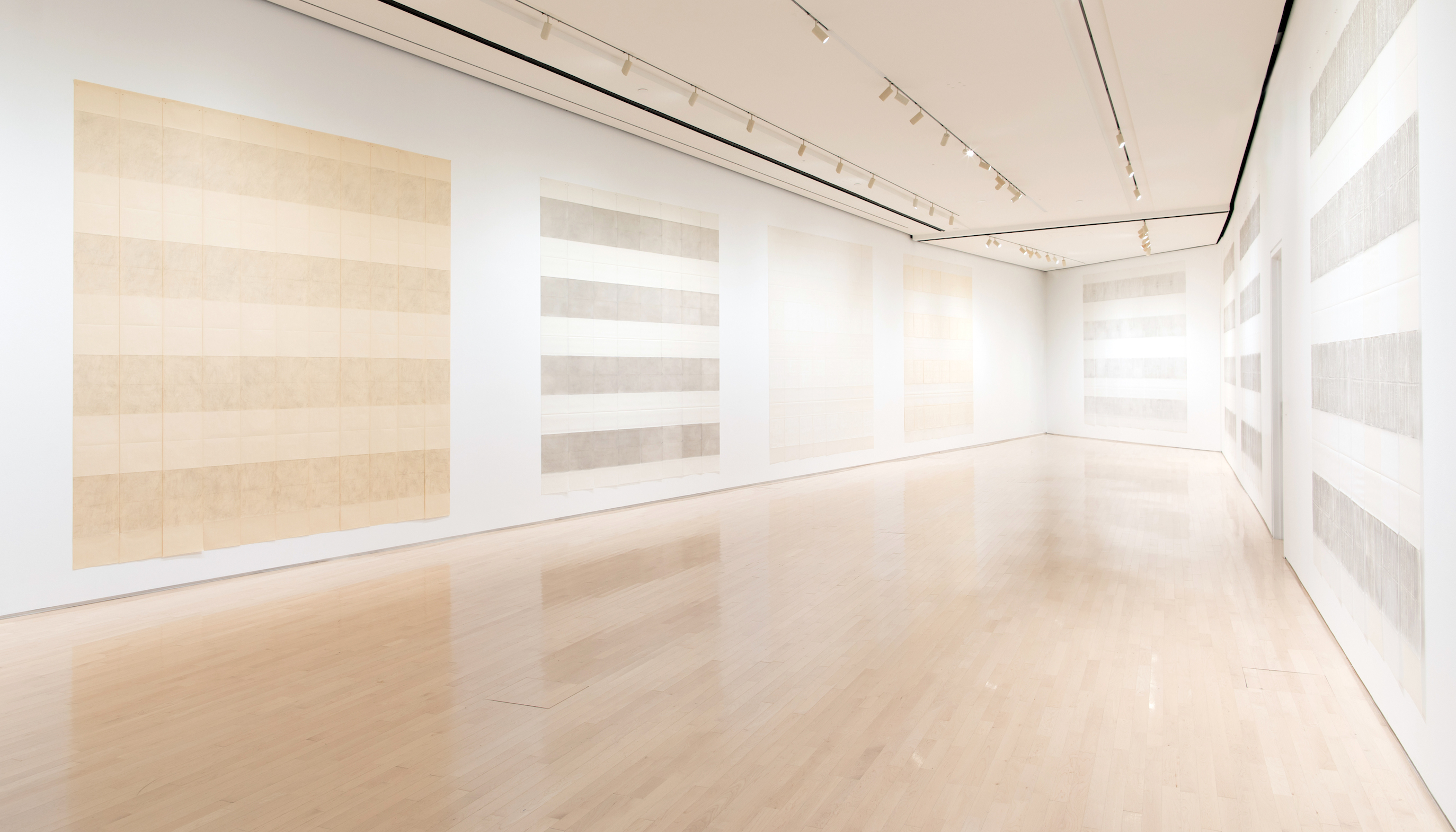
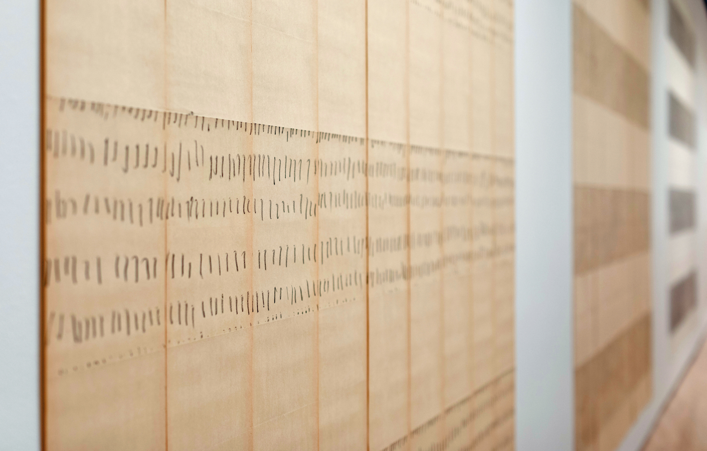
Exercising the Eye comfortably fills the UMMA’s large Taubman Gallery with a veritable Who’s Who of American Abstract Expressionism and Pop Art of the 60s and 70s, alongside a generous selection of works by artists perhaps underrepresented in the typical art-history survey.  An impressive spread of Rauschenberg’s works fills an entire wall, including diminutive aquatints and lithographs, a reminder that Rauschenberg produced far more than the “combines” for which he became famous. Nearly running the length of another wall is a suite of immersive,  large paintings by Grace Hartigan, a staple among America’s abstract expressionists and friend of Jackson Pollock, Helen Frankenthaler, and the de Koonings.  Hartigan worked both in abstract and figurative imagery, challenging Clement Greenberg’s vocal and uncompromising championing of pure abstraction, and here her immersive Tarzana applies frothy scribbles and uninhibited swaths of smack-you-in-the-face color to deliver the fleshy exuberance of a Renaissance Bacchanal translated into the vocabulary of postwar expressionism.

Other artists represented include Robert Motherwell, Adolph Gottlieb, Jasper Johns, and Philip Guston (the later represented with an original pen drawing advertising a show if his own paintings at the Gertrude Kasle Gallery).  Exercising the Eye perhaps suffers mildly  from a lack of thematic continuity beyond its works having been collected and exhibited by Gertrude Kasle, shrewdly perceptive as she may have been.  But its strength rests on the admirable willingness of Kasle to acquire and exhibit works by worthy artists that had yet to attain household-name status, and this exhibition is a markedly inclusive reflection of the climate of postwar American art, which often seems mischaracterized almost as a sort of boys-only club.

The Treachery of Images

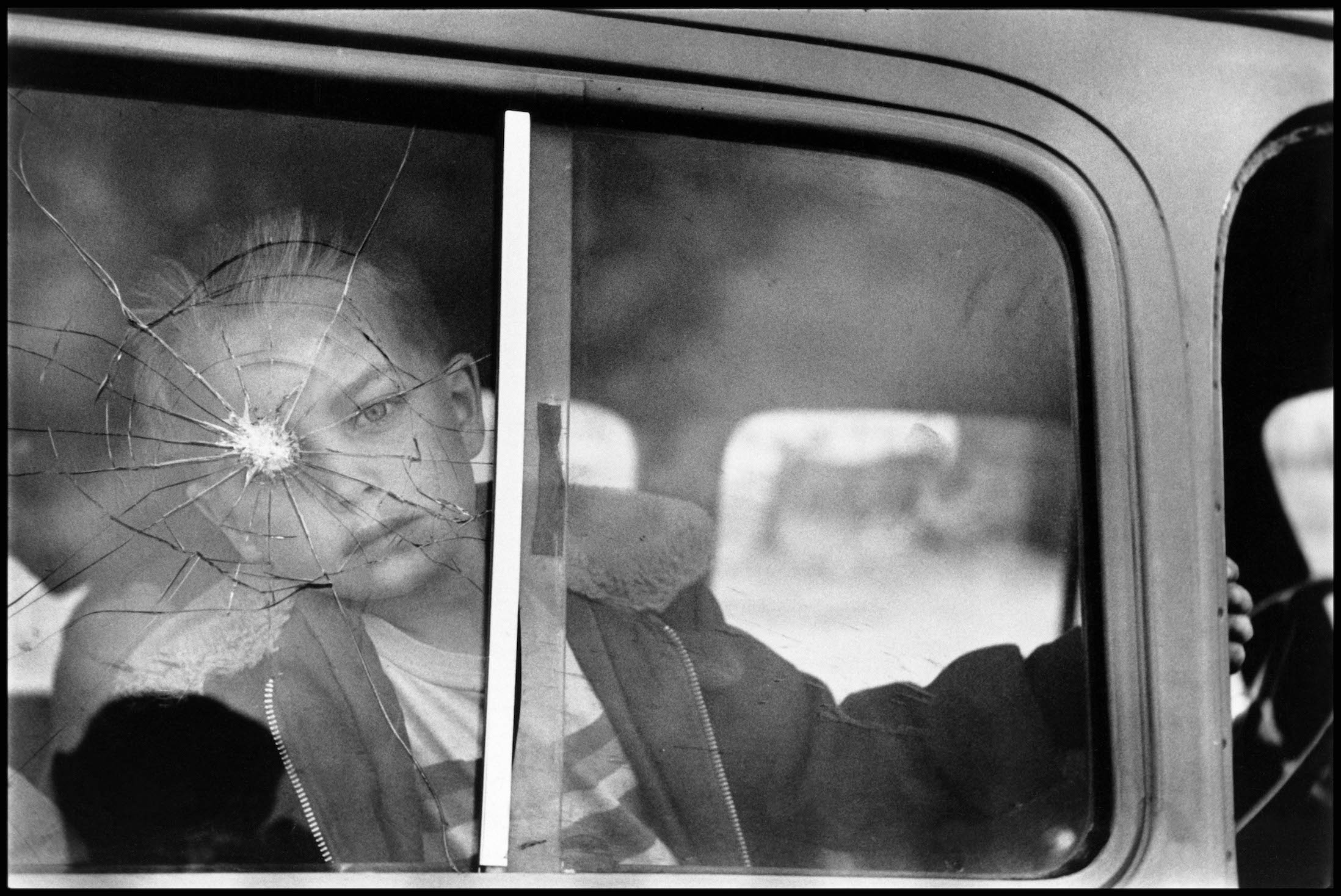
Elliott Erwitt, Cracked Glass with Boy – Colorado, Gelatin Silver Print, 1955

Concurrent with Exercising the Eye, the UMMA is also presenting a show of pictures in its photography gallery which collectively aim to “expose the contingent nature of reality” through a series of visually beguiling photographs, each guaranteed to procure a double-take from the viewer.  The exhibition, See Through: Windows and Mirrors in Twentieth-Century Photography, brings together an eclectic selection of images that visually pun on the nature of the image and in which nothing is quite as it seems.  It’s as if the visual devilry of Rene Magritte has been transposed into photography, and, impressively, all of it prior to the advent of photoshop.

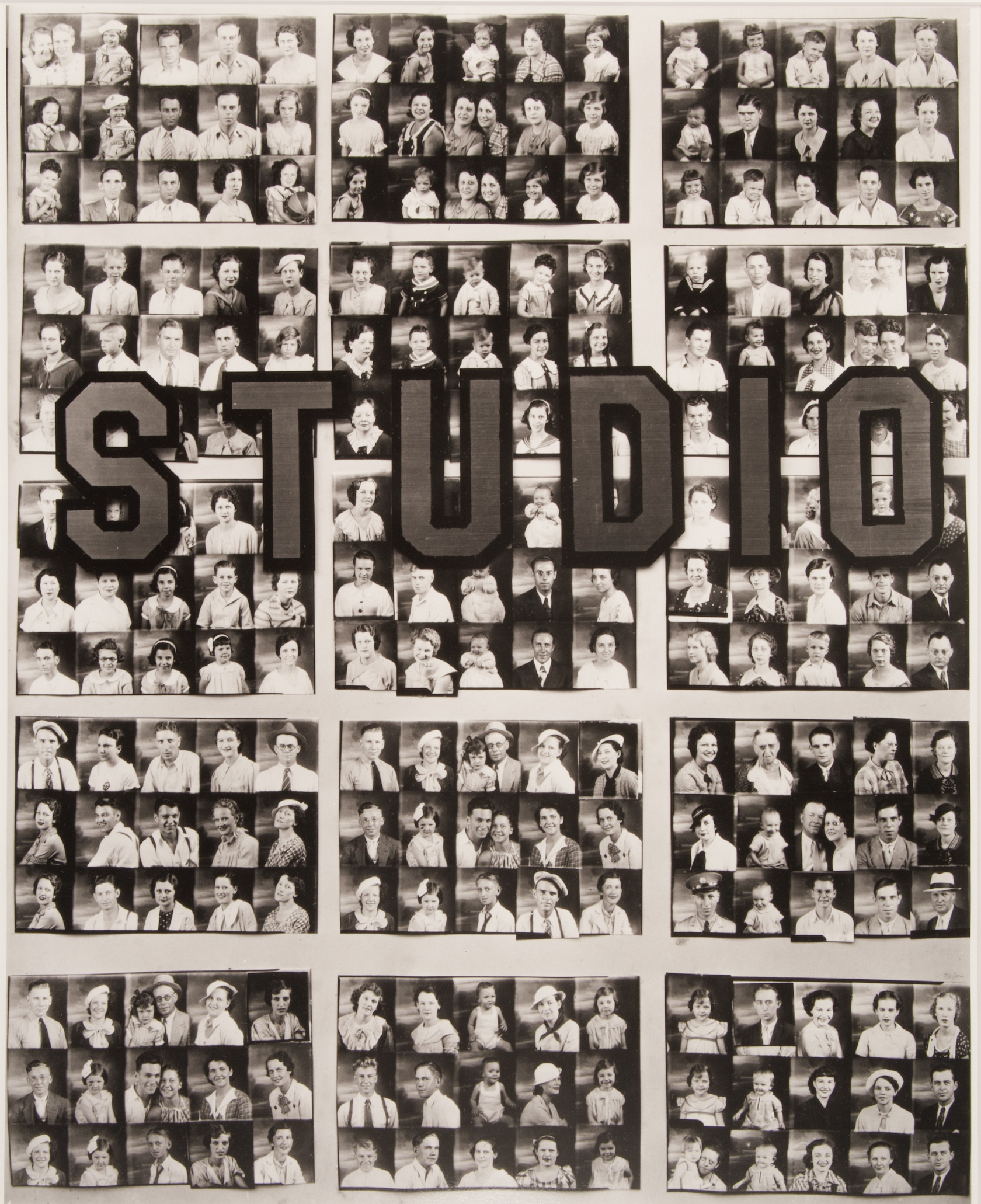
Walker Evans, Penny Picture Display, Savannah, Gelatin Silver Print, 1936

Walker Evans, generally known for his soul-wrenching portraits of down-and-out Depression-era families of the American South, is here represented with an uncharacteristically lighthearted set of illusory images that seem to portray special depth where there is none.  A wry photograph of a mirror in a hotel lobby, for example, seems to open up a portal in the picture plain that leads to another room; of course, there’s nothing in front of the camera but wall and glass.

Several images make playful use of distortion caused broken glass.  Carl Chiarenza’s  Bat Windowpresents a smashed window, its break forming an ominous angular black hole resembling the shape an abstract bat; the encroaching field of black recalls the schematic of a Robert Motherwell painting.  And Algimantas Kezys’ fragmentated reflection of two silhouetted male forms staring into a shattered mirror seems cubist, like a much paired down version of Picasso’s Les Demoiselles d’Avignon.

Such a theme as this naturally opens the door to moments of subtle humor.  Robert Doisneau’s wonderfully mischievous  La Dame Indignée (“the indignant woman”) captures the moment a Parisian woman passes by a storefront window displaying a lascivious and revealing picture of a nude woman and gives the work a fiercely disapproving scowl.  The picture was part of a series for which Doisneau stealthily photographed the varying reactions of passers-by, with this indignant woman on one end of the spectrum, and a visibly enamored man craning in for a closer look, on the other.

See Through is a small exhibition, fitting in its entirety on two perpendicular walls on the UMMA’s third-floor atrium.  Nevertheless, While the primary draw of the show is visual, there’s a cultural resonance to these photographs which whimsically distort reality.  After all, the alarming spread of pseudo-news on social media has demonstrated that a provocative image divorced from context can easily pass itself off as truth, and this exhibition serves as a gentle reminder not to instinctively take images at face value.

University of Michigan Art Museum

Exercising the Eye:The Gertrude Tase Collection, through July 22, 2018

See Through: Windows and Mirrors in Twentieth-Century Photography, through September 23, 2018


Photorealism @ Flint Institute of Arts

From Lens to Eye to Hand: Photorealism 1969 to Today

Davis Cone, American, born 1950. State-Autumn Evening, 2002. Acrylic on canvas. 26 1/2 × 46 ½” Collection of John Gordon.

According to the ancient historian Pliny the Elder, two rival artists, Zeuxis and Parrhasius, once had a public competition to determine which of the two was the better painter.  When Zeuxis unveiled his painting of a bowl of grapes, the story goes that they were so realistic that birds approached the painting and pecked at it.  Convinced he had won, Zeuxis turned to his rival and asked him to unveil his painting.  But Zeuxis had been deceived; Parrhasius had merely painted a very realistic image of a veil, which had fooled not just Zeuxis, but everyone present, and he was thus declared the winner.  The tradition of hyper-realistic painting never died, and even in the 20thcentury when abstract expressionism took the world by storm, some artists chose instead to rebel against the rebels by creating paintings that rivaled photography in their realism.  Through August 12, a fine survey of the first and second generation of photorealist painters is on view at the Flint Institute of Arts, emphatically making the point that the realist tradition is alive and well.

Robert Bechtle, American, born 1932. ’73 Malibu, 1974. Oil on canvas. 48 × 69 inches, Meisel Family Collections, New York

The show snugly fills the spacious Hedge and Henry galleries at the FIA, and traces the history of photorealism from 1969 through the present.  The movement began in densely populated areas in America’s east and west coasts, and the subject matter frequently featured the stuff of urban life.  Early photorealist artists like John Salt and Robert Bechtle produced candid images of automobiles, going out of their way to not beautify the mechanized, industrial world of postwar America. John Salt’s Albuquerque Wreckyarddepicts a junkyard populated with abandoned cars.  Although the scene is unidealized, Salt flaunts his deft ability to connivingly translate reflective chrome surfaces into paint, and the effect is visually striking.  The painting also works as understated social commentary on consumption and waste.  Tom Blackwell’s arrestingly large paintings take a different approach, focusing instead on the aesthetics of the wiring and mechanical components beneath the hood.  His Indian’s Chopper Modified ’57 Harley offers us a close-up of the inner workings of a motorcycle.  Divorced from any frame of reference or context, the highly reflective chrome and the intricacies of the engine components almost become a work of abstract art.

John Salt, English, born 1937. Albuquerque Wreck Yard (Sandia Auto Electric), 1972. Oil on canvas. 48 × 72″, Meisel Family Collections, New York

This exhibition makes clear that there are different approaches to photorealism.  Some artists wanted their paintings to quite literally translate photographs into paint, replete with points of sharp focus in the foreground and blurring and distortion in the background.  Audrey Flack’s iconic 20thcentury vanitas Wheel of Fortune, is a good example.  And at almost ten feet square, this monumental painting is arguably the star of the show.  Other artists believed that painting could actually improve on photography.  Richard Estes’s cityscapes portray the world in extreme lucidity—both foreground and background retain crisp focus.  Strictly speaking, Estes is a photorealist, but his paintings certainly don’t look like photos.

Audrey Flack, American, born 1931. Wheel of Fortune, 1977–1978. Acrylic and oil on canvas. 96 × 96″, Parrish Art Museum, Water Mill, New York. Gift of Louis K. and Susan P. Meisel, 2016.20

The show divides the exhibition into two sections, representing the first and second generations of photorealists.  Unlike the pioneers of the style, the artists of the second generation have more technology at their disposal, such as the use of computer software to assist in the transfer of a photo onto canvass.  The works of contemporary photorealists are every bit as satisfying as those of the pioneers of the movement.  Yigal Ozeri blows up small photographs into huge paintings, and his ability to convincingly translate the sparkly dance of sunlight striking ripples in Mediterranean waters into paint is virtuosic.  Perhaps the most convincing work in the show might ironically be the most passed-over, simply because it looks too deceptively real to even be a painting; in a witty demonstration of trompe l’oielwizardry at its finest, we’re deceived into thinking a cardboard box filled with money is resting under glass on a pedestal. It’s in fact a carefully-painted wooden sculpture.

Ralph Goings, American, born 1928. Miss Albany Diner, 1993. Oil on canvas. 48 × 72”, Heiskell Family Collection

The visual force of these works gets lost in translation when they’re photographed and reproduced in diminutive form in print or online.  Only in person, for example, looking at Richerd Estes’s Plaza, a cityscape crammed with busy details, do we see that the artist rendered the socks of a foreground figure with a few scribbled in, almost impressionistic brushstrokes.  And the playful ripples in Jack Mendenhall’s Pointe Hilton, when seen close, reveal themselves to be horizontal swipes of paint, bristle-strokes clearly visible.  I was reminded of Rembrandt who, in his 1654 portrait of Jan Six,shows the subject standing with gloved hands; but zoom in close on the gloves, and we see a calculatedly scribbled mess that might just as well be a detail from a de Kooning abstraction.  So while the artists on view are unmistakably contemporary, the tradition in which they work extends through the centuries all the way back to the likes of Zeuxis and Parrhasius.  And From Lens to Eye to Hand emphatically makes the point that even in a world oversaturated with photographic images–  almost exclusively in the form of advertisements– traditional painting triumphantly retains its enduring relevance.

Flint Institute of Arts: From Lens to Eye to Hand: Photorealism 1969 to Today – through August 12, 2018


Michael Luchs @ MOCAD

Michael Luchs: Fictitious Character

Installation view, Michael Luchs: Fictitious Character, Museum of Contemporary Art Detroit, 2018 Foreground, Rabbit Sculptures, Wood, wire, steel, paint, c. 1980 Image Courtesy of Simone DeSousa Gallery.

Even veteran observers of the art of Michael Luchs might be knocked back by the opening salvo of the artist’s exhibition just unveiled at the Museum of Contemporary Art Detroit (MOCAD). A line of three- dimensional assemblages of entrapped rabbits (c. 1980), six in all, forms a kind of phalanx to be threaded as one enters the first gallery. This introductory cluster of immobilized rabbits, recently unmoored from their long-term, outdoor habitat in the upstate woods of Lewiston, Michigan, and moved indoors, populated the grounds of the home and studio where the reclusive artist lives and works.

The circular spray of white on each, front and back, adds a spectral quality to their presence and long-term, al fresco durability. Larger than life and rail thin, the assembled effigies, surrounded by a wall mounted menagerie of yet more denizens of woods and ponds–rabbits, plus frogs (all c. 1988 – 2000), not only reinforce impact but testify to the indefatigable practice of Luchs, an artist seemingly devoid of fallow intervals of invention.

At long last, sighed one patron at the debut, a mini-retrospective of Luchs’s decades-long career and gloriously resilient vision. Curated by Elysia Borowy-Reeder, and assisted by Robin K. Williams, “Michael Luchs: Fictitious Character” will be on view for nearly three whole months.

Fresh insights abound in this deployment of two of Luchs’s animal surrogates: furry, silent, horizontally poised rabbits counterpointed by vertically splayed, speckled, croaking frogs. Rabbits, one might conjecture, are easy to like and therefore lend themselves to empathetic audience responses, whereas frogs, who live in watery muck and scum, less so. (Bears and squirrels also romp and gambol in Luchs’s portrayals of forest dwellers, but have gone missing here.)

Michael Luchs, Untitled Rabbit Painting, Mixed paints and metallic paints on paper, c. 2000

The aforementioned cluster of introductory rabbits seems particularly fraught, each pinioned between crisscrossed planks of weathered wood and concentric circles of barbed wire, well-nigh inescapable barriers for comparatively small, frisky, and wily animals who might usually wriggle free under less restrictive, over-the-top barriers. Alternatively, when free of restraints, and depicted in lush, pastel pinks or blues accented with gold and silver, as in Untitled Rabbit (c. 2000), one of four on view), they recline calmly and passively, yet embedded within each is a pistol implying a weapon of their own demise, or mayhap a defensive weapon tucked behind their deceptively placid demeanors.

Michael Luchs, Untitled Rabbit, Mixed metallic paints and paint on vinyl, 1988

Another rendering, of an Untitled Rabbit (1988) outlined against a night sky, appears, despite its relatively modest scale, beguilingly bejeweled and monumental, its contours firmly etched against an enveloping darkness. Peppered with a plethora of holes the size of a paper punch, it nevertheless evokes stability and self-possession, albeit rendered on a heat-wrinkled length of sheet vinyl.

Michael Luchs, Untitled Frog, Mixed paints and cloth on linen, 1994

Luchs’s versions of gigantic, totemic frogs are also standout images that hold their own in the capacious, high-ceilinged expanse of MOCAD’s repurposed commercial building. Untitled Frog, from 1994, its body splayed and upright (two akimbo legs and webbed feet squeezed in at top and bottom), and towering nearly eight feet, has been dotted with a pattern of random, irregular patches of red-orange fabric. The bird’s eye view suggests a sunning frog or perhaps a captured, spread-out amphibian whose rotund body outlined with broad swaths of black pigment evoke its skittering, leaping motions.

Michael Luchs, Trumpet Frog #2, Mixed paints and marker on canvas, 2018

In two of the most recent frogs in the show (2018), their bulbous bodies and spasmodic legs have been overlaid with a trumpet extending from mouthpiece to bell, as if to signal that the noisy, raucous vocalizing of the frog is akin to the martial timbre of a blaring trumpet. In Trumpet Frog #2, a red tongue-like shape emerges from the bell of the trumpet as if to humanize the sound a visitor might hear issuing from the instrument, undertones surely consonant with the sensibility of Luchs who, as  his statement emblazoned on the gallery wall affirms, has wrought an art of “resilience…searching…absurdity…humor…[and] seriousness.”

Michael Luchs @ MOCAD through July 29, 2018


McArthur Binion Curates @ Hill Gallery

Installation image, McArthur Binion Cruates @Hill Gallery, 2018

Hill Gallery in Birmingham, Michigan, opened a group exhibition curated by McArthur Binion on May 4, 2018, representing five Detroit-based artists.

Although Binion and I were at Wayne State University in the early 70s, I was not very familiar with his work until I saw his exhibition last July representing the United States at the 2017 Venice Biennale. It was a powerful exhibition, and like many successful artists that fit the modernist profile, Binion makes work that is a study in oppositions: line and shape, figure and ground, image and abstraction, copy and original, color and black & white. His modus operandi is to somehow magically blend an assault of binaries into a single, unified emblem of the unique and complicated self. Although the laconic grids resonate with this viewer, I walked out of the exhibit thinking about the influence of the cross-hatch marks by Jasper Johns.

After earning his BFA from Wayne State University, Binion went on to complete his MFA at Cranbrook Academy of Art and became a professor of art at Columbia College since 1992. He describes his minimalistic abstract paintings as “Rural Modernist.”  Is he referring to being born on a cotton farm in Macon, Mississippi where he was exposed to the West African textile designs in his mother’s quilts? Possibly.

Allie McGhee, Step’n Off, Mixed Media, 36 x 24″, 1990

I have written before in the Detroit Art Review about the veteran Detroit artist, Allie McGhee, when he exhibited at Detroit’s  N’Namdi Contemporary Art in April of 2016, where he had a large solo exhibition, Now & Then, alongside work by Carol Harris, also in this Hill exhibition.  McGhee’s exhibition was majestic in the way he elevated shape, form and color with mixed media on paper and the works on canvas.  In my previous review,  I described McGhee as, “A Detroiter who attended Cass Technical High School and completed his undergraduate work at Eastern Michigan University in 1965, but he was born in Charleston, West Virginia.” McGhee describes his influences like so: “As an artist I have always been inspired by the diverse rhythms of our environment,” he says. “It has been a great reserve of energy for my work. In my recent works instead of seeing the natural world as a rational observer, I see if from within as if through a telescope or microscope.”

Throughout the evening, I kept returning to his mixed media work, Step’n Off  because it just kept growing on me.  The composition leads the way on this vertical abstract expressionistic painting with a strong unconventional structure created by the use of space, shape and color.  The under-painting, with accents of primary color, provides a kind of intuitive support for the overall painting. The only reference to something vaguely representational is a small ladder, an icon that suggests a climb and the thin solid rectangle that repeats itself. McGhee says he favors using sticks to apply paint rather than brushes. Rejecting the brush, he pulls and scrapes the paint across his material, whether it is canvas or paper. The action of the stick allows McGhee’s hands to interact with the paint and the surface in a visceral way, where the thin paint spatters as he arranges this lathe-like construction. Viewers might subconsciously ask themselves, Would I like to have this painting in my living space?  My answer is, overwhelmingly, absolutely

Carole Harris, Time and Again, Textiles, 37 x 43″, 2018

The first thing that jumps out from the work of Carole Harris is her choice of medium.   When I wrote about her work in April, 2016, I described it like this: “For visual artists who quilt, Harris’s work transcends the traditional expectations we think of when mentioning quilting. In a web-based reproduction, we see an abstract painting, dynamic in the use of color, line, shape and form. It’s only on closer observation that one realizes these are compositions executed using embroidery, stitchery and multiple patterns of cotton, silks and hand-dyed fabric.”  In this viewer’s experience, especially in the Detroit area, this artist leads the way in creating abstraction using a large variety of cloth materials and stitchery.

Harris says , “My work relies on improvisation. I am fascinated by the rhythms and energy created when I cut and piece multiple patterns. I let the fabric and color lead me on a rhythmic journey. My intention is to celebrate the beauty in the frayed, the decaying and the repaired. I want to capture the patina of color softened by time, as well as feature the nicks, scratches, scars and other marks left by nature or humans.”

Glen Mannisto wrote for the Detroit Art Review about Carole Harris’s solo exhibition at UofM NCRC Rotunda Gallery,  “As a child growing up in Detroit, Harris was taught embroidery and stitching by her mother, and, being “height challenged” and quite petite, she learned to make her own clothes so they would fit properly. In high school at Cass Tech she studied music and science before settling on art, and, after graduating from college in 1966, she began an interior design practice that she maintained until recently.”

Addie Langford, Mint/Red/Oso, Acrylic and Domestic Textile on Board, 2018

Langford’s large, abstract expressionistic painting, Mint / Red / Osois is acrylic paint over domestic textile on board. The stroke work reminds this viewer of a cross between Sean Scully and Franz Kline with textiles as a backdrop. The diptych is powerful in its structure, execution and attraction to the vertical flow of dripping paint.  Langford earned her BFA in architecture at the Rhode Island School of Design and her MFA from Cranbrook Academy of Art. I became familiar with Langford’s work when she exhibited a solo show at the Simon DeSousa gallery with these semi-transparent white bars and controlled vertical drips of paint. One wonders what four years of architecture study does to an artist who wants to make things with her hands in a rigorous process of trial and error. On her web site she mentions McArthur Binion as an influence, and this writer notices some of her earlier work came from N’Namdi Contemporary Gallery in Miami.

James Franklin, Untitled, Acrylic, Epoxy, Aluminum, and Sealed Rigid Wrap on Foam, 23 x 25″, 2018

Part of the Binion show is another artist earning his MFA from Cranbrook Academy of Art, James Benjamin Franklin.  Currently living and working in Detroit, Franklin was recently in a group show at the Galerie Camille in midtown Detroit, and a solo show at Reyes Projects in downtown Birmingham.  His small work, Untitled is acrylic, epoxy and aluminum, sealed in a rigid wrap on foam and typical of his recent work. These works feel like naïve abstraction relying heavily on primary color and simple shapes.  Occasionally he inserts a grid or web into his form. This younger artist’s work feels early in its development.

Tiff Massey, Spring Prototype I, Steel, 39h x 39w x 14″ 2017, Image courtesy Hill Gallery

Again, Binion turns to his alma mater Cranbrook Academy of Art with work by Tiff Massey, who earned her Bachelor of Science from Eastern Michigan University, and a Master of Fine Arts in Metalsmithing at Cranbrook Academy of Arts. This early educational path in the sciences differs from other artists but seems to have migrated to metals and on from that point to various art forms.

The floor sculpture, Spring Prototype 1 is coiled steel rod, maybe half inch in diameter and reminds this viewer of playing with a slinky as a child. Most importantly this work moves beyond plain and simple as its graceful and cultivated design leaves the viewer wanting to see more.

Massey says, “My experience with jewelry became my gateway to other media, to a larger perspective, and to making large-scale sculpture, always with a consistent emphasis on adornment. What happens when the viewer becomes adorned and how does the environment facilitate that transition from the unadorned to the adorned? How does the context and placement of an object influence an individual’s perception of self? The work first seduces the viewer, creating a desire to take, touch, and activate.  Once activated the pieces immediately create a sense of confidence in the wearer, producing an increased desire to show off and be seen.  Whether it is a sculpture on a wall, an object set in an outdoor landscape, or jewelry worn by the viewer, my work maintains an engagement of the body itself.”

The Hill Gallery opened its doors in Birmingham, Michigan in 1980 and has offered contemporary art representing sixty artists, both nationally and internationally recognized, along with an exceptional American Folk Art collection.

McArthur Binion Curates @  Hill Gallery runs through June 16, 2018

Michel Parmentier @ MSU Broad Museum

In 1966, Andy Warhol was churning out silkscreens of electric chairs and car accidents, the Fluxus movement had given the world zany performances by the likes of Joseph Beuys and Yoko Ono, and Lichtenstein’s punchy Whams! and Bams!sprawled across gallery walls by the yard.  Against this cacophonic backdrop, when Michel Parmentier debuted his understated, monochromatic canvasses of painted blue stripes, they might hardly seem particularly radical, yet “radical” is precisely how Parmentier’s work is often described.

Through October, Michigan State University’s Broad Art Museum allocates its whole second floor to exploring just what might be so groundbreaking about Parmentier’s work.  The exhibition brings together 30 representative works spanning the artist’s career, along with rare texts authored by the artist. These allusive minimalist canvasses reveal the consistency of the artist’s philosophy, which remained largely unchanged from his early experiments in the 60s to the works he created just prior to his passing in 2000.

Michel Parmentier, installation view at the MSU Broad, 2018. Photo: Eat Pomegranate Photography

Parmentier didn’t want his painting to be about anything other than the physicality of paint itself, so he abandoned subject matter.  His work was guided by an almost religious adherence to the pliagemethod, for which he prepared a large un-stretched canvass by folding it like an accordion in increments of 38 centimeters. He’d then spray-paint the exposed surface, unfolding it to reveal visceral horizontal creases and painted bars in monochromatic, horizontal blue stripes.  The creative act was thus reduced to a nearly-mechanical process.

At first, his works might seem to rhyme with the striped paintings of Anges Martin. But Martin’s chromatically subtle works are warm, nuanced, and serene, while Parmentier’s have the impersonal detachment of an improvised painted banner advertisement. He worked in only one color each year. Wishing to disassociate his bars of color from any implied symbolism or personal significance, he’d change the color annually, switching from blue to gray in 1967, and finally to red in 1968.

Michel Parmentier, installation view at the MSU Broad, 2018. Photo: Eat Pomegranate Photography

Parmentier joined forces with several other French painters (Buren, Mosset, and Toroni, collectively calling themselves BMPT), but broke from the group in 1967, perhaps believing the other artists were becoming too reactionary.[i]  In 1968, he stopped painting altogether, not producing any art again for fifteen years.

When he resumed in 1983, he integrated some variety in texture and media.  Color disappeared altogether, replaced with varying values of graphite-gray or barely-discernible, creamy white.  And in place of canvass, Parmentier began stapling together individual sheets of disconcertingly cheap printing paper.    In addition to paint, he explored pastel, charcoal, and pencil.  We even see trace elements of the artist’s hand start to emerge: rather than apply paint with a spray can, Parmentier took to scrubbing in his horizontal stripes with pastel, or applying thousands of neatly-arranged horizontal graphite marks.  But his later works never strayed far from that which he produced the 60s.  They invariably retained the same folded horizontal creases at 38cm increments, and they defiantly refused to be anything other than self-referential.

Michel Parmentier, installation view at the MSU Broad, 2018. Photo: Eat Pomegranate Photography

The Broad Art Museum’s retrospective compartmentalizes the artist’s work chronologically, beginning with his earliest blue, gray, and red paintings from the 60s.  As the artist intended, they’re unframed and affixed to the wall only at the top, making his paintings almost look like linens hanging up to dry.  An adjacent gallery displays a large selection of the artist’s writings and projects a one-channel video showing the artist preparing a canvass using his signature pliagemethod, giving us a sense of the mechanical rigidity of his working process.

A third gallery space is devoted to his later works, generally consisting of many sheets of paper affixed together, marked with graphite or pastel.  Here, viewers can see elements that get lost in translation when his work is reproduced in photos.  Easily missable (even in person) are the dates he’d stamp repeatedly on the hem of each work; if a piece took him several days, we’ll see several dates, each stamped on the relevant section of the image.  It’s an element that recalls the conceptual paintings of On Karowa, who famously produced paintings of the day’s date, always painted in white against a black background.

Michel Parmentier, installation view at the MSU Broad, 2018. Photo: Eat Pomegranate Photography

In a letter to a friend, Parmentier once wrote, “To work without producing is undoubtedly one of the finest ideas there is […], not to work at all is another.  Detachment from everything is a third.  Being interested in everything without actively drawing any conclusions—simply doing, rather—seems to me very good.”[ii]It’s a philosophy which certainly informed his work, which always remained intentionally disengaged and aloof.  So it’s to the Broad’s credit that it took a chance on organizing an exhibition exploring such an esoteric artist.  And while this may lack the punchy visual theatrics of some of the Broad’s previous shows, it carries some historic weight as the artists’ first ever retrospective in the United States.  Furthermore, one really does need to see Parmentier’s oveurein its entirety to grasp the unflinching consistency of his desire to produce art which, as one critic intoned in 1967, “simply exists.”

Michel Parmentier @ MSU Broad Museum through October 7, 2018

Page 27 of 45

Powered by WordPress & Theme by Anders Norén