Critical art reviews of Detroit galleries and museums weekly

Category: Sculpture Page 18 of 26

Rodin @ Flint Institute of Arts

An Exhibition from the Gerald Cantor Foundation

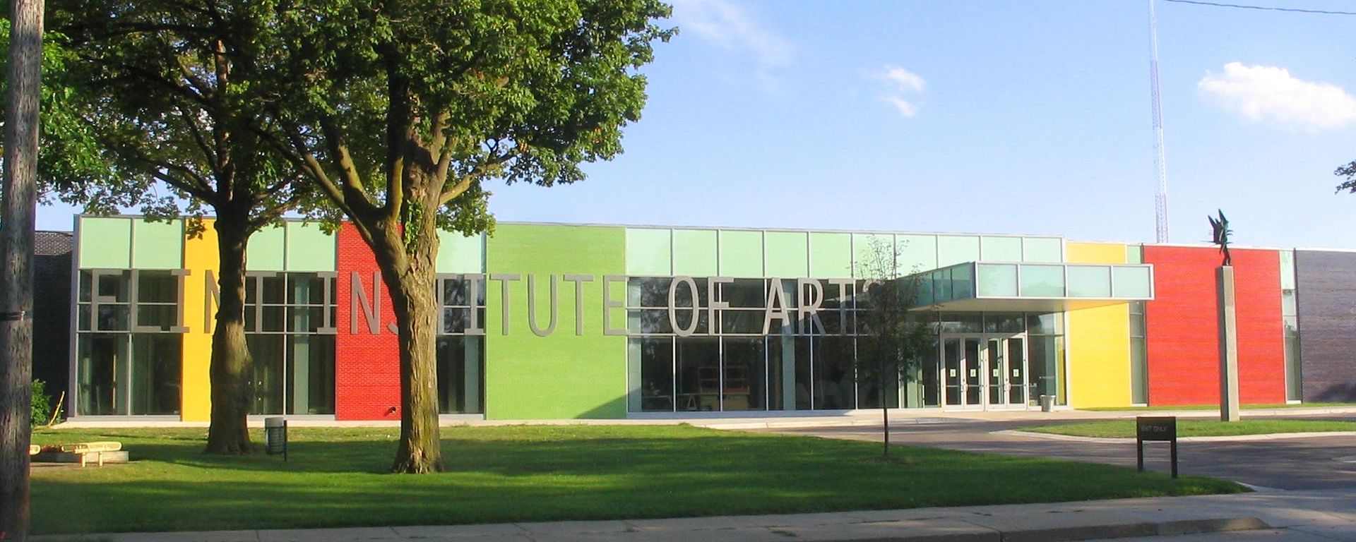
Installation Image Flint Institute of Art

Fresh out of the army, in 1946 Gerald Cantor purchased a bronze version of Rodin’s The Hand of God, thus beginning what he called his lifelong “magnificent obsession” with Rodin. Today, with over 750 sculptures and drawings in its collection, the Iris and B. Gerald Cantor Foundation boasts of the world’s largest private collection of works by the artist, the majority of which have been gifted or loaned to museums throughout the world. Rodin, The Human Experience, on view at the Flint Institute of Arts, is a muscular exhibition of 45 sculptures on loan from the Cantor Foundation, offering an impressive survey Rodin’s artistic career. Expect to see more Rodin in one place than nearly anywhere else this side of the Atlantic.

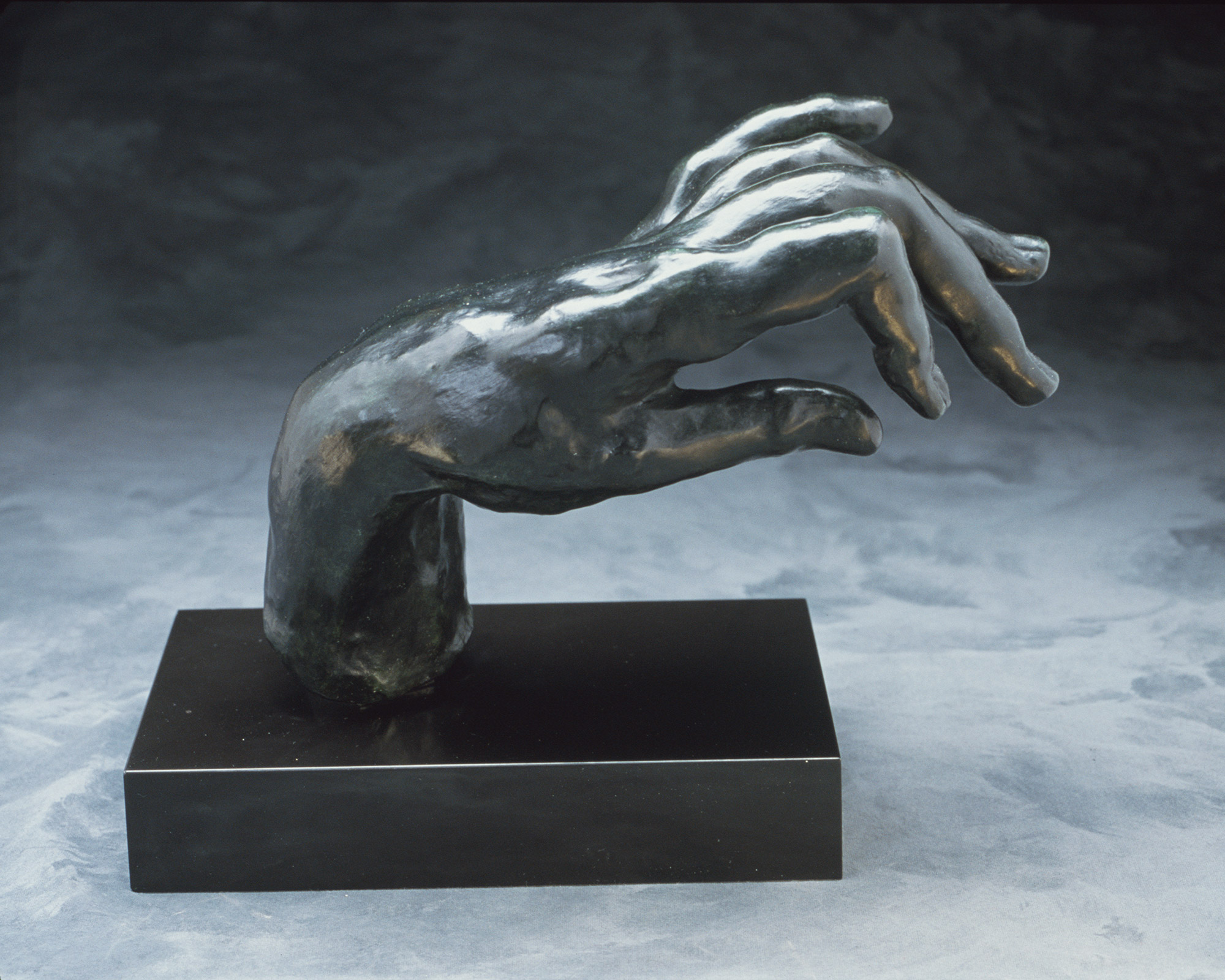
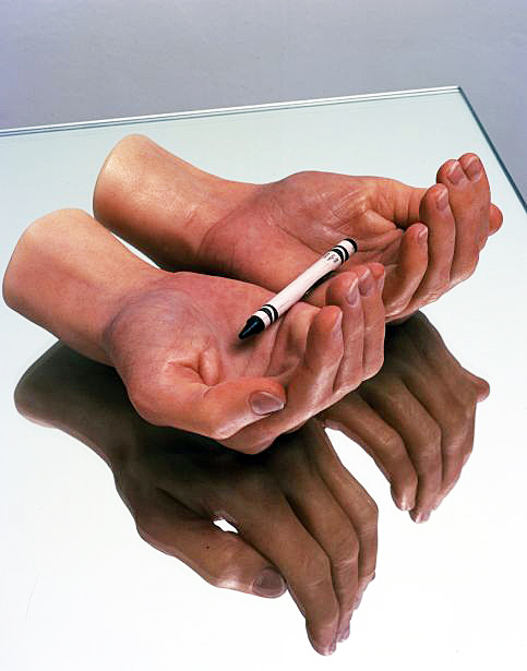
Auguste Rodin, French, 1840-1917, Large Hand of a Pianist, modeled 1885, Musee Rodin, cast 9, 1969

Rodin possessed an uncanny knack for creating emphatically expressive sculpture, even when the sculpted forms were merely a clutching hand or straining torso. They surge with energy, and the surfaces of his figures were left calculatedly rough, so as to catch the light and imbue a sense of movement. They need to be seen in the round, and, thankfully, nearly all the works on view are thoughtfully displayed for viewing from multiple sides.

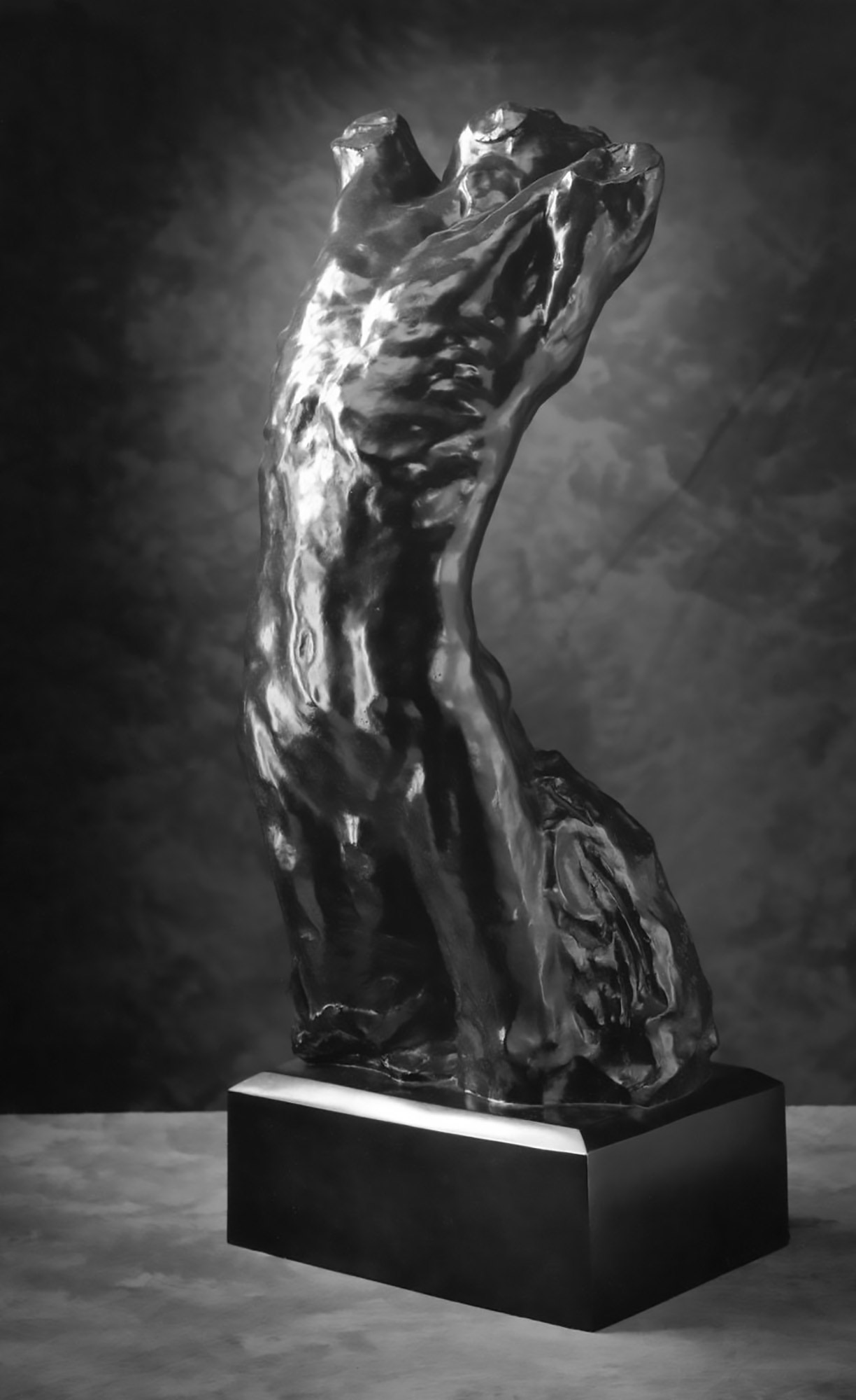
Auguste Rodin, French, 1840 – 1917, Narcisse, modeled about 1882,enlarged and retitled 1890; Musée Rodin, cast 8/8 in 1985, Bronze, 32 × 13 × 12 1/4 inches. Lent by Iris & B. Gerald Cantor Foundation.

The exhibition comfortably fills the spacious Hodge Galleries with works both large and small. Some of the most interesting sculptures, in fact, are the wispy, diminutive studies Rodin made—never intended for display—which reveal how he worked out compositional problems. These offer a glimpse at his working process.

The Gates of Hell was his breakout masterpiece, and the teeming cascade of figures which writhe on its surface served as inspiration for many of his subsequent works, like The Thinker, which in its original state, was perched high on the doors, meditatively and dispassionately contemplating the inferno below.

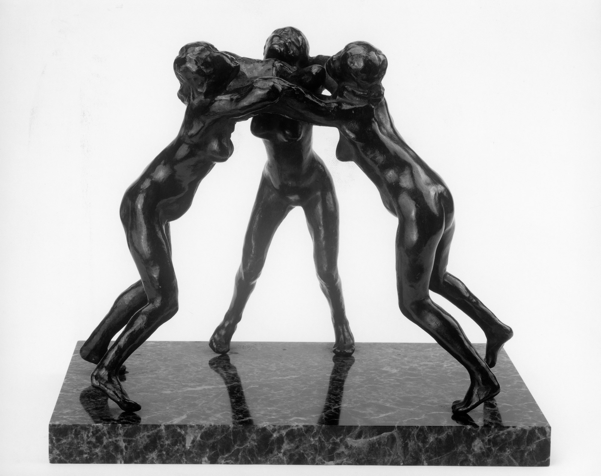
Auguste Rodin, French, 1840 – 1917, Three Faunesses, modeled before 1896; Musée Rodin, cast in 1959, cast number unknown, Bronze, 9 1/4 × 11 1/2 × 6 1/2 inches. Lent by Iris & B. Gerald Cantor Foundation.

Several studies for Rodin’s triumphant posthumous monument to Balzac are on display; one of his most iconic works, Rodin obsessed about getting the likeness correct, going so far as to arrange for Balzac’s tailor to make a suit of Balzac’s dimensions; this was worn by a model who was a dead-ringer for the author himself. In the end, though, Rodin sculpted Balzac shrouded the monk’s robe he famously wore as he wrote.

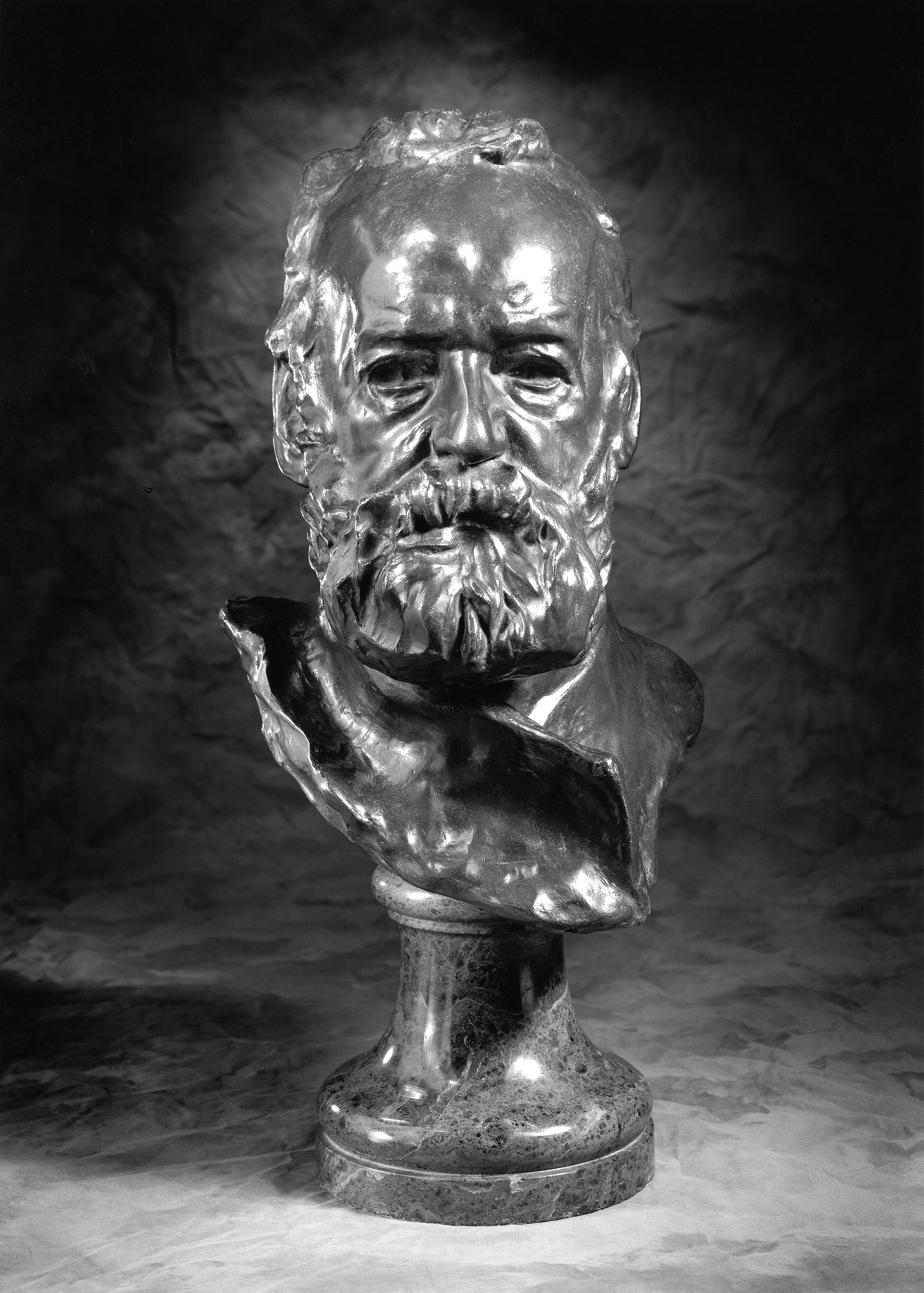
Auguste Rodin, French, 1840 – 1917, Bust of Victor Hugo, modeled 1883; cast number and date unknown, Bronze, 17 × 10 1/4 × 10 3/4 inches. Lent by Iris Cantor

There are several studies for the Burghers of Calais, a project that now seems ideally suited for Rodin, though it was poorly received at its unveiling. The emotionally charged ensemble depicts a group of citizens of Calais about to sacrificially offer themselves to the English, who during the Hundred Years War, had laid siege to the city. Each man reacts differently; one, clasping his head, seems distraught. On the face of another we read steely determination. Their entire bodies viscerally respond to the emotional weight of certain death, and the ensemble allowed Rodin to fully explore sculpture as a vehicle for expressing emotion.

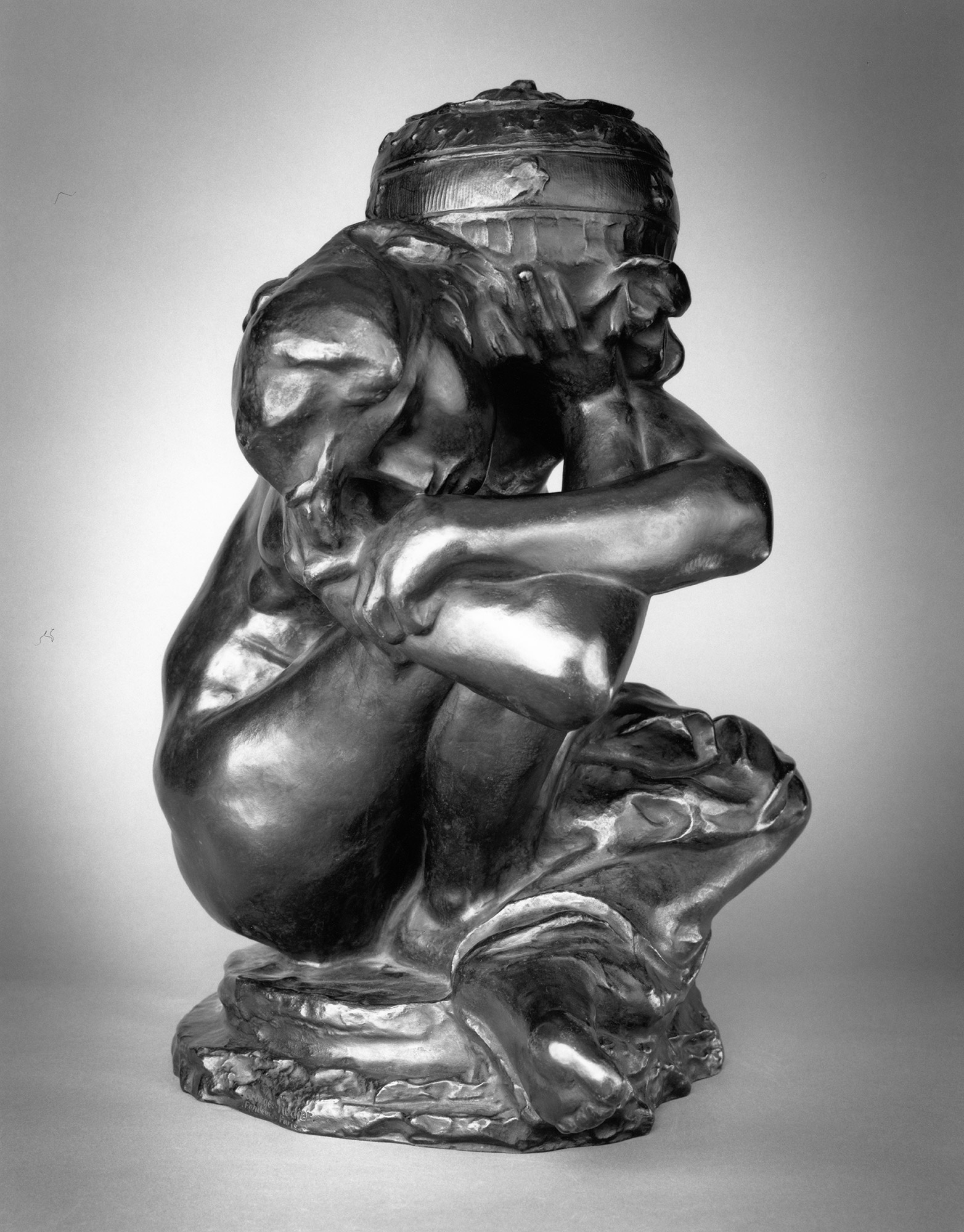
Auguste Rodin, French, 1840 – 1917, Fallen Caryatid with Urn, modeled 1883, enlarged 1911-17; Musée Rodin, cast 4 in 1982, Bronze, 45 1/4 × 36 3/4 × 31 1/8 inches. Lent by Iris Cantor.

When Sixteenth Century art historian Giorgio Vasari described Michelangelo’s sculptures as terribilita (“terrible,” in English), he certainly wasn’t insulting them; the word then meant what we might today describe as “awesome,” like a fearfully powerful thunderstorm.   It’s hard not to experience a streak of the same sensation as you stand in these rooms full of Rodin’s sculptures; they’re absolutely sublime.   The forty-five works which comprise this exhibition are an infinitesimally small fraction of Rodin’s prodigious output; nevertheless, they’re more than enough to support the assessment, made by many, that Rodin was, without question, the greatest sculptor of his time.

Flint Institute of Art   This exhibition has been organized and made possible by the Iris & B. Gerald Cantor Foundation. On exhibition through July 30, 2017


Suspended Disbelief @ Broad Museum, East Lansing

Transported Man Exhibition opens by New Director

Eli and Edythe Broad Art Museum at Michigan State University, East Lansing, MI

I once entertained aspirations of being a professional magician (I was never good, but at one point I could make all the faces of a deck of cards disappear, using a trick deck, admittedly). It’s likely for the best that I never pursued that career, but the Broad Art Museum’s Transported Man suggests that perhaps the world of art and that of magic aren’t that different. Both, after all, inexorably rely on the viewer voluntarily suspending disbelief.

The Broad’s new director, Marc-Olivier Wahler has a tough act to follow. The museum’s grand opening in 2012 featured works by art world heavyweights Andy Warhol, Joseph Albers, Anselm Kiefer, and Damien Hirst. The building’s architect Zaha Hadid even made an appearance. But, with over 400 exhibitions under his belt, Wahler capably delivers a conceptually interesting and visually arresting debut exhibition. His first show is an ambitious exploration of the relationship between art and viewer, and it brings together over 40 international artists, some quite familiar (Duchamp and Magritte) and others either emerging or mid-career.

The Transported Man derives its title from the magic trick of the same name, as depicted in the novel (and movie) The Prestige. Using magic as a motif, the exhibition, broadly speaking, explores the mutability of perception. Mundane items—magically—become art objects once placed in a museum. Furthermore, the exhibition tests the limits at which art can fool us. It certainly works. By the time you’re done on the second floor, you’ll have seen so much trompe l’oeil wizardry and visual sleight-of-hand that you’ll be thoroughly confounded as to what’s real and what’s illusory. The Broad’s counterintuitively shaped spaces, replete with walls that slant every which way, make the experience even more disorienting.

The Transported Man, all images courtesy of the Eli and Edythe Broad Art Museum at Michigan State University

Stepping into the first level exhibition galleries, visitors will be met with a wooden table hovering in air; it’s propped up by a fan set within the floor (there’s no attempt at hiding that), yet how the air current so firmly holds the table in place remains a mystery. But the elephant in the room is, quite literally, the elephant in the room. It freely hangs with its trunk clasped around a rope affixed to the ceiling. Possessing all the convincing texture of an actual elephant, it’s actually a polyurethane resin, polyester, steel, and fiberglass sculpture by Daniel Firman. There’s something strangely beautiful and visually satisfying about the suspended creature so improbably defying gravity. (Look up Firman’s elephants on the internet; they’ve appeared in all sorts of places).

Perhaps the most disorienting work in the show is Synchronicity, an experimental work by Robin Meier and Andre Gwerder. It’s a big, black tent inside a big black tent. Step inside both and suddenly you’re walking on (and smelling, quite strongly, in fact) soil and grass, the atmosphere has suddenly become hot and extremely humid, and it’s very dark. Real crickets happily chirp away (afterhours, the lights within turn on, mimicking natural daylight, and the crickets, cicadas, and fireflies erroneously think it’s day). The work explores how we can manipulate nature through electronic stimuli. Small electronic LED lights stimulate actual synchronistic fireflies, which under the impression that it’s a hot, muggy night, flicker in a pulsating rhythm. While far from the point of the installation, I couldn’t help but reflect on our own susceptibility to electronic stimuli/media which we increasingly accept at face-value as truth.

Upstairs, the visual and sensory theatrics continue. In the corner of one gallery space you’ll find weeds sprouting improbably from the floor. They’re actually steel sculptures by Tony Matelli, and seem so convincingly real that you really do have to fight the urge to reach out and touch them…just to check.

The Transported Man, all images courtesy of the Eli and Edythe Broad Art Museum at Michigan State University

One subtext of the show is the uncanny transformation of mundane objects into works of art. The point is most explicitly made with Piero Manzoni’s Magic Base—Living Sculpture, a wooden pedestal upon which people are supposed to stand, thus momentarily turning themselves into art objects (for this exhibition, however, viewers are asked to kindly refrain from turning themselves into art objects, and thus help preserve the original base, now over half a century old). This also seems to be the point behind the many non-functional air ducts installed throughout the museum by Charlotte Posenenske, and the plywood plank (by Robert Gober) leaning against a wall. Visually, these works are uninteresting, but they nevertheless foster conversation about the nature of art, and in this respect they advance the goal of the exhibition.

The Transported Man, all images courtesy of the Eli and Edythe Broad Art Museum at Michigan State University


Perhaps ironically, the most conceptual part of the show may very well be The Transported Collection, a playfully inventive adjacent exhibition of works from the Broad’s permanent collection. About forty paintings and drawings hang on a wall in one of the Broad’s lower galleries, but without any obvious reference to their corresponding artists. The viewer is left in a quandary: which of these works are, in fact, generally recognized as great works of art? Stealthily tucked in the corner of the room are some laminated explanatory cards which identify the artists. I cheated and peaked; the list is impressive– Van Dyck, Picasso, Delacroix, Matisse, Giacometti, and others. But some of the most compelling works on view were by artists I’d not heard of, such as Federico Castelluccio, who fools the eye with a convincingly illusory painting of a torn up, wrinkled postcard of a Titian portrait which seemed to be taped back together and affixed to a wooden background. This small exhibition wittily questions the subjective process by which we determine what constitutes great works of art.

Jonathan Monk, Second Hand Daily Exchange, 2006 The Transported Man, all images courtesy of the Eli and Edythe Broad Art Museum at Michigan State University

Picasso famously said that art is a lie which points to the truth. He was right; after all, the overwhelming majority of art history is comprised of artists trying to fool us into seeing three dimensions on a two dimensional surface. But it’s while looking at illusory paintings that we’re made acutely aware of the beauty of the actual world…or the shortcomings of human nature, as the case may be. Art’s deception has a purpose; to paraphrase from Shakespeare’s Hamlet, it holds up a mirror to nature, and within that mirror’s distorted reflection, we’re more able to see ourselves.   So while the playful theatrics and visual punning makes The Transported Man an eminently enjoyable and accessible show, there’s substance behind the visual magic that speaks to art’s ability to nudge us toward beautiful, enduring– sometimes uncomfortable– truths

The Transported Man at  the Eli and Edythe Broad Art Museum at Michigan State University


Anderson & Youngblood @ Galerie Camille

Carla Andersen, West Fjords 5, Iceland, Archival pigment print, 30 x 40″ 2016

There is a striking contrast between the work of Carla Anderson, photographer, and Elizabeth Youngblood, abstract artist using various mediums, now on exhibition as Chosen Silences, opened in midtown Detroit, at Galerie Camille, April 7 – 27, 2017.

These two artists share an attraction to abstraction and contemplation but deliver their ideas using different media. This certainly must have contributed to the idea of an exhibition together as the work is not presented in different spaces, but is intentionally integrated, with the purpose of bringing the viewer along as they peruse the gallery space. It’s a good idea.

Gallery director Melannie Chard says, “Chosen Silences blends the work of Anderson and Youngblood to create an environment of quietude and contemplation of form, texture, tension and light.  While each artist works in a different medium, both have chosen to communicate in that space of quiet. In that space of what would seem silent, but isn’t.”

Carla Andersen, West Fjords 4, Iceland, , Archival pigment print 44 x 52” 2016

Anderson’s photography reminds me, at times, of how I feel when I am looking at a color field painting. These large, 30 x 40” images (sometimes digital, sometimes film) are about the space in nature, captured beautifully using large format cameras, and presented in a way that does not go unnoticed. And I must mention scale, because these photographs would not have the same impact if they were printed in, say, 8 x 10”. The large-scale print brings the viewer intimately closer to the subject, as in West Fjords 5, photographed in Iceland, in a way that draws you into a universe of these small stones or in the reveal of an oncoming night sky in Emmett County.

Carla Andersen, Emmet County, Michigan, Archival pigment print, 30 x 40″ 2016

There is a large context for Andersen’s work, who was awarded her BFA from CCS, 1976 and her MFA from Cranbrook in 1978. Her influences could have been a combination of Carl Toth and George Ortman, both teachers at the studio-based Cranbrook Academy of Art during the 1970s. Probably more important would be her exposure to the work of Edward Weston who did abstracts of the desert, as in Oceano 1936, Eliot Porter, as in Pool in the Brook, 1953, or more recently, Joel Meyerowitz as in his large color image, Dawn Hardline, 1980. This work, sometimes called non-objective, relies less on representational objects and more on color, light, texture and form that conveys a feeling or an impression. I have always been drawn to the work of Man Ray’s series called Symmetrical Patterns from Natural Forms first exhibited in Germany in 1914, where he experimented with objects, light and form. The American, a Russian immigrant from Philadelphia would become close friends of Marcel Duchamp and engage in avant-garde photography throughout the 20th century. That’s not to say Andersen’s work is avant-garde at this point in time, because of the groundwork laid down for nearly a hundred years of photography.

Carla Andersen, Great Salt Lake, UT 35, Archival pigment print 30 x 40” 2016

The symmetry of Great Salt Lake stops the viewer in their tracks when they notice the reflection of the sky in the lake, and the two objects juxtaposed: the moon and a small log in the lake. The illusion makes one feel as though they are out in the lake viewing the sliver of landscape (when actually they could possibly be on a shore), and upon close observation, there is a one percent downward tilt to the right to the horizon. It is the combination of these subtleties that make this image so powerful. It’s worth mentioning that Larry Melkus at Fine Arts Printing executed the printing and mounting of these prints. He says, “Carla and I came up with a double archival cold mounting process. The print is flush mounted onto a 3mm white archival plastic sheet. This is then float mounted onto a larger sheet of white aluminum composite material. The effect is that the print is displayed on its own “pedestal” within the frame. In addition, John Rowland painted his frames to match the white of the print surround, resulting in a subtle display of visual strength surrounding, framing and showcasing the photographic work.”

Elizabeth Youngblood, #6 Flat Horizontal Wire and porcelain, 14″ 2013

Elizabeth Youngblood’s work is multi dimensional, a mixture of three-dimensional objects made from ceramic and wire, and a collection of black and white drawings on paper. The contrast between the porcelain bars and the strands of thin black wire, as in #6 Flat Horizontal, provide an interesting play between material and as a relief, the shadows from the light adds to the dimension. Youngblood was awarded a BFA from the University of Michigan and an MFA from Cranbrook Academy of Art, where she studied design with the McCoys, who I have turned to several times for design work. No doubt they had an influence on her work, probably more about the process of developing conceptual ideas. It’s possible this eventually led her away from working as a graphic designer, more towards to becoming a fine artist.

Elizabeth Youngblood, Untitled Really, Wire and Porcelain, 2014

Clara DeGalan wrote about Youngblood’s work in fall of 2016 at 9338 Campau for the Detroit Art Review, saying “Youngblood respects making, and, though she is acutely aware of the cultural associations that come with each material she ropes into her vision, her devotion to process and skill-building manage, miraculously, to shed the oppressive political discourse that has hung around craft for decades and present it, unilaterally, as a vast conduit for exploration of an artist’s conceptual vision.”

It’s always a challenge to decide how large to make a three dimensional piece of work. If I were to dare to offer a constructive idea for her work, it would be to pay more attention to scale, pretty much across the board.

Elizabeth Youngblood, Large No. 3, Graphite on Paper, 42 x 45”, 2011

In contrast to the more didactic and delicate wire pieces, and in a minimalist fashion, Youngblood makes the drawing, Large No. 3, where she applies more graphite than is necessary to make a point about the material and the pressure applied. In this drawing, she illustrates ‘no fear’ in executing a powerfully bold and massive block composition, challenging her viewer to ponder her intent.

Chosen Silence, Galerie Camille     April 7 – 27, 2017


Abstraction @ David Klein Gallery

Group Exhibition: Gisela Colon, Jeff Colson, Brad Howe, Heather Gwen Martin, Hugo McCloud, Ruth Pastine, Matt Wedel, Patrick Wilson

Who introduced abstract painting to Western culture? Today, Kandinsky is given credit as the father of abstract painting as early as 1910, with first a watercolor, then on canvas, but he had a manifesto in which he wrote about abstraction in 1909. Personally, I think abstraction will be in our art vocabulary for years to come, synonymous with words like cubism, impressionism and realism. David Klein Gallery has an exhibition of eight artists from various parts of the country that opened March 18, 2017, representing both paintings and sculptures. On the Road: American Abstraction, surveys artists from other parts of the country, providing the Detroit audience with abstract sensibilities on both the east and west coast, as well as work from the Midwest.

Hugo McCloud, Speechless Conversations, 2016, Aluminum Foil, Aluminum coating, Oil Paint, 79 x 98″

The work that grabbed most of my attention was the large red field abstraction by native Californian Hugo McCloud, who now lives and works in Brooklyn, New York. The horizontal diptych fuses unconventional materials, along with woodblock printing, where he creates a rich surface that reflects a type of urban decay. The rich surface contains a large variety of under painting both in terms of shape and color. Self-taught with a background in industrial design, he says in a statement to artnet, “All of my work is kind of process oriented. When I had a desire to go into the fine art realm,” he explained, “I didn’t really have an understanding of how to work on canvas or use brushes and traditional art making tools. That wasn’t really my foundation.” McCloud stretches his canvas out on the floor, sanding, marking, all driven intuitively by his desire to explore and uncover his personal aesthetic.

Gisela Colon, Skewed Square Glo-Pod, 2013, Blow-Molded Acrylic, 60 x 42 x 12″

On the other end of the abstract spectrum is the work of Gisela Colon, raised in Puerto Rico where she completed her undergraduate work at the University of Puerto Rico, and her JD from Southwestern University of Law, in Los Angles where she now resides. Her earlier work was acrylic over wood constructions, painted with an automotive lacquer, but here in this piece at the David Klein Gallery Irregular Rectangle Glo-Pod she has turned to the technique of blow-molding that uses sheets of colored acrylic. She calls that and subsequent pieces made without the use of paint ‘Glo-Pods’ due to what she deemed “a breakthrough in my use of materials that generated an internal self-generated glo without the use of paint.”Her work has been connected to the work of west coast artists interested in the properties of light and the nature of perception. To this writer, these sculptural objects have a focus that draws on the writings by Donald Judd and Robert Irwin from the 1960s. These ideas may have set up this minimalist approach to creating objects as sculptural reliefs using properties of light, technological elements and reductive forms that, in this case, attach themselves to the wall. The non-specific objects hover between painting a sculpture where light is emitted from within, creating a very contemporary piece of artwork designed to please.

Brad Howe, Soft, 2016, Stainless Steel, Urethane, 12 x 24 x 9″

These abstract planes take me back to Tony Smith, allied with the minimalist school, where he worked with simple geometrical forms combined on a three-dimensional grid, creating drama through simplicity and scale. Created by artist Brad Howe, from Stanford University, these relatively small folds of stainless steel are impeccably constructed with effort and thought, providing simple form and color with attention drawn to their edges.

Howe says, “If we are to engage in the project of self-edification, the evolution of self, the enterprise is tied to our imagination. As Richard Rorty indicates, imagination is bound by our vocabulary, and it is in the growth of vocabulary we should focus. Vocabulary is tied to experience, and it is in energized moments of exposure to strangeness that our vocabulary expands. Encountering strangeness stretches and expands our self-image and seeds the rich potential for our collective conversations.”

Given the amount of concern that sculptors give to scale, these pieces feel like models waiting to be fabricated forty times larger than these tabletop sizes.

Alison Saar, Janus, 10/10, 2004, 10 x 19″

In its second gallery space, the David Klein Gallery provides an intimate collection of works on paper that includes lithographs, woodcuts and etchings. Of particular note is Alison Saar’s hand-tinted paper etching, Janus, that provides an image depicting the two worlds of the same woman, one existing in severe pain, the other in solitude. The expression may resonate with many people, women and men alike who find life to have its existence varied in a dichotomy of emotions. Saar says, “It was really poignant to me, this idea that a work of art could, somehow, turn a page, or shed a light, or lead back to a source. And that’s one of the things that’s exciting about being an artist; that your work threads people to other places, and not necessarily in straight lines.”

A native of Los Angles, Alison Saar’s work is primarily figurative, often female, in various emotional states or physical expressiveness. She seems to find symbolic richness in found objects, often with a narrative that offers a metaphoric view of life’s possibilities.

The David Klein Gallery has a long history of representing a collection of Detroit artists living and working in the Detroit Metro area. In contrast, On the Road: American Abstraction, Christine Schefman, Director of Contemporary Art, draws on artists who are represented by galleries from New York to Los Angeles, providing thought on some new experience and provoking exposure to the Detroit art community.

David Klein Gallery   March 19 – April 22, 2017


Stella’s Flatland @ UMMA

Today, Frank Stella’s paintings (better described as sculptures, really) burst from the wall, exploding forcefully into our space. But it was Stella’s flat and austere Black Paintings created while he was still a student at Princeton that originally thrust him into the national spotlight. Through April 23, a modest but important ensemble of three lithographs recently gifted to the University of Michigan Museum of Art (UMMA) reminds us that before his paintings brazenly shattered the fourth wall, Stella was first and foremost the master of emphatically two-dimensional canvasses thoroughly unburdened by any adherence to illusionistic space.

Frank Stella (American, born 1936), Lac Laronge IV, 1969, Acrylic on unprimed canvas. Toledo Museum of Art, Purchased with funds from the Libbey Endowment, Gift of Edward Drummond Libbey. ©Frank Stella. 1972.4

Stella’s meteoric rise began when, as a graduate fresh out of Princeton, his work was exhibited at the Museum of Modern Art’s Sixteen Americans exhibition in 1959. During the 1960s, Stella’s work adhered to the flat aesthetic of his Black Paintings, though he began experimenting with radically unconventional canvas shapes. Among these were his whimsical Notched-N paintings, canvasses which defied the centuries-old conception of painting as illusionistic and necessarily bound to the confines of a rectilinear surface. His stacked chevrons of muted color bands are never confined by any frame, blurring the boundary between painting and sculpture. In 1967, Stella began a famous collaboration with printmaker Kenneth Tyler, founder of the (then) Los Angeles based Gemini Studio, and Stella began to transpose his paintings into lithography.

Frank Stella, Empress of India II, from Notched-V series, 1968, lithograph on paper. Gift of Marsha L. Vinson and Marvin Rotman, 2014/2.19

It was one of many collaborations for Tyler, who also worked with 20th century art-world heavyweights such as Robert Motherwell, Josef Albers, Roy Lichtenstein, Jasper Johns, and David Hockney. With Stella, Tyler produced a series of lithographs based on Stella’s Notched- Ns. Look for Empress of India II; it’s a diminutive print based on the majestic, sprawling, 18-foot Empress of India in the permanent collection of the MoMA. The three lithographs on view in the UMMA’s Corridor Gallery were produced in the first year of their lifelong collaboration (they worked together until Kenneth Tyler closed his studio in 2000).

Frank Stella, Ifala I, from Notched-V series, 1968, lithograph on paper. Gift of Marsha L. Vinson and Marvin Rotman, 2014/2.20

Initially, it’s difficult to be impressed by them, perhaps simply because as 21st century viewers, we might reflexively associate their crisp, geometric lines with computer-generated art—merely the photoshoped creations of easy copy-and-paste. But if we lean in close, we’ll see the subtle imperfections that betray the human touch. (Significantly, even Stella’s large geometric abstractions of the same era reveal marks of the human touch; lost in translation when reproduced in textbooks, in person we can see the subtle pencil lines that demark the separation between color borders.) The lithographs are also tactile; the ink rising from the page gently but unmistakably pushes out into our space; one lithograph even shows gentle signs of distress; an effect which doesn’t translate in digital reproduction.

Frank Stella, Quathlamba II, from Notched-V series 1968, lithograph on paper. Gift of Marsha L. Vinson and Marvin Rotman, 2014/2.21

Long after he had moved beyond his minimalism, Stella maintained his partnership with Tyler. Among the more famous (and audacious) of their later collaborative works was Stella’s series of loosely illustrative prints based on Herman Melville’s Moby Dick. These intensely sculptural prints press out into viewer space, and– technically virtuosic– took years to produce.

Frank Stella (American, born 1936), La penna di hu, 1987-2009, Mixed media on etched magnesium, aluminum and fiberglass. Toledo Museum of Art. Museum purchase, by exchange. ©Frank Stella. 2014.104

Today, Stella’s works are, at least on first appearance, the complete antithesis of his minimalist abstractions of the 1960s. Take, for example, his playfully obnoxious La penna di hu (1987-2009), a recent work currently on view at the Toledo Art Museum. It’s sculptural in every sense, perhaps its only initial commonality with his paintings of the past being that it hangs on a wall. Yet, like Stella’s Notched-Ns, it nevertheless fights the notion that art should be illusory, and, in this respect, Stella’s oeuvre has remained strikingly consistent.

In comparison with his playfully sculptural three-dimensional collages, the works from Stella’s formative years as a minimalist artist perhaps seem weighted down by an austere solemnity, their meticulously calculated arrangements of shape and color eluding interpretation. But these serene, meditative works brazenly defied the notion of art as the conduit of illusion and narrative, and the three lithographs on view at the UMMA stand as historically important documentation of Stella’s celebrated early days as 1960s minimalist, emphatically the art world’s undisputed modernist master of Flatland.

Frank Stella, Lithographs, UMMA – April 23, 2017


Page 18 of 26

Powered by WordPress & Theme by Anders Norén